スパークラインとカスタムソート機能を解放:Amazon QuickSight でトレンドをより迅速に、より賢くソート
Amazon QuickSight が、表計算内のトレンド可視化を可能にする「Sparklines」と、ビジネスロジックに合わせたカスタムソート機能を追加し、BI ダッシュボードの表現力と実用性を向上させた。
キーポイント
Sparklines(スパークライン)機能の導入
表計算のセル内にコンパクトな折れ線グラフを埋め込み、別チャートへ移動せずにデータのパターンやトレンドを即座に把握可能にする。
コントロールのカスタムソート機能
ドロップダウンやリスト制御において、データベースの順序ではなく組織の優先順位(例:「Escalated, In Progress, Resolved」)に基づいた並べ替えを定義できるようになる。
エンタープライズ版限定の機能強化
これらの新機能は Amazon QuickSight Enterprise エディションおよび Author/Author Pro アクセス権を持つユーザーに提供される。
影響分析・編集コメントを表示
影響分析
この機能追加は、BI ツールにおける「データ表示」から「意思決定支援」へのシフトを加速させるものであり、特に大規模な表計算データを扱うエンタープライズ環境において、情報の可読性と分析スピードを劇的に改善する。ユーザーが複雑なチャート操作を経由せずとも直感的にトレンドを捉えられるようになるため、現場のデータ活用レベルが底上げされる効果が期待できる。
編集コメント
BI ツールの機能進化において、単なる可視化の追加だけでなく「ビジネス文脈に合わせたデータ順序」を定義できる点は、実務現場での導入障壁を下げる重要な一歩です。
Amazon Quick Sight は、Amazon Quick のビジネスインテリジェンス機能であり、モダンな対話型ダッシュボードや自然言語クエリ、ピクセル単位のレポート、機械学習による洞察、大規模な埋め込み分析までを含む、統合された BI エクスペリエンスを提供します。Amazon Quick は、ビジネスの洞察、調査、自動化のための AI 駆動エージェントを一つの統合体験にまとめ、セキュリティとアクセスポリシーを維持しながら、チームがより賢く、迅速に作業できるよう支援します。
本日、Quick Sight のダッシュボードをさらに表現力豊かにし、ビジネス要件により合致させる2つの新機能を発表できることを嬉しく思います。それはスパークラインとコントロールのカスタムソートです。
クイックサイトにおいてテーブルは最も広く使用されているビジュアルタイプであり、これらの新機能により、著者体験は大幅に強化されます。スパークラインは、コンパクトなインラインのトレンドチャートをテーブルセル内に直接埋め込みます。メトリクスが改善しているのか低下しているかを判断するために別々の折れ線グラフへ移動する必要はなく、データが存在する場所であるテーブル自体内でパターンを即座に把握できます。コントロールのカスタムソート機能により、著者はドロップダウンやリストコントロールに対して、ビジネス主導の正確な順序を定義できるようになります。ステータスドロップダウンは「エスカレート済み、進行中、解決済み」と表示でき、セグメントリストでは「エンタープライズ、ミッドマーケット、SMB」といった順序で提示できます。これはデータベースが結果を返す順序ではなく、組織が業務を優先順位付けする順序を反映したものです。
本稿では、これらの機能について解説し、実用的な意思決定準備完了のダッシュボードにおいてこれらを統合する具体的なシナリオを通じて、いつどのように使用するか、また設定方法を詳しく説明します。
本稿を終える頃には、読者は以下ができるようになります:
- スパークラインとカスタムソートが何であり、どのようなビジネス課題を解決するのかを理解する。
- テーブル内でスパークラインを有効化し設定する。
- クイックサイト内のディメンションフィールドに対してカスタムソート順序を定義する。
- 実世界のダッシュボードシナリオにおいて両方の機能を組み合わせて適用する。
- スパークラインとカスタムソートを使用する際の重要な考慮事項を理解する。
前提条件
本稿の手順を実行する前に、以下の準備が整っていることを確認してください:
- Amazon Quick にアクセスする権限を持つアクティブな AWS アカウント。
- アカウント内で Amazon Quick Enterprise エディションが有効化されていること。
- 分析およびダッシュボードの作成と管理を行うための Author または Author Pro アクセス権。
- Quick Sight の基本概念(データセット、分析、フィールドウェル、ダッシュボード)への基本的な理解。
スパークラインの使い方入門
スパークラインは、表セルに直接埋め込まれたコンパクトなインライン折れ線グラフです。トレンドデータを別個のビジュアルとして表示する必要はなく、スパークラインを使用することで、読者は周囲のデータコンテキストから離れることなく、即座にトレンドを把握し比較することができます。軸や座標を持たず、時間経過に伴うトレンドの全体的な形状を、シンプルかつ極めて凝縮された形で提示します。
表ビジュアルにスパークラインを追加するための手順:
- Amazon Quick にログインし、強化したい表ビジュアルを含む分析を開きます。
- 表ビジュアルを選択してアクティブ化します。そのビジュアルが「グループ化」フィールドウェルに少なくとも1つのフィールドを持ち、「値」フィールドウェルに数値メジャーを少なくとも1つ含んでいることを確認してください。
- ビジュアル右上隅のメニューから、フォーマットビジュアルアイコン(鉛筆のアイコン)を選択します。すると右側に「フォーマットビジュアル」ペインが開きます。
- プロパティペインで、「ビジュアル」ドロップダウンリストを開き、「スパークラインを適用」を選択します。スパークライン編集ペインが開きます。
スパークライン設定の構成とカスタマイズ:
- 値列の場合、スパークラインが表す測定項目フィールドを選択してください(例:売上高、チケット数、ヘルススコア)。他のスパークラインやデータバーですでに使用されているフィールドは利用できない点にご注意ください。
- X 軸フィールドの場合、横軸に沿ってプロットする次元フィールドを選択してください(例:注文日、月、週)。
プレゼンテーションセクションを展開し、以下のオプションを構成します:
- Y 軸の動作: 共有(すべての行で同じ Y 軸スケールを使用し、容易な比較を可能にする)または独立(各行を個別にスケーリングして個々のトレンド形状を強調する)を選択してください。デフォルトは「共有」です。
- ビジュアルタイプ: ライン(デフォルト)またはエリアライン(ライン下に塗りつぶされた領域を追加)を選択してください。
- ラインの色: カラーピッカーを使用して、スパークラインのラインにカスタム色を設定できます。デフォルトではテーマ色が使用されます。
- ライン補間: データポイント間の接続方法を制御するために、リニア(デフォルト)、スムーズ、またはステップドを選択してください。
- マーカーの表示有無(オプション)。すべてのマーカーはデフォルトで非表示です。以下を表示するように選択できます:
すべての点:すべてのデータポイントにマーカーを表示します。
- 最大値:最高値の地点にマーカーを表示します。
- 最小値:最低値の地点にマーカーを表示します。
適用、適切な粒度の選択、およびプレビュー:
- [Apply] を選択します。スパークラインがテーブルに新しい列として表示され、値フィールドの名前が付けられます(例:「年間売上動向」)。各行にはインラインのトレンドチャートが表示されます。1 つのテーブルあたり最大 3 つのスパークライン列を追加できます。
- X 軸フィールドは、「グループ化」フィールド内のフィールドと同じであってはなりません。日付/時刻フィールドについては、ソート方向や時間粒度も設定可能です。
- ダッシュボードを公開して、閲覧者が利用できるようにします。
**
ヒント:** スパークラインは、ビジュアルズ(Visuals)ペインに作成された順に表示されます。後でスパークラインを編集するには、フォーマット ビジュアル ペインの [Visuals] ドロップダウンを開き、変更したいスパークラインの隣にある編集アイコンを選択します。スパークラインを削除するには、その編集ペインを開いて [Delete] を選択してください。
コントロールでのカスタムソートの開始方法
カスタムソートを使用すると、作成者はドロップダウンおよびリストフィルターコントロールにおける値の表示順序を制御できます。デフォルトでは、コントロールの値は昇順でアルファベット順にソートされますが、カスタムソートを利用することで、特定のビジネス順序(例:会計四半期や優先度レベル)で値を表示したり、関連するメトリクスに基づいてソートしたり(例:総売上高に基づく地域別のソート)することが可能になります。
カスタムソートは、ドロップダウン(単一選択および複数選択)およびリスト(単一選択および複数選択)のコントロールスタイルで使用可能です。利用可能なソートオプションは、そのコントロールが特定の値を使用しているか、データセットの列からの値を使用しているかに依存します。
カスタムソートをコントロールに設定するには、以下の手順を実行してください。
カスタムソートは、分析シート上のフィルターコントロールを通じて設定されます。具体的には、ドロップダウン(単一選択および複数選択)とリスト(単一選択および複数選択)のコントロールスタイルが対象です。設定パスは、そのコントロールが特定の値を使用しているか、データセットの列から値を取得しているかに依存します。コントロールの値を手動で定義する場合はオプション A を選択してください。一方、コントロールがデータセットの列から動的に値を取得する場合、オプション B を選択してください。
オプション A: 特定の値を持つコントロール
コントロールが手動で入力した特定の値を使用している場合、パラメータを追加してコントロールを作成するための手順に従ってください。
フィルターコントロールを選択する
- パラメータを追加します。
- そのパラメータからコントロールを作成し、シートの上部に追加します。コントロールには特定の値を追加してください。例えば、優先度レベルのコントロールでは、「中率」「低率」「高率」を表示できます。
- ソートしたいシートの上部にあるフィルターコントロールを選択します。
- フォーマットコントロールパネルを開きます。コントロール上の鉛筆アイコンを選択して、フォーマットコントロールパネルを開きます。
- コントロールがシートの上部に固定されている場合、それを展開し、カーソルを合わせて3つの点(メニュー)が表示されるまでホバーしてから、「編集」を選択します。
ソート順の選択
- フォーマットコントロールパネルで、ソートセクションを見つけてください。
- 以下のオプションから1つを選択してください:
「入力順」は、値を入力した正確な順序で表示します。これにより、自動ソートなしでカスタム順序が維持されます。例えば、優先度レベルコントロールでは「高レート、低レート、中レート」と表示できます。
- 昇順(A から Z、0 から 9)は、値を昇順にソートします。これがデフォルト設定です。
- 降順(Z から A、9 から 0)は、値を降順にソートします。
- コントロールは即座に選択したソート順を反映します。
**
注:** コントロールが特定の値とソースエンティティ(フィルターやパラメータなど)の両方からの値を持つ場合、結合されたリストはまとめてソートされます。ユーザー定義の順序の場合、値は入力された順序で末尾に追加されます。もしソースからの値が現在の設定に基づいてソートできない場合は、その値はリストの末尾に追加されます。
オプション B:データセットの列から値を取得するコントロール
コントロールがデータセットの列から値を表示する場合、そのフィールドまたは集計関数を用いた別のフィールドでソートすることができます。これは、関連する指標に基づいてコントロールの値を順序付けたい場合に役立ちます。例えば、総売上高に基づいて製品リストを並べ替える場合などです。
フィルターコントロールを選択する
- ソートしたいシートの上部またはシート内部にあるフィルターコントロールを選択します。
- フォーマットコントロールパネルを開きます。鉛筆アイコンを選択してフォーマットコントロールパネルを開きます。
- 「ソート」セクションを見つけて設定します。以下のいずれかを選択してください:
- コラム別ソート: コントロールが紐付けられているコラムの値に基づいてソートします。「ソート方向」(昇順または降順)を設定し、オプションとして集計関数を選択するか、「集計なし」を選択して生のカラム値でソートできます。
- 別のフィールド別ソート: データセット内の異なるコラムの値に基づいてソートします。ソート対象フィールドでは、データセットからコラムを選択してください(計算されたフィールドの場合、スカラーかつ非集計のコラムのみが利用可能です)。適用する集計関数を選択してください。数値フィールドの場合、選択肢には合計 (Sum)、平均 (Average)、カウント (Count)、一意のカウント (Distinct count)、最小値 (Min)、最大値 (Max)、中央値 (Median)、パーセンタイル (Percentile)、分散 (Var)、標準偏差 (Stdev) などがあります。数値でないフィールドの場合、「カウント」と「一意のカウント」が利用可能です。その後、ソート方向を設定します。
- 「適用」を選択します。設定に基づいてコントロールの値が並べ替えられます。
**
注:** クロスシートフィルターコントロールの場合、ソート順序はクロスシート設定を通じて構成され、シート全体におけるコントロールのすべてのインスタンスに適用されます。ダッシュボードコントロールは分析からソート設定を継承するため、ダッシュボードの閲覧者がソート設定の変更を行うことはできません。
ボーナスヒント:テーマを使用してフォントスタイルを制御する
Amazon QuickSight で洗練されたブランド一貫性のあるダッシュボードを構築する際、フィルタコントロール上のフォントを含むすべての詳細が重要です。コントロールのフォントテーミング機能により、QuickSight ではテーマレベルでタイポグラフィ設定を定義できるため、ドロップダウン、スライダー、日付ピッカー、テキスト入力などのすべてのコントロールが、ダッシュボード全体で一貫したフォントファミリー、サイズ、スタイルを自動的に継承します。以下の手順に従って、コントロールにフォントスタイルを適用してください:
- QuickSight 分析で、上部ツールバーの鉛筆/編集アイコンを選択し、左側のパネルから「テーマ」を選択します。既存のテーマを編集するか、「テーマの作成」を選択して新しいテーマを作成します。
- テーマエディタ内で「コントロール」を展開します。
- お好みの設定を選択してください:
フォントファミリー(例:Amazon Ember、Arial、Open Sans)。
- フォントサイズ(例:12px、14px)。
- フォントスタイル(Regular、Bold、Italic)。
- フォントカラー。
- フォントの整列。
- 「保存」を選択してテーマを更新します。QuickSight は即座に新しいフォント設定をダッシュボード上のすべてのフィルタコントロールに適用します。ドロップダウン、日付ピッカー、スライダー、リストコントロールはすべてリアルタイムで更新されます。
コントロールのフォントテーミングとカスタムカラーパレットを組み合わせることで、ダッシュボードに完全に統一されたブランドアイデンティティを与えることができます。
実世界での応用
スパークライン(Sparklines)とカスタムソートは、幅広いビジネス機能において価値があります:
Sales and revenue operations
12 の営業地域を管理する地域営業部長は、複数のチャート間を行き来することなく、単一のダッシュボードビューで四半期の業績を確認する必要があります。
Sparklines in action
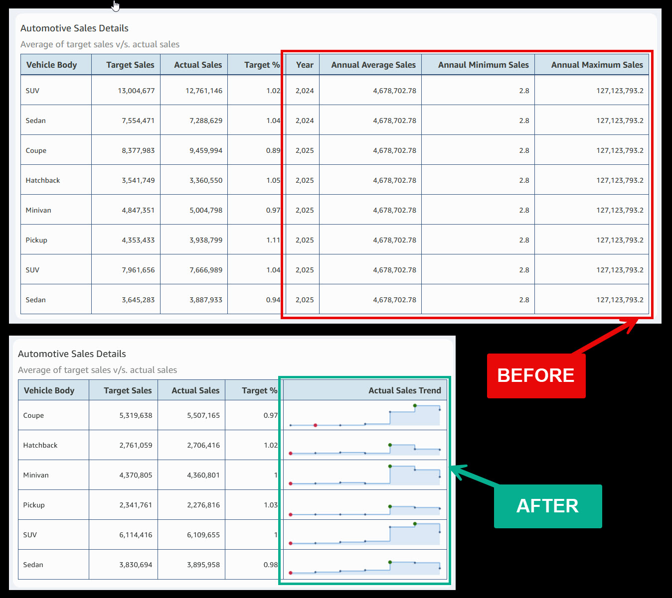
自動車販売のダッシュボードで見られる一般的なシナリオを考えてみましょう。BEFORE テーブルには、各車体タイプごとに 8 つのデータ列が表示されていますが、そのうち 3 つはすべての行で同じ静的な値を繰り返しています:年間平均売上、年間最小売上、年間最大売上です。これらの列は、意思決定に役立つ文脈を追加することなく、貴重なダッシュボードの実装スペースを占有してしまいます。
営業担当者が業績表を確認する際に最初に尋ねる質問は、「各車体タイプは年間を通じてどのように推移したのか?」です。以前はこの問いに答えるには、別の折れ線チャートへ移動するか、作成者に新規チャートの構築を依頼する必要がありました。
AFTER テーブルは、この 2 つの問題を同時に解決します。冗長な列を削除し、単一の年間売上トレンドスパークライン列を追加することで、表の列数は 8 から 5 に減りながら、むしろ*より多くの*洞察を提供しています。各車体タイプにはインラインでトレンドが表示され、赤いドットが最低点を、緑のドットがピークを示します。営業担当者は、クーペが上昇中か、ピックアップトラックが減少傾向にあるか、SUV が横ばいを維持しているかを、表から離れることなく即座に把握できます。
結果として: 列スペースの使用量が 37% 削減され、チャートの切り替えは不要となり、単一の視界で完全な業績の全体像を把握できるようになりました。
カスタムソートの活用
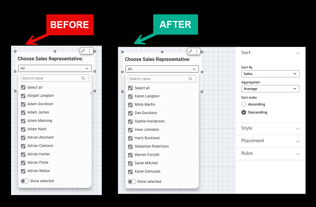
"*Choose Sales Representative*"というドロップダウンフィルターを使用して、マネージャーがパフォーマンスレビューの対象となる営業担当者を選定できる販売ダッシュボードを想定してください。BEFORE(変更前)のビューではデフォルト動作が表示され、名前は厳密なアルファベット順に並べられています。具体的には、アビゲイル・ラングドン (Abigail Langdon)、アダム・デイヴィッドソン (Adam Davidson)、アダム・ジェームズ (Adam James)、アダム・マンニング (Adam Manning) から始まり、組織内のすべての"Adrian"まで続きます。トップのパフォーマーを探しているマネージャーは、誰を探しているかをすでに知っているにもかかわらず、リスト全体をスクロールするか、名前を検索する必要があります。
このドロップダウンを開いた際に営業マネージャーが最初に尋ねる質問は「*A で始まる名前は誰か?*」ではなく、「*私の最高収益を生み出しているのは誰か?*」です。アルファベット順ソートでは、全く異なる問いに答えてしまっています。
AFTER(変更後)のビューはこの体験を変革します。別のフィールドでソートオプションを使用して、著者はソート対象フィールドをSales(売上)に設定し、集計方法としてAverage(平均)、順序としてDescending(降順)を選択しました。これにより、ドロップダウンを開くと、最もパフォーマンスの高い担当者が上位に表示されます:カレン・ラングドン (Karen Langdon)、モリー・マーティン (Molly Martin)、ダン・デイヴィッドソン (Dan Davidson)、ソフィー・ヘンダーソン (Sophie Henderson)。マネージャーはスクロールしたり推測したりすることなく、即座にトップのパフォーマーを確認できます。
結果: ビジネスへの影響度に基づいてランク付けされるフィルターコントロール。誰が重要かを特定するためにスクロールする必要はゼロ、チームのパフォーマンスを即座に可視化でき、コーチングの判断へと迅速に進む道が開かれます。これらはすべて著者によって一度設定されれば、すべてのダッシュボード閲覧者に継承されます。
財務報告
Quick Sight のテーブルにおけるスパークライン(Sparklines)は、財務チームにコンパクトでコンテキスト内の
原文を表示
Amazon Quick Sight, the business intelligence capability of Amazon Quick, delivers a unified BI experience, from modern interactive dashboards and natural language querying to pixel-perfect reports, machine learning insights, and embedded analytics at scale. Amazon Quick brings together AI-powered agents for business insights, research, and automation in one integrated experience, helping teams work smarter and faster while maintaining security and access policies.
Today, we’re excited to announce two new capabilities that make Quick Sight dashboards even more expressive and business-aligned: sparklines and custom sort for controls.
Tables are the most widely used visual type in Quick Sight, and with these additions, they become part of a significantly more powerful authoring experience. Sparklines embed compact, inline trend charts directly inside table cells. Instead of navigating to a separate line chart to determine whether a metric is improving or declining, readers can spot the pattern right where the data lives, in the table itself. Custom Sort for controls gives authors the ability to define a precise, business-driven order for drop-downs, and list controls. A status drop-down can now read *Escalated, In Progress, Resolved*, and a segment list can present *Enterprise, Mid-Market, SMB*, sequences that reflect how your organization prioritizes work, not how a database returns results.
In this post, we walk through both features, what they are, when to use them, and how to configure them, with real-world scenarios that bring them together in a practical, decision-ready dashboard.
By the end of this post, readers will be able to:
- Understand what sparklines and custom sort are and the business problems they solve.
- Enable and configure sparklines within a table.
- Define a custom sort order for dimension fields in Quick Sight.
- Apply both features together in a real-world dashboard scenario.
- Understand key considerations for using sparkline and custom sort.
Prerequisites
Before following the steps in this post, verify you have:
- An active AWS account with permissions to access Amazon Quick.
- Amazon Quick Enterprise edition enabled in your account.
- Author or Author Pro access to create and manage analyses and dashboards.
- Basic familiarity with Quick Sight concepts: datasets, analyses, field wells, and dashboards.
Getting started with sparklines
Sparklines are compact inline line charts that are embedded directly within table cells. Rather than requiring a separate visual to show trend data, sparklines allow readers to see and compare trends immediately without leaving the context of the surrounding data. They present the general shape of a trend without axes or coordinates, typically over time, in a simple and highly condensed way.
Complete the following steps to add sparklines to table visual:
- Log in to Amazon Quick and open the analysis containing the table visual you want to enhance.
- Choose the table visual to activate it. Verify the visual has at least one field in the Group by field well and one numeric measure in the Values field well.
- On the menu in the upper-right corner of the visual, select the Format visual icon (pencil visual). The Format visual pane opens on the right side.
- In the Properties pane, open the Visuals drop-down list and choose APPLY SPARKLINES. The sparkline editing pane opens.
Configure and customize the sparkline settings:
- For Value column, choose the measure field that you want the sparkline to represent (for example, Revenue, Ticket Count, or Health Score). Note that fields already used by another sparkline or data bar are not available.
- For the X-axis field, choose the dimension field to plot along the horizontal axis (for example, Order Date, Month, or Week).
Expand the Presentation section to configure the following options:
- Y-axis behavior: Choose Shared (same Y-axis scale across all rows for easy comparison) or Independent (each row scaled separately to highlight individual trend shapes). The default is Shared.
- Visual type: Choose Line (default) or Area line (adds a shaded area beneath the line).
- Line color: Use the color picker to set a custom color for the sparkline line. Default uses the theme color.
- Line interpolation: Choose Linear (default), Smooth, or Stepped to control how data points are connected.
- Marker visibility (optional). All markers are hidden by default. You can choose to show:
All points to show a marker on every data point.
- Max value to show a marker on the highest value.
- Min value to show a marker on the lowest value.
Apply, choose the right granularity and preview:
- Choose Apply. The sparkline appears as a new column in the table, named after the value field. It represents (for example, “Annual Sales Trend”). Each row now displays an inline trend chart. You can add up to 3 sparkline columns per table.
- The X-axis field must not be the same as a field in the Group by field. You can also configure the sort direction and time granularity for date/time fields.
- Publish the dashboard to make it available to readers.
Tip: Sparklines appear in the Visuals pane in the order they are created. To edit a sparkline later, open the Visuals drop-down in the Format visual pane and choose the edit icon next to the sparkline you want to modify. To remove a sparkline, open its edit pane and choose Delete.
Getting started with custom sort in controls
Custom sort gives authors control over how values appear in drop-down and list filter controls. By default, control values are sorted alphabetically in ascending order. With custom sort, you can display values in a specific business order (such as fiscal quarters or priority levels) or sort by related metrics (such as sorting regions by total sales).
Custom sort is available for drop-down (single select and multi-select) and List (single select and multi-select) control styles. The available sort options depend on whether the control uses specific values or values from a dataset column.
Complete the following steps to configure custom sort in controls:
Custom sort is configured through filter controls on your analysis sheet, specifically drop-down (single select and multiselect) and List (single select and multiselect) control styles. The configuration path depends on whether the control uses specific values or values from a dataset column. Choose Option A if you manually define your control values. Choose Option B if your control pulls values dynamically from a dataset column.
Option A: Controls with specific values
When a control uses specific values that you entered manually, follow the steps to add a parameter and create the control:
Select the filter control
- Add a parameter.
- Create a control from that parameter and add it to the top of the sheet. Add specific values to the control. For example, a priority-level control can display: Medium Rate, Low Rate, High Rate
- Choose the filter control on top of the sheet that you want to sort.
- Open the Format control pane. Choose the pencil icon on the control to open the Format control pane.
- If the control is pinned to the top of the sheet, expand it, hover over it until the three dots appear, then choose Edit.
Choose your sort order
- In the Format control pane, find the Sort section.
- Select one of the following options:
As Entered displays the values in the exact order you entered them. This preserves your custom ordering without any automatic sorting. For example, a priority-level control can display: High Rate, Low Rate, Medium Rate
- Ascending (A to Z, 0 to 9) sorts values in ascending order. This is the default.
- Descending (Z to A, 9 to 0) sorts values in descending order.
- The control immediately reflects your chosen sort order.
Note: When a control has values from both specific values and a source entity (such as a filter or parameter), the combined list is sorted together. For user-defined order, values are appended in the order they were entered. If a value from the source cannot be sorted based on the current configuration, it is appended at the end of the list.
Option B: Controls with values from a dataset column
When a control displays values from a dataset column, you can sort by that field or by another field using an aggregation function. This is useful when you want to order control values by a related metric, such as sorting a list of products by total sales.
Select the filter control
- Choose the filter control on top of the sheet or inside the sheet that you want to sort.
- Open the Format control pane. Choose the pencil icon to open the Format control pane.
- Locate the Sort section and configure it. Choose one of the following:
- Sort by control column sorts values based on the column the control is tied to. Configure the Sort direction (Ascending or Descending) and optionally choose an Aggregation function or select No aggregation to sort by raw column values.
- Sort by another field sorts values based on a different column in the dataset. For Sort by field, choose a column from the dataset (for calculated fields, only scalar non-aggregated columns are available). Choose an Aggregation function to apply. For numeric fields, options include Sum, Average, Count, Distinct count, Min, Max, Median, Percentile, Var, Stdev, and others. For non-numeric fields, Count and Distinct Count are available. Then set the Sort direction.
- Choose Apply. The control values reorder based on your configuration.
Note: For cross-sheet filter controls, sort order is configured through the cross-sheet settings and applies to all instances of the control across sheets. Dashboard controls inherit the sort configuration from the analysis, meaning sort configuration changes are not available to dashboard readers.
Bonus tip: Control font styling using themes
When building polished, brand-consistent dashboards in Amazon Quick Sight, every detail matters, including the fonts on your filter controls. With font theming for controls, Quick Sight lets you define typography settings at the theme level so that all controls (drop-downs, sliders, date pickers, text inputs) automatically inherit a consistent font family, size, and style across your entire dashboard. Use the following steps to apply font styling to controls:
- In your Quick Sight analysis, Select the pencil/edit icon on the top toolbar, then select Themes from the left panel. Choose an existing theme to edit, or create a new one by choosing Create theme.
- Inside the theme editor, expand Controls
- Choose your preferred:
Font family (for example, Amazon Ember, Arial, Open Sans).
- Font size (for example, 12px, 14px).
- Font style (Regular, Bold, Italic).
- Font color.
- Font alignment.
- Choose Save to update the theme. Quick Sight immediately applies the new font settings to all filter controls on the dashboard. Drop-downs, date pickers, sliders, and list controls all update in real time.
Combining control font theming with custom color palettes gives your dashboard a fully cohesive brand identity.
Real-world applications
Sparklines and custom sort are valuable across a wide range of business functions:
Sales and revenue operations
A regional sales director managing 12 territories needs to review quarterly performance in a single dashboard view without switching between multiple charts.
Sparklines in action
Consider a common scenario in automotive sales dashboards. The BEFORE table shows eight columns of data for each vehicle body type, including three that repeat the same static values across every row: Annual Average Sales, Annual Minimum Sales, and Annual Maximum Sales. These columns consume valuable dashboard real estate without adding decision-relevant context.
The first question a sales agent asks when reviewing a performance table is: *How did each vehicle body type perform across the year?* Previously, answering that required navigating to a separate line chart or requesting the author to build one.
The AFTER table solves both problems at once. By removing redundant columns and adding a single Annual Sales Trend sparkline column, the table goes from eight columns to five while delivering *more* insight, not less. Each vehicle body type now displays an inline trend with red dots marking low points and green dots marking peaks. A sales agent can instantly see whether Coupe is climbing, Pickup is declining, or SUV is holding steady, all without leaving the table.
The result: 37% less column space consumed, zero chart-switching required, and a complete performance picture visible in a single glance.
Custom sort in action
Consider a sales dashboard where a “*Choose Sales Representative*” drop-down filter helps managers select reps for performance review. The BEFORE view shows the default behavior: names listed in strict alphabetical order starting with Abigail Langdon, Adam Davidson, Adam James, Adam Manning, and continuing through every Adrian in the organization. A manager looking for their top performers must scroll through the entire list or search by name, already knowing who they are looking for.
The first question a sales manager asks when opening this drop-down is not “*Whose name starts with A?*” but rather “*Who are my highest revenue generators?*” Alphabetical sorting answers the wrong question entirely.
The AFTER view transforms this experience. Using the Sort by another field option, the author sets the Sort By field to Sales with Average aggregation in Descending order. Now the drop-down opens with the highest-performing reps at the top: Karen Langdon, Molly Martin, Dan Davidson, Sophie Henderson. The manager instantly sees top performers first without scrolling or guessing.
The result: A filter control that ranks by business impact, not the alphabet. Zero scrolling to find who matters, instant visibility into team performance, and a faster path to coaching decisions, all configured once by the author and inherited by every dashboard reader.
Financial reporting
Sparklines in Quick Sight tables give finance teams a compact, in-conte
関連記事
自然言語プロンプトからダッシュボードを生成する Amazon Quick の新機能
Amazon は、自然言語による指示だけで複数シートのダッシュボードを数分で自動生成する「Amazon Quick」を発表した。これにより、データ分析や経営報告の準備時間が大幅に短縮される。
Datasette Apps:カスタム HTML アプリケーションを Datasette 内でホスト可能に
Simon Willison が開発した Simon Willison Blog は、Datasette に新しいプラグイン「datasette-apps」を追加し、自己完結型の HTML と JavaScript で構成されるアプリケーションを同プラットフォーム上で実行できる機能を公開しました。
AWS SMGS が Amazon Bedrock AgentCore を活用した AI 搭載型会話アシスタントで業務管理を革新する方法
AWS のリーダーたちは、複数の階層にまたがる複雑なデータを管理し、グローバルな運営に影響を与える時間制約のある意思決定を行っています。従来のビジネスインテリジェンスは静的なダッシュボードや手動報告に依存しており、遅延が生じ組織の俊敏性が制限されていました。これに対し、NarrateAI という知的会話ソリューションが、データレイクと Amazon Bedrock AgentCore を駆使した対話型エージェント AI によって対応しています。
今日のまとめ
AI日報で今日の重要ニュースをまとめ読み