Amazon Quick Sightでリッチなカスタムツールチップを作成
AWSはAmazon Quick Sightにシートツールチップ機能を追加し、ダッシュボード作成者が自由形式のレイアウトシートを使用して、複数のビジュアルや動的データを含むカスタムツールチップを設計できるようにしました。
キーポイント
カスタムツールチップの実現
Amazon Quick Sightで自由形式のシートエディターを使用して、複数のチャートやKPI指標、テキストなどを組み合わせたカスタムツールチップレイアウトを設計できるようになりました。
動的データ表示
ツールチップは読者がデータポイントにホバーする際に動的にレンダリングされ、リアルタイムデータを表示し、最大5つのビジュアルをサポートします。
データストーリーテリングの強化
テキストベースのデータラベルを超えた視覚的に豊かなツールチップ体験を作成でき、読者が探索中のビジュアルから離れることなく補足的な洞察を提供できます。
使用要件
この機能を使用するには、AWSアカウント、Quick Sight Enterprise Edition、および作成者または作成者プロのアクセス権が必要です。
重要な引用
Dashboard authors can now design custom tooltip layouts using free-form layout sheets.
These layouts combine charts, key performance indicator (KPI) metrics, text, and other visuals into a single tooltip that renders dynamically when readers hover over data points.
With this feature, you have more control over how contextual information appears, and you can create richer data storytelling without requiring readers to navigate away from the visual they’re exploring.
The tooltip sheet supports up to 5 visuals and filters data dynamically based on the data point you hover over.
影響分析・編集コメントを表示
影響分析
この機能はBIツールのユーザー体験を向上させ、より直感的で情報量の多いデータ可視化を可能にします。特に複雑なデータ分析において、コンテキスト情報の提示方法を改善し、意思決定プロセスを支援する重要な進化と言えます。
編集コメント
AWSのBIサービスにおけるユーザー体験向上のための実用的な機能追加。営業PR色が強いが、具体的な機能説明と実装手順が詳細に記載されている。
Amazon Quick Sightは、Amazon Quickのビジネスインテリジェンス(BI)機能であり、統合されたBIサービスです。大規模なモダンでインタラクティブなダッシュボード、自然言語クエリ、ピクセルパーフェクトなレポート、機械学習(ML)によるインサイト、エンベデッドアナリティクスを提供します。Amazon Quickは、ビジネスインサイト、リサーチ、自動化のためのAIエージェントを1つの統合された体験にまとめ、セキュリティとアクセスポリシーを維持しながら、よりスマートかつ迅速な作業をサポートします。
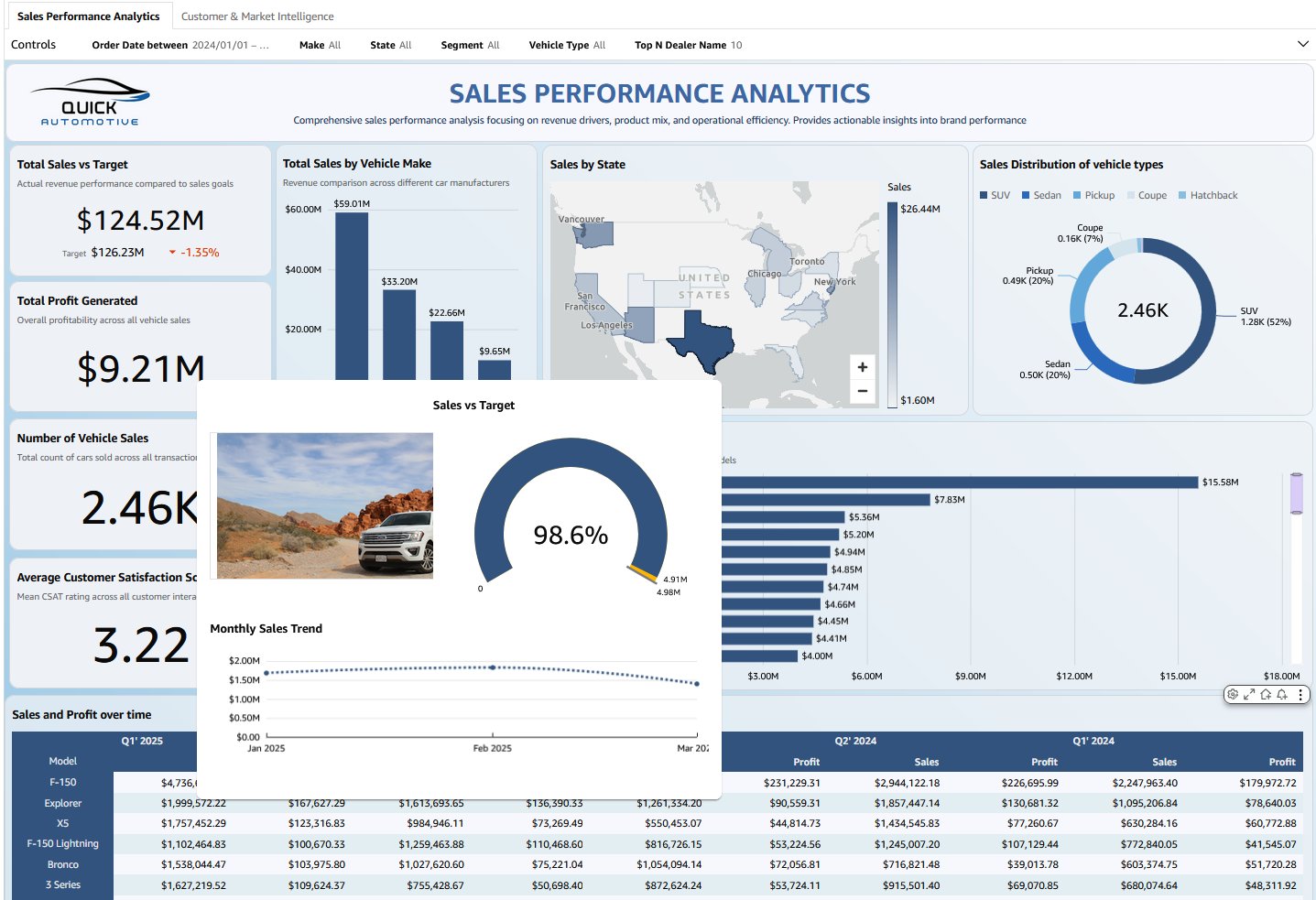
本日、Amazon Quick Sightにおけるシートツールチップを発表いたします。ダッシュボードの作成者は、フリーフォームレイアウトシートを使用してカスタムツールチップレイアウトをデザインできるようになりました。これらのレイアウトは、チャート、主要業績評価指標(KPI)メトリクス、テキスト、その他のビジュアライゼーションを組み合わせ、データポイントにマウスを乗せた際に動的に表示される単一のツールチップとしてレンダリングされます。シートツールチップは、テーブルやピボットテーブルを含むほとんどのチャートタイプと互換性があり、作成者は一貫した体験のために複数のビジュアル間で同じツールチップシートを再利用できます。この機能により、コンテキスト情報がどのように表示されるかについてより多くの制御が可能になり、読者が現在探索しているビジュアライゼーションから離れることなく、より豊かなデータストーリーテリングを作成できます。
ソリューションの概要
シートツールチップを使用することで、以下のことが可能になります:
- 自由形式シートエディタを使用して、カスタムツールチップのレイアウトを設計する
- 折れ線グラフ、棒グラフ、テキストボックスなど、単一のツールチップ内に複数のビジュアルタイプを含める
- 異なるデータポイントにマウスを乗せた際に更新される、動的でリアルタイムのデータを表示する
- トレンド可視化に加えて、売上高、販売数量、総注文数などの文脈的な指標を追加する
- テキストベースのデータラベルを超えた、視覚的に豊かなツールチップ体験を作成する
- マウスオーバー時に補足情報を表示することで、データストーリーテリングを強化する
この機能は、自由形式レイアウトを持つ専用のツールチップシートタイプを使用しており、ビジュアルコンポーネントを自由に配置できます。ツールシップシートは最大5つのビジュアルをサポートし、マウスオーバーするデータポイントに基づいてデータを動的にフィルタリングします。
前提条件
開始する前に、以下の準備が整っていることを確認してください。
- Amazon Quick Sight にアクセスするための権限を持つアクティブな AWS アカウント
- アカウントで Quick Sight Enterprise Edition が有効化されていること
- 分析およびダッシュボードの作成と管理を行うための Author または Author Pro のアクセス権限
- 分析、ダッシュボード、シート、ビジュアルタイプなどの Quick Sight の基本概念に関する基本的な理解
シートツールチップの開始方法
以下の手順では、販売ダッシュボードを例として、シートツールセットアップを設定する方法を示します。このアプローチはあらゆるユースケースに適用できます。単に、関連するビジュアルと指標をあなたのデータに合わせて置き換えてください。
Quick Sight ビジュアライゼーションのシートツールチップを作成するには、以下の手順を実行します。
ステップ 1: インタラクションタブに移動する
- Amazon Quick コンソールで、左ペインの Quick Sight 下にある分析を選択します。
- ダッシュボードシートのビジュアライゼーション(棒グラフやテーブルなど)のいずれかを選択し、[ビジュアライゼーションを編集] を選択します。
- 右側のプロパティパネルで、インタラクションタブに移動します。
- ツールチップ設定の下で、以下の例に示すように [シートツールチップ] を選択します。
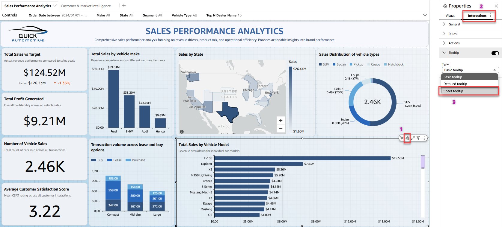
- [シートツールチップを作成] を選択して、ユースケース用のツールチップを構築します。
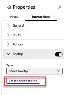
ステップ 2: ツールチップシートのデザインと公開
- Quick Sight 分析により、フリーフォームのレイアウトを持つ新しいツールチップシートが開き、ツールチップデザインの空白キャンバスが提供されます。最大 5 つのビジュアライゼーションをツールチップシートに追加し、レイアウトに合わせてサイズ変更および書式設定を行います。
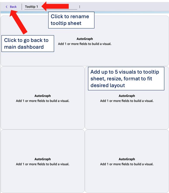
- 設定を構成したら、上部のメニューバーにある [ ] ボタンを選択して、メインのダッシュボードシートに戻ります。
- ビジュアル上の任意のデータポイントにカーソルを合わせると、カスタムレイアウトでレンダリングされたシートのツールチップが表示されます。
- 異なるデータポイント間を移動すると、ツールチップはすべてのビジュアル、テキストボックス、メトリクスをリアルタイムで動的に更新し、一目で豊富なコンテキスト情報を提供します。
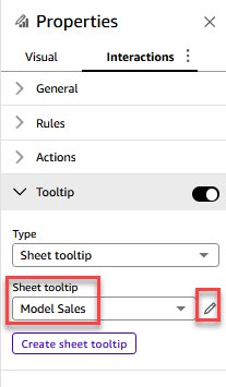
- 既存のツールチップシートを編集するには、ツールチップのドロップダウンリストからシートを選択し、鉛筆アイコンを選択して変更を行います。
- 最後に、ダッシュボードを公開して、読者がツールチップを使用できるようにします。
使用例
売上focusedのシートツールチップを作成する例を見てみましょう。この例では3つのビジュアルを使用しています。これらのビジュアルとメトリクスは、あなたのユースケースに合わせて任意のものと置き換えることができます。
- ビジュアルセクションから、キャンバス上にビジュアルをドラッグして、レイアウトに合わせてリサイズします。
- シートツールチップの名前を「Model Sales」に変更します。
- 目標に対する売上を測定し、比較率を表示するためにゲージチャート(gauge chart)を追加します。
- 月次の売上トレンドを示すためにラインチャート(line chart)を追加します。
- 次にテーブルを追加し、モデルの画像を選択します。フィールド設定を編集して、URL を画像として表示するようフィールドを設定します。
キャンバス上の各ビジュアル要素のサイズと位置を調整します。フリーフォームレイアウト(free-form layout)を使用すると、要素を自由にドラッグして並べ替えることができるため、希望するツールチップの構成を作成できます。以下のスクリーンショットに示す結果を確認するために、ビジュアルをフォーマットします。
以下の動画は、モデルのデータポイントにマウスをホバーしたときに、「Sales vs. Target(売上対目標)」、「Monthly Sales trend(月次売上のトレンド)」、および選択されたモデルの画像を表示する「Automotive Sales Performance(自動車売上パフォーマンス)」ダッシュボードシートのツールチップの例を示しています。特定のユースケースに応じて選択するビジュアルやメトリクスによって、ツールチップの内容は異なります。
シートツールチップでサポートされている機能
Quick Sight のほとんどのビジュアルタイプにシートツールチップ(sheet tooltip)を追加できます。以下のリストは、サポートされているビジュアルタイプを示しています。
シートツールチップを使用できるビジュアルタイプ
ゲージ
ドーナツチャート
パイチャート
履歴パイチャート
縦棒グラフ
履歴積み上げ棒グラフ
縦積み上げ棒グラフ
履歴100%積み上げ棒グラフ
縦100%積み上げ棒グラフ
折れ線グラフ
面積折れ線グラフ
積み上げ面積折れ線グラフ
クラスタリング棒コンボチャート
積み上げ棒コンボチャート
箱ひげ図
ピボットテーブル
テーブル
ヒートマップ
ツリーマップ
散布図
ヒストグラム
ファネルチャート
地図上のポイント
塗りつぶしマップ
階層マップ
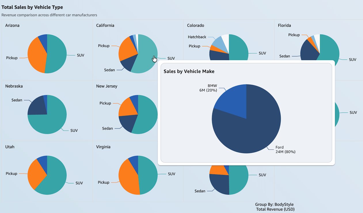
また、スモールマルチプルズを使用するビジュアルにもシートツールチップを追加できます。スモールマルチプルズ機能により、特定の次元の多くの値にわたってデータを比較することができます。以下のスクリーンショットは、スモールマルチプルズ付きの円グラフ上に表示される、四半期ごとの売上を示すシートツールチップを示しています。このビューは、地域別車両タイプの比較と四半期ごとの売上トレンドを併せて確認するなど、読者がより深い洞察を得るのに役立ちます。
パラメータを使用して、シートツールチップに表示されるビジュアルをユーザーが動的に変更できるようにすることもできます。以下の例では、ユーザーはシートツールチップで「四半期別の売上」を表示するか、「車両メーカー別の売上」を表示するかを選択できます。
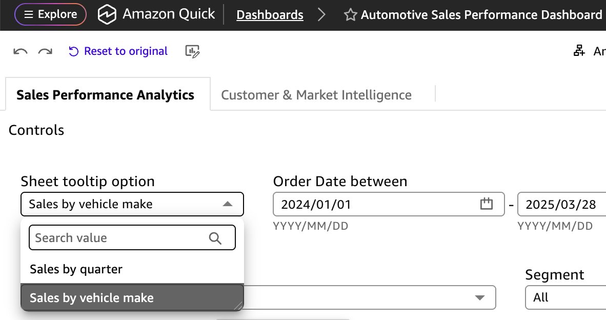
ダッシュボードの作成者は、QuickSight(クイックサイト)でビジュアルを表示または非表示にするためにパラメータを使用することで、前述のシートツールチップのオプションを設定できます。詳細については、「ダッシュボードでインタラクティブ性を駆動するためのQuickSightパラメータとコントロールの使用」および「デフォルトでビジュアルを非表示にする」をご覧ください。
以下のビデオは、ダッシュボードの閲覧者がシートツールチップ内のビジュアルを切り替えられるようにQuickSightを設定する方法を示しています。
シートツールチップの制限事項
シートツールシップ機能を探求する際、以下の現在の制限事項にご注意ください:
- 特定のビジュアライゼーションタイプにはシートツールチップを追加できません。以下のリストを参照してください。
シートのツールチップを追加できないビジュアライゼーションタイプ
KPI
ウォーターフォールチャート
サンキーダイアグラム
レーダーチャート
ワードクラウド
カスタムビジュアライゼーション
Highcharts ビジュアライゼーション
インサイト
- 各ツールチップシートには、最大5つのビジュアライゼーション、5つの画像、および5つのテキストボックスをサポートしています。
- 各分析には最大50のツールチップシートを追加できます。この制限は、インタラクティブレポートおよびピクセルパーフェクトレポートのシート制限とは別個です。
- 分析には、少なくとも1つのインタラクティブまたはページネーションレポートシートが含まれている必要があります。ツールチップシートのみを分析のシートタイプとして使用することはできません。
- ピクセルパーフェクトレポートシートでは、レポートが静的なPDF出力であるため、シートのツールチップはサポートされていません。
- レイヤーマップビジュアライゼーションは、ツールチップシートではサポートされていません。
- シートのタイトルと説明は、ツールチップシートでは使用できません。
- 跨シートフィルタリング(クロスシートフィルタリング)は、ツールチップシートではサポートされていません。
- シートのツールフリーフォームレイアウトを使用し、最大幅640px、高さ720pxをサポートしています。
- ビジュアライゼーションのインポート機能は、他の分析からシートのツールチップをインポートできません。
- ツールチップシート内のビジュアライゼーションにカスタムアクションを追加することはできません。
結論
Amazon QuickSightのシートツールチップは、ダッシュボード作成者の体験を向上させ、詳細なデータをホバー表示するリッチでマルチビジュアルのツールチップレイアウトを自由に設計できる創造的な自由を提供します。動的なチャート、リアルタイムのメトリクス、柔軟なフリーフォームレイアウトを組み合わせることで、シートツールチップはホバー操作をインタラクティブなデータ探索体験に変換します。エグゼクティブ向けダッシュボード、営業レポート、運用監視ビューを構築する際に関わらず、シートツールチップを使用すれば、現在のコンテキストから離れることなく、より深いインサイトを提供できます。
シートツールチップやその他の新機能について詳しく知りたい場合は、Amazon QuickSightコミュニティの「新着情報」セクションをご覧ください。あなたが構築する創造的なツールチップ体験を楽しみにお待ちしています!
著者について
 image
image
Meshan Khosla
Meshan KhoslaはAmazon QuickSightを担当するソフトウェア開発エンジニアです。優れたソフトウェアの構築と困難な技術的問題の解決を楽しんでいます。仕事以外では、サッカー観戦や、いずれは手放すことになりそうなサイドプロジェクトに取り組むのが趣味です。bio
 image
image
Neeraj Kumar
Neeraj KumarはAWSのシニア・グローバルソリューションズアーキテクトであり、組織がデータをどのように活用するかを変革するエンタープライズ規模のソリューションを設計しています。自動車、製造業、通信分野で20年以上にわたるデータおよびアナリティクス分野での経験を持ち、Amazon QuickSightとAI駆動型アナリティクスを活用してより深い洞察を得られるようグローバル顧客を支援し、統合されたAI/BIの環境を近代化し、データ駆動型のイニシアチブを加速させるお手伝いをしています。

Will Tsao
Will TsaoはAmazon QuickSightのビジュアライゼーションチーム所属のソフトウェアエンジニアで、直感的かつ強力なテーブルおよびピボットテーブルの体験構築を専門としています。複雑な問題解決と、ユーザーがデータを探索し理解する方法を向上させる創造的で洗練されたソリューションの提供に情熱を注いでいます。仕事以外では、Williamはキックボクシングに多くの時間を費やし、身体的・精神的な両面から常に自身に挑戦しています。
Ying Wang
Ying Wangは、AWSのGenerative AI組織に所属するシニアスペシャリストソリューションアーキテクトで、Amazon QuickSightおよびAmazon Qを専門とし、大規模なエンタープライズ顧客や独立系ソフトウェアベンダー(ISV)のサポートを行っています。彼女はデータ分析およびデータサイエンス分野で16年の経験を持ち、データアーキテクトおよびソフトウェア開発エンジニアリングマネージャーとしての強力なバックグラウンドを有しています。データアーキテクトとして、Yingは顧客のクラウド上でのエンタープライズデータアーキテクチャソリューションの設計とスケーリングを支援しました。エンジニアリングマネージャーとしての役割では、新機能の提供およびエンジニアリングと製品の両方の観点からの製品革新を推進することで、顧客がQuickSightを通じてデータを最大限に活用できるよう支援しました。

Roy Yung
Roy Yungは、Amazon QuickSight担当のシニアスペシャリストソリューションアーキテクトです。Royは、エンタープライズビジネスインテリジェンス(BI)ソリューションの実装において10年以上の経験を持っています。AWSに入る以前、Royは保険、銀行、航空、小売業界においてBIおよびデータプラットフォームソリューションを提供してきました。
原文を表示
Amazon Quick Sight, the business intelligence (BI) capability of Amazon Quick, is a unified BI service. It provides modern interactive dashboards, natural language querying, pixel-perfect reports, machine learning (ML) insights, and embedded analytics at scale. Amazon Quick brings together AI agents for business insights, research, and automation in one integrated experience, helping you work smarter and faster while maintaining security and access policies.
Today, we’re announcing sheet tooltips in Amazon Quick Sight. Dashboard authors can now design custom tooltip layouts using free-form layout sheets. These layouts combine charts, key performance indicator (KPI) metrics, text, and other visuals into a single tooltip that renders dynamically when readers hover over data points. Sheet tooltips work with most chart types, including tables and pivot tables, and authors can reuse the same tooltip sheet across multiple visuals for a consistent experience. With this feature, you have more control over how contextual information appears, and you can create richer data storytelling without requiring readers to navigate away from the visual they’re exploring.
Solution overview
With sheet tooltips, you can now:
- Design custom tooltip layouts using the free-form sheet editor
- Include multiple visual types within a single tooltip, such as line charts, bar charts, and text boxes
- Display dynamic, real-time data that updates as readers hover over different data points
- Add contextual metrics like revenue, units sold, and total orders alongside trend visualizations
- Create visually rich tooltip experiences that go beyond text-based data labels
- Enhance data storytelling by surfacing supplementary insights on hover
This feature uses a dedicated tooltip sheet type with a free-form layout, giving you the flexibility to arrange visual components exactly how you want. The tooltip sheet supports up to 5 visuals and filters data dynamically based on the data point you hover over.
Prerequisites
Before you begin, make sure you have the following:
- An active AWS account with permissions to access Amazon Quick Sight
- Quick Sight Enterprise Edition enabled in your account
- Author or Author Pro access to create and manage analyses and dashboards
- Basic familiarity with Quick Sight concepts such as analyses, dashboards, sheets, and visual types
Getting started with sheet tooltips
The following walkthrough demonstrates how to set up a sheet tooltip using a sales dashboard as an example. You can apply the same approach to any use case. Simply substitute the visuals and metrics that are relevant to your data.
Complete the following steps to create a sheet tooltip for your Quick Sight visuals:
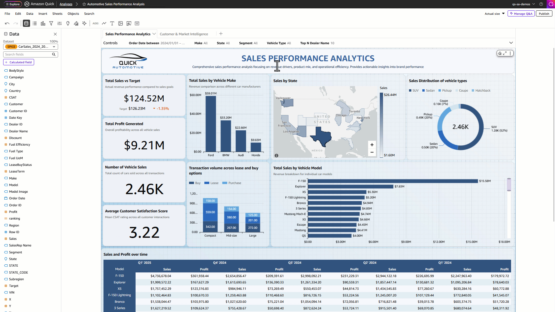
Step 1: Navigate to the Interactions tab
- In the Amazon Quick console, in the left pane, under Quick Sight, choose an analysis.
- Choose any visual on your dashboard sheet, such as a bar chart or table, and choose Edit visual.
- In the Properties panel on the right, navigate to the Interactions tab.
- Under the Tooltip configuration, select Sheet tooltip as shown in the following example.
- Choose Create sheet tooltip to build one for your use case.
Step 2: Design and publish your tooltip sheet
- Quick Sight analysis opens a new tooltip sheet with a free-form layout, providing a blank canvas for your tooltip design. Add up to 5 visuals to the tooltip sheet. Resize and format them to fit your layout
- After configuring the settings, navigate back to your main dashboard sheet by choosing the button on the top menu bar.
- Hover over any data point on your visual to see the sheet tooltip rendered with your custom layout.
- As you move across different data points, the tooltip dynamically updates all visuals, text boxes, and metrics in real time, providing rich contextual information at a glance.
- To edit an existing tooltip sheet, select the sheet from the tooltip drop-down list and choose the pencil icon to make any changes.
- Finally, publish the dashboard so that your readers can use the tooltips.
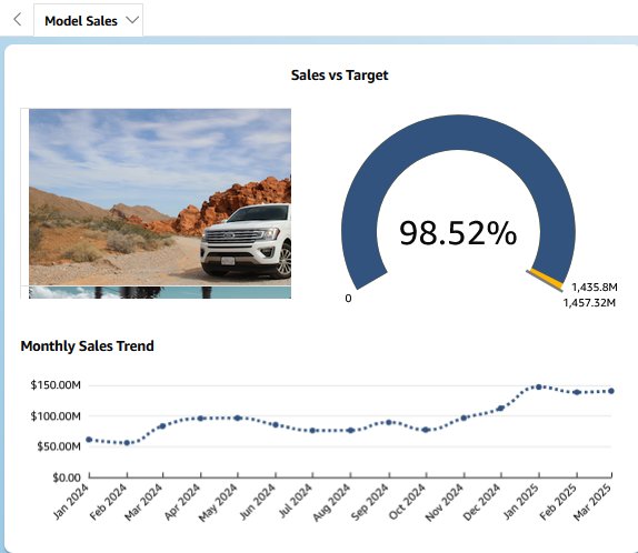
Use case
Let’s take an example to create a sales-focused sheet tooltip with three visuals. You can replace these with any visuals and metrics that suit your use case.
- From the Visuals section, drag a visual onto the canvas and resize it to fit your layout.
- Rename the sheet tooltip to Model Sales.
- Add a gauge chart to measure sales against target and display the comparison percentage.
- Add a line chart to show monthly trend for sales.
- Now add a table and select the model image. Edit the field settings and set the field to show URLs as images.
- Adjust the size and position of each visual element on the canvas. The free-form layout allows you to drag and rearrange elements freely to create your preferred tooltip composition. Format the visuals to see the results as shown in the following screenshot.
The following video shows an example of the Automotive Sales Performance dashboard sheet tooltip displaying Sales vs. Target, Monthly Sales trend and image of selected model when hovering over a model data point. Your tooltip content will vary based on the visuals and metrics you choose for your specific use case.
Features supported by sheet tooltips
You can add a sheet tooltip to most visual types in Quick Sight. The following list shows the supported visual types.
Visual types can have sheet tooltips
Gauge
Donut chart
Pie chart
Historical pie chart
Vertical bar chart
Historical stacked bar chart
Vertical stacked bar chart
Historical stacked 100% bar chart
Vertical stacked 100% bar chart
Line chart
Area line chart
Stacked area line chart
Clustered bar combo chart
Stacked bar combo chart
Box plot
Pivot table
Table
Heat map
Tree map
Scatter plot
Histogram
Funnel chart
Points on map
Filled map
Layered map
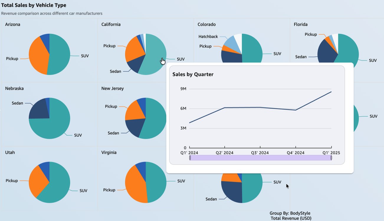
You can also add sheet tooltips to visuals that use small multiples. The small multiples feature allows you to compare data across many values of a specific dimension. The following screenshot shows a sheet tooltip displaying sales by quarter over a pie chart with small multiples. This view helps readers gain deeper insights, such as comparison of vehicle type across regions along with the quarterly sales trends.
You can also use parameters to let readers dynamically change the visuals shown in a sheet tooltip. In the following example, readers can choose whether they want to view Sales by quarter or Sales by vehicle make in the sheet tooltip.
A dashboard author can configure the preceding sheet tooltip option by using a parameter to show or hide a visual in Quick Sight. See Using Quick Sight parameters and controls to drive interactivity in your dashboards and Hiding a visual by default to learn more.
The following video demonstrates how to configure Quick Sight to allow dashboard readers to switch visuals in a sheet tooltip.
Limitations in sheet tooltips
As you explore the sheet tooltip feature, note the following current limitations:
- Certain visual types cannot have sheet tooltips added to them. See the following list.
Visual types cannot have sheet tooltips
KPI
Waterfall chart
Sankey diagram
Radar chart
Wordcloud
Custom visual
Highcharts visual
Insight
- Each tooltip sheet supports up to 5 visuals, 5 images, and 5 text boxes.
- Each analysis supports up to 50 tooltip sheets. This limit is separate from the interactive and pixel-perfect report sheet limits.
- An analysis must contain at least one interactive or paginated report sheet. Tooltip sheets cannot be the only sheet type in an analysis.
- Sheet tooltips are not supported on pixel-perfect report sheets because reports are static PDF output.
- Layer map visuals aren’t supported on tooltip sheets.
- Sheet title and description are not available on tooltip sheets.
- Cross-sheet filtering is not supported on tooltip sheets.
- Sheet tooltips use free-form layout and support up to 640px width and 720px height.
- Import visual feature cannot import sheet tooltip from another analysis.
- You cannot add custom actions on visuals in a tooltip sheet.
Conclusion
Sheet tooltips in Amazon Quick Sight enhance the dashboard authoring experience, giving authors the creative freedom to design rich, multi-visual tooltip layouts that display detailed data on hover. By combining dynamic charts, real-time metrics, and flexible free-form layouts, sheet tooltips transform hover interactions into interactive data exploration experiences. Whether you’re building executive dashboards, sales reports, or operational monitoring views, sheet tooltips help you deliver deeper insights without requiring readers to navigate away from their current context.
To learn more about sheet tooltips and other new features, visit the Amazon Quick community What’s New section. We look forward to seeing the creative tooltip experiences you build!
About the authors
Meshan Khosla
Meshan Khosla is a Software Development Engineer working on Amazon Quick Sight. He enjoys building great software and solving challenging technical problems. Outside of work, he enjoys watching football and working on soon-to-be abandoned side projects.bio
Neeraj Kumar
Neeraj Kumar is a Senior Worldwide Solutions Architect at AWS, architecting enterprise-scale solutions that transform how organizations use data. With over two decades in data and analytics across automotive, manufacturing, and telecom sectors, he guides global customers to gain deeper insights using Amazon Quick and AI-powered analytics, helping them modernize their Unified AI/BI landscape and accelerate their data-driven initiatives.
Will Tsao
Will Tsao is a Software Engineer on Amazon’s Quick Sight Visualization team, where he specializes in building intuitive and powerful table and pivot table experiences. He is passionate about solving complex problems and delivering creative, elegant solutions that enhance how users explore and understand data. Outside of work, William dedicates much of his time to kickboxing, continuously challenging himself both physically and mentally.bio.

Ying Wang
Ying Wang is a Senior Specialist Solutions Architect in the Generative AI organization at AWS, specializing in Amazon Quick Sight and Amazon Q to support large enterprise and ISV customers. She brings 16 years of experience in data analytics and data science, with a strong background as a data architect and software development engineering manager. As a data architect, Ying helped customers design and scale enterprise data architecture solutions in the cloud. In her role as an engineering manager, she enabled customers to make the most of their data through Quick Sight by delivering new features and driving product innovation from both engineering and product perspectives.
Roy Yung
Roy Yung is a Senior Specialist Solutions Architect for Amazon Quick Sight. Roy has over 10 years of experience implementing enterprise business intelligence (BI) solutions. Prior to AWS, Roy delivered BI and data platform solutions in the insurance, banking, aviation, and retail industries.
関連記事
今日のまとめ
AI日報で今日の重要ニュースをまとめ読み