Claude の設計思想を理解するための初心者向けガイド
Anthropic は Claude Design を新機能として発表し、これは画像生成ではなく実際のコードを出力してインタラクティブなプロトタイプを作成できるツールである。
AI深層分析を開く2026年7月30日 23:35
AI深層分析
キーポイント
Claude Design の本質と仕組み
同製品は Anthropic Labs の研究プレビューであり、Claude Opus 4.7 のビジョン能力を基盤にしているが、単なる画像生成ではなくブラウザで動作する実際のコードを出力する点が特徴である。
市場への影響と競合関係
発表当日に Figma の株価が約 7%下落し、同社の取締役が直前に退任したというタイミングの偶然性が市場関係者の注目を集めた。
利用条件とアクセス方法
Pro、Max、Team、Enterprise プランのユーザーは誰でも利用可能だが、Enterprise 管理者はデフォルトでオフになっているため手動で有効化する必要がある。
Claude Design の本質と出力形式
これは画像生成モデルではなく、ブラウザで実行可能な実際のコードを生成するツールである。このアーキテクチャにより、ナビゲーションや3D要素を含むインタラクティブなプロトタイプが可能になっている。
Canva や Figma との位置づけ
単なる高速なデザインツールやベクター精密さを持つ代替品ではなく、コードを出力する設計パートナーに近い存在である。その強みと課題はすべて、この「コード生成」という選択に起因している。
重要な引用
Claude Design doesn't generate flat images the way an image model does. It generates real, working code
interactive prototypes with working navigation, embedded video, voice input, and 3D elements
code being the universal medium underneath everything Claude Design produces
It's closer to a design partner that happens to output code
編集コメントを表示
編集コメント
記事の記述によると、この新機能は画像生成モデルとは異なり実行可能なコードを出力する点に革新性がある。ただし発表日が 2026 年となっている点は、未来のシナリオまたは記述上の不整合として留意すべきである。
Source Article
元記事を日本語で読む
本文に関係しない購読案内、埋め込み通知、サイト内プロモーションは除いています。
 image**
イントロダクション
2026 年 4 月 17 日、Anthropic は「Claude Design」をリリースしました。その同日、Figma の株価は約 7%下落し、発表のわずか 3 日前には Figma の取締役であるマイク・クリガー氏が退任しています。このタイミングの重なりは市場関係者たちによって即座に指摘されました。これは投資家たちの本音による反応であり、業界が今回のリリースをどう捉えているかを示すものです。
しかし、これが初心者にとって「実際に何をするべきか」について語るものではありません。このガイドは、後者の問いに対する答えです。Claude Design はまだ新しいツールのため、現在書かれている記事の多くはマーケティング文句や初回の印象に過ぎません。そこでこの記事では、初めてツールを開く際に本当に重要な点に焦点を当てます。内部構造はどうなっているのか、単なる汎用的な下書きではなく本格的なプロジェクトを立ち上げるにはどうすればよいか、既存のツールとどこで競合し、どこでまだ荒削りな部分が残っているのか——それらについて解説します。
Claude Design 実態とは
Claude Design は、Anthropic Labs が提供する研究プレビュー版です。これは Anthropic 社が「初期段階でまだ進化中の製品」を指すカテゴリに分類されます。このツールは Claude Opus 4.7 のビジョン機能によって駆動されており、現在 claude.ai/design で利用可能です。
Pro、Max、Team、Enterprise プランのいずれかに加入しているユーザーであれば誰でも利用できますが、Enterprise プランでは管理者が手動で有効化する必要があります。デフォルトではこの機能はオフになっています。

Claude Design の UI
実際の利用において最も重要なのは、キャンバス背後で何が行われているかです。Claude Design は画像生成モデルのように平面的な画像を出力するわけではありません。実際に動作するコードを生成します。この「コードを出力する」という一点の違いこそが、インタラクティブなプロトタイプ(動作するナビゲーション機能付き)、埋め込み動画、音声入力、3D 要素といった機能を可能にしています。なぜなら、出力結果は単なる静止画ではなく、ブラウザで実際に実行可能な本物のコードだからです。
詳細な実地検証記事では、スライド資料やランディングページ、あるいは完全なインタラクティブプロトタイプなど、どのような見た目であっても、Claude Design が生成するすべてのものの根底にあるのは「コード」であると明確に指摘しています。
この位置づけが重要なのは、最初から適切な期待値を設定するためです。これは単に Canva よりも高速なツールというわけではなく、Figma のベクター精度を備えたデザインツールの代替品でもありません。むしろ、コードを出力する設計パートナーに近い存在であり、その強みと現在の課題の両方が、この一つのアーキテクチャ上の選択に直接起因しています。
始め方:最初のプロジェクト
Claude Design を初めて開くと、4 つの開始オプションが表示されます。Prototypeはインタラクティブなインターフェースやフロー向け、Slide deckはプレゼンテーション用です。また、From Templateでは事前に構築されたテンプレート構造から始められます。これらに当てはまらないもの(単一ページのドキュメント、インフォグラフィック、あるいは一度きりのビジュアルアセットなど)は、Otherというオープンな選択肢で対応できます。
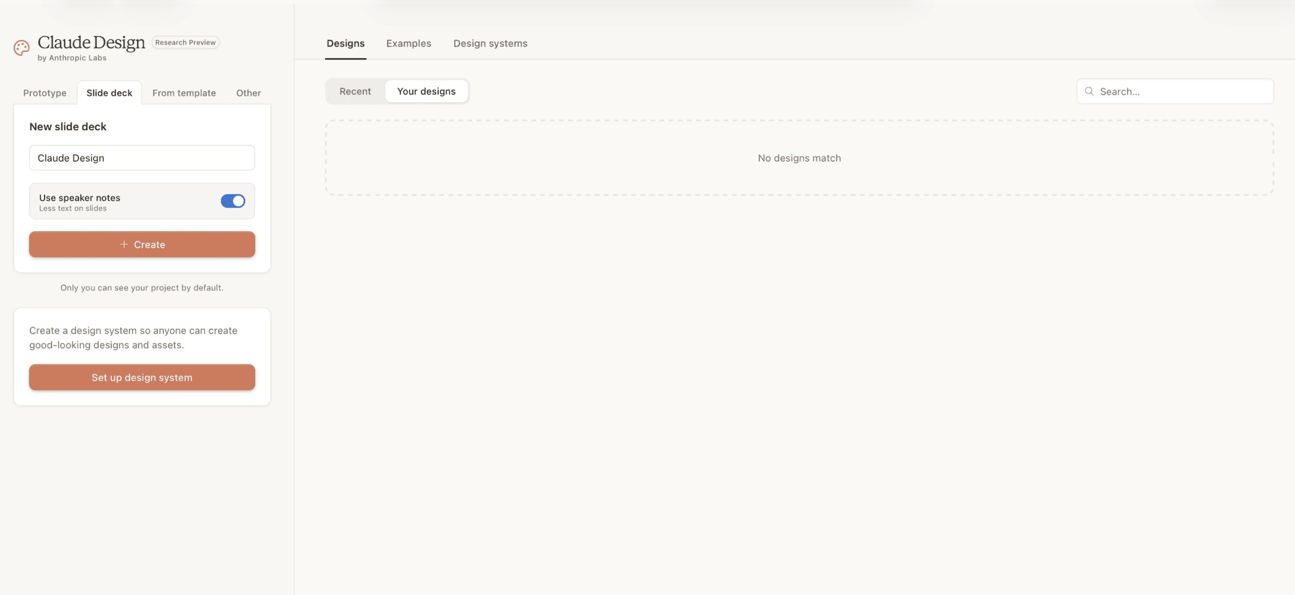
Claude Design の作業レイアウト
この作業レイアウトは、チャットパネルとライブキャンバスが並んだ構成です。Claude Code を使ったことがある人ならすぐに馴染みを感じるでしょう。その類似性は表面的なものではありません。
まず、作成したいものを説明する最初のプロンプトを入力します。すると、Claude Design は即座に生成を開始するのではなく、通常はまず聴衆、トーン、構造などについて確認質問を投げかけます。その後で構築が始まります。これは Claude Code の Plan モードと同じ基本パターンです。「実行する前に提案する」アプローチであり、推測して最初のドラフトがうまくいくことを願うものではありません。
その質問に的確に答えるために時間をかけることは、一見すると時間がかかりすぎると感じるほど価値があります。曖昧な最初のプロンプトでは、ほぼ毎回、汎用的でポートフォリオのテンプレートのような結果しか得られません。その最大の原因はプロンプトが弱いことではなく、デザインシステムが存在しないことです。これは次のセクションの主題でもあります。
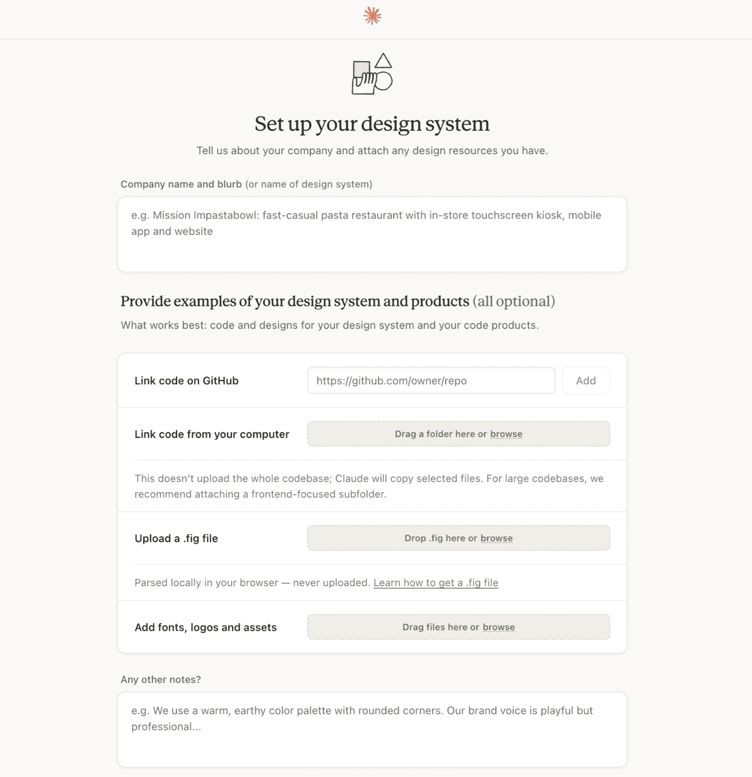 image**
Claude デザインシステム
# デザインシステムこそがゲーム全体を左右する
このステップを飛ばすと、その後に生成されるものはすべて有能そうに見えますが、同様に曖昧なプロンプトから他の Claude Design ユーザーが得る結果と区別がつきません。一度適切に設定すれば、その後のすべてのプロジェクトで、汎用的な美的デフォルトではなく、実際のブランドを継承した成果物が得られます。これは初心者が下す最も重要な決断でありながら、最初の結果を得るために必ずしも必要に見えないため、多くの人がこのステップを飛ばしてしまいます。
- まず、実際に使用するブランドの要素を集めます。色、フォント、ロゴファイル、既存のスクリーンショットなど、出力が本当にどのような見た目になるべきかを示す素材です。
- 次に、それらをアップロードし、Claude に与えられた情報からスタート用の UI キットを生成させます。

デザインシステムのセットアップ
- 最後に、そのドラフトを盲目的に受け入れるのではなく、批判的にレビューします。モデルが資産を解釈する最初の試みが、必ずしもあなたの意図と一致するとは限らないからです。
ドラフトのデザインシステムを検証する
4 つ目は、フォーム、データテーブル、ヒーローセクションなど異なるコンテンツタイプをカバーするテストプロンプトを手元に用意し、設計した例以外の場面でもシステムが機能するか確認することです。
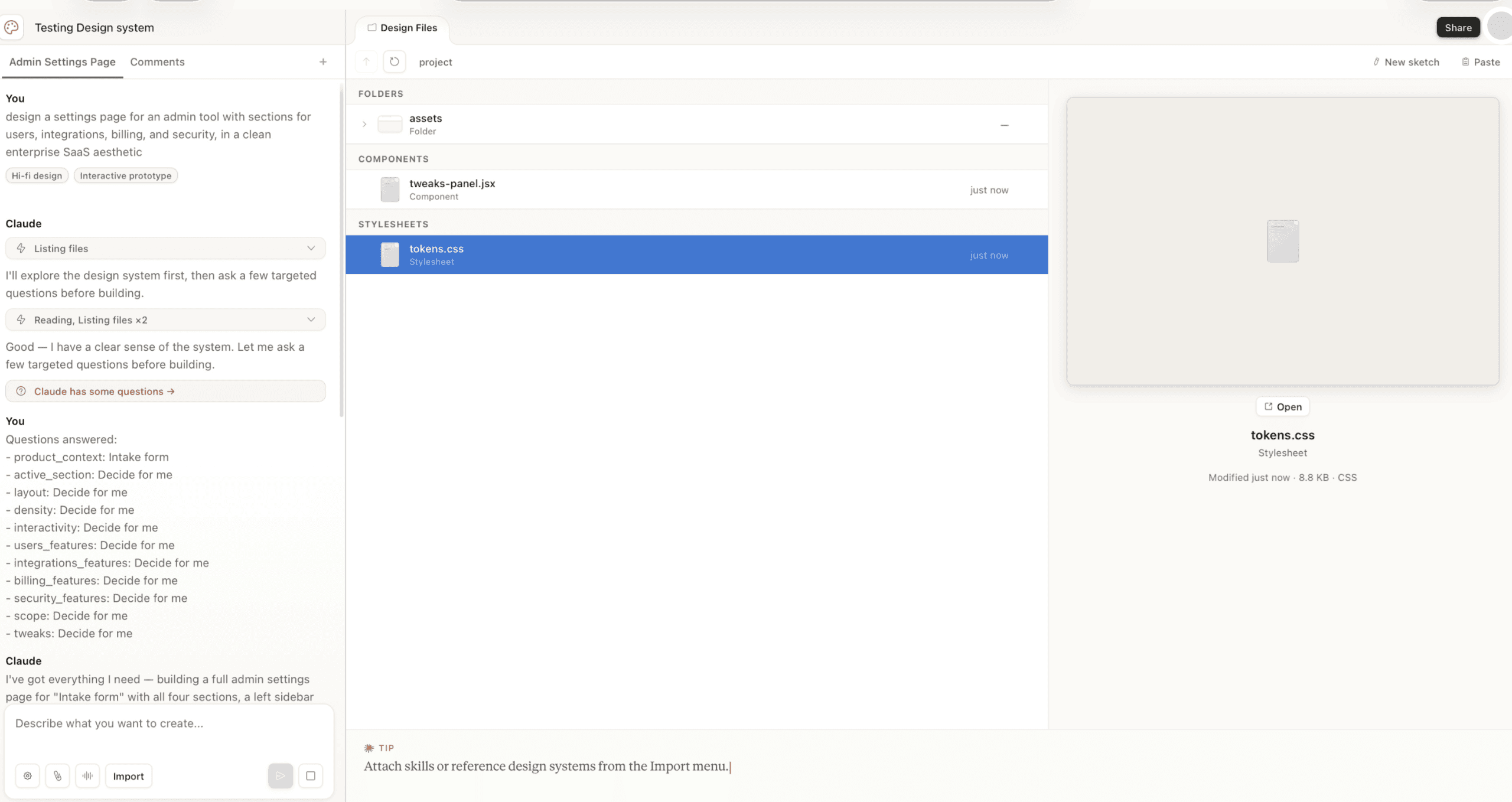
デザインシステムの検証
5 つ目は、一度きりの設定タスクとして終わらせず、継続的に改善していく生きたドキュメントとして公開し、維持することです。
ブランド資産が12 個ものファイルや古い資料に散在している場合、これらを一つのきれいなソースにまとめるのが難しいかもしれません。そんなときは、まず Claude Cowork を使ってすべての情報を統合・整理した単一のブランドドキュメントを作成し、そのドキュメントを Claude Design のシステム設定に読み込ませるという 2 ステップのワークフローが役立ちます。
Claude Design が資産を確認する前に、Cowork で面倒な統合作業を行っておけば、システム構築の起点は矛盾した四十枚のスナップショットではなく、整合性の取れた内容になります。
一度デザインシステムを公開すると、Team アカウントおよび Enterprise アカウントでは組織レベルで適用されるため、チームメンバーが新たに作成するプロジェクトには、自動的に同じコンポーネント、カラーパレット、タイポグラフィスケールが引き継がれます。ゼロから作り直す必要はありません。
# プロンプトの書き方
初心者が最初の試作から実際に使える成果物へと到達するまでの差は、ほとんどが「一行の指示」と「構造化された明確な要件定義」の違いに帰着します。効果的なアプローチには、常に以下の4つの要素を含める必要があります。
- ゴール: この出力で達成すべき目的は何ですか?
- 対象読者: 実際にこれを見るのは誰ですか?
- 必須情報: 含まれるべき具体的なコンテンツは何か(推測に任せるのではなく明記すること)。
- レイアウト構造: おおよその構成はどうあるべきか(中身だけでなく、どう整理すべきかも含めて)。
デザインシステムが整備されている場合、プロンプト内でコンポーネント名を参照することで、より一貫性のある結果を得られます。例えば「ボタンを青くして」と指示するのではなく、「デザインシステムのプライマリボタンのスタイルを使用してください」と指定します。これにより、Claude Design は毎回あなたの意図をゼロから解釈し直すのではなく、実際に定義されたコンポーネントを参照して処理を行うためです。
修正作業においては、インラインコメント機能とチャットパネルでは得意とする範囲が異なります。インラインコメントは、特定の要素に紐付いた局所的なフィードバックに適しています(例:「見出しのサイズが大きすぎる」)。一方、チャットパネルは、レイアウト全体に関わる構造的・スコープレベルの変更(例:「2 つのセクションを 3 つに再構成してください」)を行う際に有効です。
重要な習慣として、大きな変更を加える前にバージョンを保存しておくことを早めに身につけておきましょう。Claude Design にはバージョン履歴機能が備わっていますが、実験の最中に異なる 2 つの方向性を比較したい場合、単に直前の保存ポイントに戻すだけでは不十分なことがあります。意図的に大きな変更を加える前に保存を行えば、以前のバージョンがどうだったかという曖昧な記憶ではなく、明確な比較対象を得ることができます。
Figma や Canva、Vibecoding ツールとの位置づけ
Claude Design は既存の単一カテゴリを完全に置き換えるものではなく、3 つのカテゴリにまたがる性質を持っています。この特性こそが Claude Design の真価であり、一方で「自分が慣れ親しんだツールのように振る舞うはずだ」と期待して使いこなそうとすると誤解を招きやすい理由でもあります。
| ツール | 得意分野 | コラボレーションの深さ | 出力形式 | エクスポート経路 |
|---|---|---|---|---|
| Claude Design | 素早い初稿作成、インタラクティブなプロトタイプ、資料作成、自然言語による対話での反復改善 | チャット駆動型、単一キャンバス、チーム/エンタープライズ版では組織レベルのデザインシステムを管理可能 | 実装コード(内部で HTML/CSS/JS を使用) | コードバンドル;資料用には PPTX(レイアウトは一部簡略化される) |
| Figma | ピクセル単位のベクターデザイン、複雑な多ページデザインシステム、深いチームコラボレーション | ネイティブのマルチユーザー編集、コメント機能、バージョン分岐、開発者への引き渡しツール | ベクターデザインファイル | Figma ファイル、デベロッパーモード仕様書、プラグイン経由のエクスポート |
Canva
テンプレート駆動のマーケティング素材やソーシャルコンテンツを素早く作成
共有ワークスペース、ブランドキット、シンプルなコメント機能
フラットなグラフィック、一部のインタラクティブ要素に対応
PNG、PDF、動画形式、直接ソーシャルメディアへの公開が可能
Vibecoding ツール (v0, Lovable, Bolt)
プロンプトから即座にデプロイ可能なアプリへ
主に個人での作業、コードレビューをベースとしたコラボレーション
完全にデプロイ可能なアプリケーションコードを生成
Git リポジトリ経由で直接ホスティングへ展開可能
この表から得られる実践的な教訓は以下の通りです。アイデアを素早くインタラクティブな形に変えたい場合、特に最終的にコードとして引き継ぐことを想定している場合は「Claude Design」を選びましょう。ピクセル単位のデザイン精度が求められたり、大規模チームで複雑なシステムを深く共同制作する必要がある場合は「Figma」が適しています。納品物がフラットでテンプレート化されたマーケティング素材であり、カスタマイズ性よりもスピードが優先される場合は「Canva」を使いましょう。最終目標が設計図ではなく、実際にデプロイされたアプリケーションである場合は、「Vibecoding ツール」を選択してください。
# 初心者におすすめの取り組み
ドキュメントを読むよりも、実践的な演習をいくつかこなす方が、ツールの使い方を早く身につけられます。例えば、既存の文書(1 ページのブリーフやメモのセットなど)を読み込み、それを洗練された 1 ページの資料に変換してみましょう。その際、フォーマットに関する判断のうち、Claude Design が自動的に処理する部分と、ユーザーが指定する必要がある部分を意識して比較すると理解が深まります。
気に入っているインターフェースのラフなスクリーンショットをアップロードし、「これをインタラクティブなプロトタイプに変えて」と指示するのもおすすめです。これは、単なる静止画のコピーではなく実際にクリックできる成果物が得られるため、背後にあるコード構造(Canvas 下のアーキテクチャ)がどう動いているかを素早く確認する有効な手段です。
すでに構築したプロジェクトに対して、アクセシビリティの改善を依頼するのも良いでしょう。コントラスト比の見直し、代替テキスト(alt text)の追加、キーボードナビゲーションの対応などです。こうした要素は後から付け加えるよりも早期に対応する方がコストが安く済みますし、Claude Design が表面の外観だけでなくプロジェクトの本質的な理解をどこまで持っているかを試す良いテストになります。
ぜひ一度試してほしいのが、単一の画面ではなく、複数ステップにわたるユーザーフローの作成依頼です。サインアップシーケンスやチェックアウトプロセスなど、1 つの静的なページを超えた要求を出すことで、ツールが画面間での状態管理や順序付けをどのように推論・処理できるかが明確になります。これは単一画面へのプロンプトでは決して見えてこない部分です。
デザインシステムを公開したら、あえてその限界を試すことが重要です。データ集約型のダッシュボードや長文記事レイアウトなど、元の検証プロンプトに含まれていなかった珍しいコンテンツタイプを投入し、システムが既存の枠組み内で安定して機能するか、それともパターンから逸脱して独自に振る舞い始めるかを確認してください。これが、実際のプロジェクトで問題が発生する前にデザインシステムの欠陥を発見する最速の方法です。
制限事項、ガバナンス、そして Claude Code への引き継ぎ
新製品のローンチには必ず多少の荒削りな部分が残るものです。Claude Design にも同様の限界が存在します。ワークフローを構築する前にこれらの制約を理解しておくべきであり、プロジェクトの最中に初めて知るような事態は避けるべきです。
機能面では、インタラクティブなプロトタイプ内で動画コンテンツを生成することは可能ですが、完成した出力として動画ファイルをエクスポートする機能はまだ備わっていません。これは一見矛盾しているようにも見える重要な制限です。
また、長いセッション中になるとインラインコメントが稀に消えてしまうという報告もあります。キャンバスが大きくなるにつれて、大規模で複雑なプロジェクトでは動作の遅延が目立つようになります。スライドデッキ用の PPTX エクスポート機能は存在しますが、その過程でレイアウトの一部が簡略化されてしまうため、Claude Design 内で最大限の視覚的洗練さを追求して作成したデックが、エクスポート後も全く同じ見た目を保つとは限りません。
さらに、重要な傾向として「限界効用逓減」のパターンを計画に組み込む必要があります。リファインメント(改善)のリクエストは、最初の数回の試行で最も大きな効果をもたらしますが、同じ出力に対してその先も無理に繰り返すと、投入するプロンプトの労力に対する成果は次第に小さくなっていきます。
アカウント管理面では、実際の利用状況における制限値の把握が分かりにくいという指摘があります。また、データレジデンシー(データの処理・保存場所を地理的に保証する機能)はまだ提供されておらず、組織内で特定のコンプライアンス要件がある場合はこの点が課題となります。
また、Claude Design と Claude Code の連携には理解しておくべき非対称性が存在します。完成した Claude Design プロジェクトを Claude Code に引き渡して本番環境のアプリケーションに変換する流れは非常にスムーズで、この方向性は強力です。一方、既存のコードを取得して Claude Design へ戻し、さらに視覚的な反復作業を行うという逆の流れは、現時点では明らかに弱いです。
この非対称性を念頭にワークフローを計画しましょう。プロジェクトの初期段階、つまりコードが存在する前に Claude Design を活用するのが正解です。2 つの間で自由に行き来することを期待するのは避けてください。
個人利用ではなくチームへの導入を検討している場合は、全員に一度に機能をオンにするのではなく、段階的なアプローチを採用する価値があります。まずは小規模なパイロットグループから始め、デフォルトの期待値となる前に実際のデザインシステムを公開して検証し、その基盤が確固たるものになってから範囲を広げるのが良いでしょう。
まとめ
Claude Design が本当に役立つツールになるのか、それとも単なるお遊びで終わるのかを決定づける唯一の要因は、デザインシステムの構築を「面倒な通過点」ではなく、「最初の重要なプロジェクト」として捉えるかどうかです。
初週にこのセットアップを適切に行い、4 つの部分からなるプロンプトパターンを学び、ツールの現在の限界を理解すれば、Claude Design はあなたのワークフローに確固たる地位を築きます。具体的には、素早くインタラクティブなドラフトを作成し、それを Claude Code へとスムーズに引き継ぐことが可能になるのです。
逆に、セットアップを飛ばして「一言で指示するだけでこちらの意図を汲み取ってくれる」と期待すれば、得られるのは「汎用的で、能力はあるが忘れ去られやすい」出力だけです。これが新しい AI デザインツールの評判を悪くしている原因ですが、それはツール自体にできないからではなく、実際に試す機会を与えられていないからです。
Shittu Olumide はソフトウェアエンジニアであり技術ライターです。最先端の技術を駆使して説得力のある物語を紡ぐことに情熱を持ち、細部への鋭い眼と複雑な概念をシンプルに説明する才能を持っています。また Twitter でも活動しています。
原文を表示
**
# Introduction
On April 17, 2026, Anthropic launched Claude Design. That same day, Figma's stock dropped roughly 7%, and Figma's own board member Mike Krieger stepped down just three days before the announcement — a coincidence in timing that market watchers noticed immediately. That's a real reaction from real investors, and it says something about how the industry is reading this launch. It says almost nothing about what a beginner should actually do with the tool on their first afternoon.
This guide is for that second question. Claude Design is new enough that most of what's written about it right now is either marketing copy or first-impressions hype, so this article focuses on the part that actually matters if you're about to open it for the first time: what it is under the hood, how to get a real project off the ground instead of a generic first draft, where it genuinely competes with tools you already know, and where its rough edges still show.
# What Claude Design Actually Is
Claude Design is a research preview under Anthropic Labs**, Anthropic's category for early, still-evolving products. It's powered by Claude Opus 4.7's vision capability, and it's live now at claude.ai/design. It's available to anyone on a Pro, Max, Team, or Enterprise plan, though Enterprise admins have to turn it on deliberately since it ships off by default at that tier.
**
Claude Design UI
The detail that actually matters for how you'll use it is what's happening underneath the canvas. Claude Design doesn't generate flat images the way an image model does. It generates real, working code, and that single distinction is what makes everything else about the tool possible: interactive prototypes with working navigation, embedded video, voice input, and 3D elements, because the output is genuinely code a browser can run, not a static picture of an interface. One detailed hands-on account described this directly as code being the universal medium underneath everything Claude Design produces**, whether the output looks like a slide deck, a landing page, or a full interactive prototype.
That framing matters because it sets expectations correctly from the start. This isn't a faster Canva, and it isn't a replacement for Figma's vector-precision design tools. It's closer to a design partner that happens to output code, which means its strengths and its current gaps both trace directly back to that one architectural choice.
# Getting Started: Your First Project
**
Opening Claude Design for the first time presents four starting points: Prototype, for interactive interfaces and flows; Slide deck, for presentations; From Template, for a pre-built starting structure; and Other**, an open lane for anything that doesn't fit the first three — single-page documents, infographics, or one-off visual assets.
**
Claude Design working layout
The working layout is a chat panel alongside a live canvas, which will feel immediately familiar if you've used Claude Code, and the resemblance isn't superficial. Type a first prompt describing what you want, and rather than immediately generating something, Claude Design commonly asks clarifying questions first — about audience, tone, or structure — before it starts building. That's the same underlying pattern as Plan Mode in Claude Code**: propose before executing, rather than guessing and hoping the first draft lands.
Answering those clarifying questions properly is worth more time than it feels like it should take. A vague first prompt gets a generic, portfolio-template-looking result almost every time, and the single biggest reason for that isn't a weak prompt; it's a missing design system, which is the actual subject of the next section.
**
Claude Design System
# The Design System Is the Whole Game
Skip this step, and everything you generate afterwards will look competent but interchangeable with what any other Claude Design user gets from a similarly vague prompt. Set it up properly once, and every project afterwards inherits your actual brand, not a generic aesthetic default. This is, by a wide margin, the most consequential decision a beginner makes, and it's also the step most people skip because it isn't obviously required to get a first result.
- First, gather your actual brand inputs — colors, fonts, logo files, existing screenshots, and anything that represents what your output should genuinely look like.
- Second, upload them and let Claude generate a starting UI kit from what it's given.
Setting up your design system
- Third, review that draft critically rather than accepting it, since the model's first pass at interpreting your assets won't always match your intent.

Reviewing your draft design system
- Fourth, validate it with a handful of test prompts covering different content types — a form, a data table, and a hero section — to confirm the system holds up outside the exact example it was built from.
Validating your design system
- Fifth, publish it, and treat it as a living document you keep refining rather than a one-time setup task you never revisit.
There's a genuinely useful two-step workflow worth adopting here if your brand assets are scattered across a dozen files and old decks rather than living in one clean source: use Claude Cowork first to synthesize everything into a single, organized brand document, then feed that document into Claude Design's system setup. Doing the messy consolidation work in Cowork before Claude Design ever sees your assets means the design system it builds starts from something coherent instead of forty conflicting screenshots.
Once a design system is published, it applies at the organization level for Team and Enterprise accounts, which means the second project anyone on your team starts inherits the same components, colors, and type scale automatically, rather than every new project starting from zero again.
# Prompting It Well
The gap between a beginner's first result and a genuinely usable one is almost always the difference between a one-line prompt and a properly structured brief. The pattern worth adopting covers four things every time: the goal (what this piece of output needs to accomplish), the audience (who's actually going to see it), the key information (the specific content that has to be present, not implied), and the layout structure** (roughly how it should be organized, not just what it should contain).
Once a design system is in place, referencing its components by name inside a prompt — *"use the primary button style from the design system"* rather than *"make the button blue"* — produces noticeably more consistent results, since Claude Design is drawing on an actual, defined component rather than reinterpreting your intent from scratch each time.
For revisions, there's a meaningful difference between the inline comment tool and the chat panel. Inline comments work well for specific, localized feedback tied to one element — *"this heading is too small"* — anchored directly to the thing you're pointing at. The chat panel is the better tool for structural or scope-level changes — *"reorganize this into three sections instead of two"* — where the change touches the whole layout rather than one component.
One habit worth building early: save a version before attempting a significant change. Claude Design supports version history, but if you're mid-experiment and want to compare two different directions rather than only being able to roll back to the last save point, deliberately saving before a big swing gives you a clean comparison point rather than a fuzzy memory of what the previous version looked like.
# Situating Claude Design next to Figma, Canva, and Vibecoding Tools
**
Claude Design doesn't cleanly replace any single existing category; it overlaps with three of them simultaneously, which is part of why it's genuinely useful and also part of why it's easy to misuse if you expect it to behave like the tool you're used to.
Tool**
Best for
Collaboration depth
Output type
Export path
Claude Design
Fast first drafts, interactive prototypes, decks, and iterating through natural conversation
Chat-driven, single canvas, org-level design systems on Team/Enterprise
Real code (HTML/CSS/JS under the hood)
Code bundle; PPTX for decks (with some layout simplification)
Figma
Pixel-precise vector design, complex multi-page design systems, and deep team collaboration
Native multiplayer editing, comments, version branching, and dev handoff tooling
Vector design files
Figma files, dev-mode specs, plugin exports
Canva
Fast, template-driven marketing assets and social content
Shared workspace, brand kits, simple commenting
Flattened graphics, some interactive elements
PNG, PDF, video, direct social publishing
Vibecoding tools (v0, Lovable, Bolt)
Going straight from a prompt to a deployable app
Mostly solo, code-review-based collaboration
Fully deployable application code
Git repo, direct hosting deploy
The practical read on this table: reach for Claude Design when you want to move from an idea to something interactive fast, especially if the output is meant to hand off toward code eventually. Reach for Figma when the project needs pixel-level design precision or a large team collaborating deeply on one complex system. Reach for Canva when the deliverable is a flat, templated marketing asset and speed matters more than customization. Reach for a vibecoding tool when the actual goal is a deployed application, not a design artifact that still needs a build step afterwards.
# Things Worth Trying as a Beginner
**
A handful of starting exercises tend to teach the tool faster than reading documentation does. Try converting an existing document — a one-page brief, or a set of notes — into a polished one-pager, and pay attention to how much of the formatting decision-making Claude Design handles on its own versus what you have to specify. Try uploading a rough screenshot of an interface you like and asking it to turn that into an interactive prototype, which is a fast way to see the code-underneath-the-canvas architecture in action, since the result isn't a static copy — it's something you can actually click through.
Ask for an accessibility pass on something you've already built — contrast ratios, alt text, keyboard navigation — since catching these early is far cheaper than retrofitting them later, and it's a good test of how much Claude Design understands about a project beyond its surface appearance. Also worth doing at least once: ask for a full multi-step user flow instead of a single screen — a signup sequence, a checkout process — rather than one static page, since that's where the tool's ability to reason about state and sequence across screens becomes visible in a way a single-screen prompt never shows you.
Once you have a design system published, deliberately test its limits: throw an unusual content type at it — a data-heavy dashboard, a long-form article layout, something you didn't include in your original validation prompts — and see whether the system holds up or starts improvising outside your established patterns. That's the fastest way to find the gaps in your design system before a real project exposes them for you.
# Limitations, Governance, and the Handoff to Claude Code
No new product launch is without rough edges, and Claude Design's are worth knowing before you build a workflow around it, rather than discovering them mid-project.
- On the capability side, it can't yet export finished output as video, even though it can generate video content within an interactive prototype — a specific and slightly confusing gap worth remembering. Inline comments have been reported to occasionally vanish in longer sessions. Large, complex projects can start to lag noticeably as the canvas grows. PPTX export for slide decks works but simplifies some layouts in the process, so a deck built for maximum visual polish inside Claude Design isn't guaranteed to look identical once exported. And there's a real diminishing-returns pattern worth planning around: refinement requests tend to produce their biggest improvements in the first handful of rounds, and pushing well past that point on the same piece of output tends to yield smaller and smaller gains for the same amount of prompting effort.
- On the account side, usage limits have been reported as confusing to track in practice, and data residency support — meaning the ability to guarantee where your data is processed and stored geographically — isn't available yet, which matters if your organization has specific compliance requirements around that.
- There's also a real asymmetry worth understanding in how Claude Design connects to Claude Code. Handing a finished Claude Design project off to Claude Code to turn into a production application works well; that direction is strong. The reverse — taking existing code and pulling it back into Claude Design for further visual iteration — is noticeably weaker right now. Plan your workflow with that asymmetry in mind: use Claude Design early in a project, before code exists, rather than expecting to bounce a project back and forth between the two freely.
- If you are rolling this out to a team rather than using it solo, a phased approach is worth adopting over flipping it on for everyone at once: start with a small pilot group, get a real design system published and validated before it's the default expectation, and only open it more broadly once that foundation is solid.
# Wrapping Up
The single lever that determines whether Claude Design feels genuinely useful or just like a novelty is whether you treat the design system setup as the real first project rather than a formality standing between you and the fun part. Do that properly in your first week, learn the four-part prompting pattern, and understand where the tool's current edges are, and Claude Design earns a real place in your workflow: fast, interactive first drafts that hand off cleanly toward Claude Code. Skip the setup and expect it to read your mind from a one-line prompt, and you'll get exactly the generic, competent-but-forgettable output that gives new AI design tools their worst reputation — not because the tool can't do better, but because it was never actually given the chance to.
Shittu Olumide** is a software engineer and technical writer passionate about leveraging cutting-edge technologies to craft compelling narratives, with a keen eye for detail and a knack for simplifying complex concepts. You can also find Shittu on Twitter.
関連記事
News to Guide
ニュースの次に確認する
発表内容を、現在の料金や仕様と照らし合わせられる関連ガイドです。
今日のまとめ
AIデイリーブリーフで今日の重要ニュースをまとめ読み