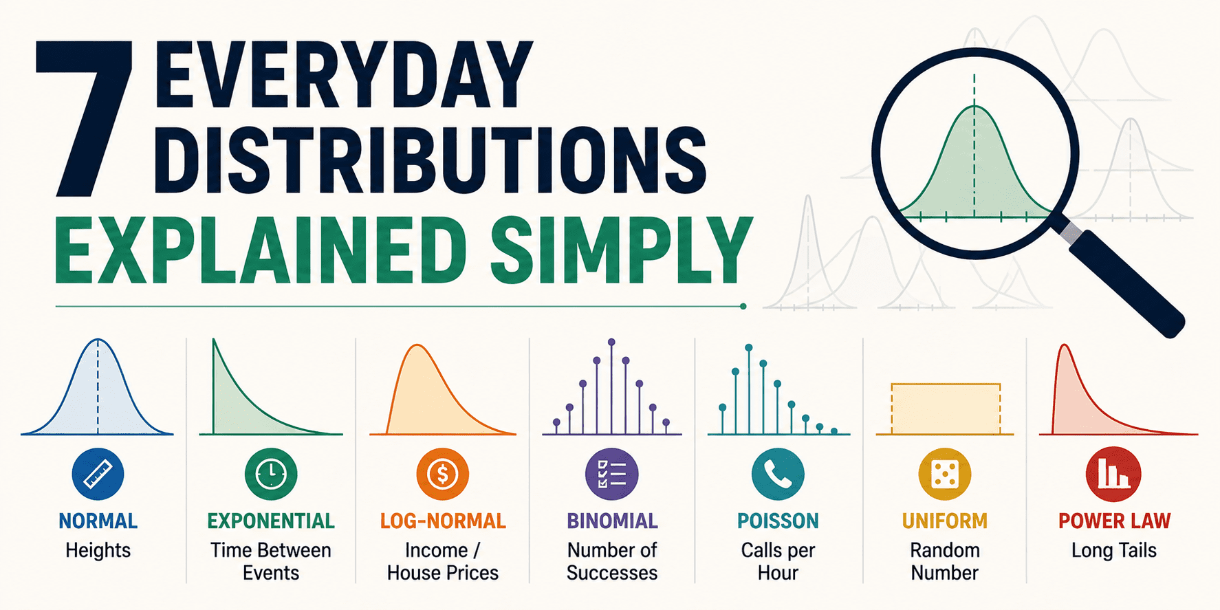
7 つの一般的な分布をシンプルに解説
KDnuggets は、統計的分布の基礎的な概念を数式を使わずに直感的な例で解説し、データ分析におけるパターン認識の重要性を伝えている。
キーポイント
正規分布の日常性
多くの小さな独立した要因が積み重なる結果として現れる「ベルカーブ」であり、身長やテストスコアなど中間値に集中する現象を説明する。
一様分布の特性と限界
すべての結果が等しい確率で起こるパターンだが、現実世界にはバイアスが存在するため真の一様性は稀である。
統計的直感の育成
重厚な数学理論に頼らず、日常の事象から分布のパターンを認識することで、データ分析を「世界の解釈ツール」として捉え直すアプローチ。
均一分布の特性と用途
すべての結果に等しい確率がある「偏りのない」分布であり、シミュレーションや仮定のためのクリーンな基準点として有用です。
二項分布の適用条件
試行回数が固定され、各試行が Yes/No の結果を持ち、確率が一定である場合に成功回数を数えるために使用されます。
変換率分析における役割
「8% の登録率」などの指標の背後には二項分布があり、正常な変動と不審な変動を数学的に区別する根拠となります。
ポアソン分布の適用範囲
時間や空間の中でランダムに発生する事象(特に稀で独立した事象)の数をカウントする際に使用されます。
重要な引用
Distributions are just stories about how numbers tend to show up in real life.
Once you start spotting these patterns, stats stops feeling like a school subject and starts feeling like a cheat code for interpreting the world.
Uniform is the distribution that doesn't play favorites.
Binomial is basically a structured way to say: 'Given N attempts and probability p, what counts are most likely?'
"Poisson is the distribution you reach for when you're counting events that happen randomly over time or space, especially when they're relatively rare and independent."
"If Poisson counts how many events happen in a window, exponential flips it and asks: 'How long until the next event?'"
影響分析・編集コメントを表示
影響分析
この記事は、AI やデータサイエンスの初学者に対して、複雑な数学的定義よりも直感的な理解を優先させる教育的価値が高い。統計分布の基礎的な概念をビジネスや日常の文脈で再解釈することで、分析プロセスにおけるパターン認識能力の向上に寄与する。
編集コメント
高度なアルゴリズムの解説ではなく、データ分析の根幹となる「分布の直感」を養うための優れた入門記事です。
# 状況が複雑に
**
おそらく誰かが「それは正規分布だ」と言って、それがすべてを説明する魔法の呪文であるかのように言っているのを聞いたことがあるでしょう。真実は、分布とは単に数字が現実世界で現れる傾向についての物語に過ぎないということです。いくつかの物語は滑らかな曲線です。いくつかはでこぼこしています。いくつかは単にブランド力がついたコイン投げに過ぎません。
この記事は、何を見ればよいかを知った後に実際に認識できる 7 つの分布を、簡単な日常ツアーとして紹介します。難しい数学はありません。門番のような態度もありません。ただ、「ああ、だからその数字はあのように振る舞うのか」という雰囲気がそこにあるだけです。これらのパターンに気づき始めると、統計学は学校の教科書のようなものから、世界を理解するためのチートコードのようなものに感じられるようになります。
# 1. 正規分布
*「多くのものが中央に集まる」曲線***
正規分布は古典的なベルカーブです。ある値が多数の小さな独立した影響によって形作られるときに現れます。それは、全員が少し貢献するグループプロジェクトのように考えられ、最終結果はほとんどの場合平均付近に落ち着きます。
日常例:
身長(特定の年齢層および人口内での)、小さな測定誤差、大規模な集団におけるテストの点数、そして「メールへの返信にかかる時間」(あなたの一日が主に安定している場合)。
それが正常に感じさせるのは対称性です。ほとんどの値が存在する中心があり、その中心から離れるほど、事象は稀になります。「標準偏差 2 つ分外れた」と言うとき、人々は基本的に「これはベル曲線ではかなり珍しいことだ」と言っているのです。
# 2. 一様分布
**
*「すべてが等しく起こりうる」パターン***
一様分布は偏見を持たない分布です。範囲内のすべての結果が現れる確率は同じです。
完璧な例は通常、人為的なものです:
公平なサイコロを転がること、よくシャッフルされたデッキからランダムにカードを選ぶこと、0 と 1 の間のランダムな数を生成すること、あるいは等しいスライスの賞品ホイールの一つを回すことです。
現実世界では、真の一様性 は偏見があるため稀です。それでも、モデルとしては非常に役立ちます。ランダム性をシミュレートする場合や、基礎的な仮定を構築する場合は、一様分布がクリーンな「出発点」となる分布です。
また、一様分布には 2 つのタイプがあります:
- 離散型一様分布(1〜6 のサイコロ転がり)
- 連続型一様分布(0 と 1 の間の任意の値)
# 3. 二項分布
**
*「成功は何回か?」カウンター***
二項分布は、以下のような場合に使用します:
- 試行回数が固定されている
- 各試行が yes/no の結果である
- 確率が毎回同じである
これは、得られる成功の回数の分布です。
身近な例:
100 人の受信者のうち何人があなたのメールを開き、20 回のフリースローのうち何本が決まり、建設現場で個人用保護具(PPE)を何回着用するか。
二項分布は基本的に、「N 回の試行と確率 p が与えられた場合、どのカウントが最も起こりやすいか」を体系的に表現する方法です。
また、この分布は多くの「コンバージョンレート」に関する思考の背後にもあります。誰かが「登録率は 8% です」と言うとき、二項分布はその背後で静かに立ち、何が正常な変動で何が不審な変動なのかという計算を行っています。
# 4. ポアソン分布
**
*「時間窓内で何件のイベントが発生するか」を追跡するもの***
ポアソン分布は、時間や空間の中でランダムに発生するイベントを数える際に用いられる分布です。特に、それらが比較的稀で独立している場合に適しています。
日常の例:
*1 時間あたりのカスタマーサポートチケットの数、長い文書におけるページごとの誤字の数、5 分間の間に通過する車の数(交通量が安定している場合の)ウェブサイトの登録者数、小売店に届く電話の件数。
ポアソン分布には非常に特有の雰囲気があります。それは「時間窓内でのカウント」に関するものです。「発生したか否か」ではなく、「何回発生したか」が焦点です。
また、これは人々が「えっ、統計って実際にそんなものをモデル化できるの?」と驚く最初の分布の一つでもあります。なぜなら、それは現実のイベント数の予測不能なランダム性を予想する上で、驚くほど良い仕事をしてくれるからです。
# 5. 指数分布
**
*「次の出来事までの待ち時間」モデル***
ポアソン分布が一定の期間内にどれだけのイベントが発生するかを数えるものであるなら、指数分布はそれを逆転させ、「次のイベントまでどのくらいかかるか?」と問いかけます。
いくつかの例としては以下があります:
次のサポートチケットが届くまでの時間、キューでの到着間の時間、静かなお店に次の顧客が訪れるまでの時間、単純化された信頼性設定におけるランダムなシステム障害の発生間隔などです。
人間にとっての説明をすると、イベントが一定の確率で完全にランダムに起こる場合、すでに 10 分待ったからといって、次のイベントが「より起きやすくなる」わけではありません。これは感情的には奇妙に感じるかもしれませんが、人間の多くはパターンを好むからです。しかし、指数分布は、基礎となるプロセスがほぼ記憶を持たない(メモリーレス)場合において、歴史的データに基づいて時間間隔をモデル化する有用な方法です。
# 6. 対数正規分布
**
*「右に歪んだ長い尾」の現実チェック***
対数正規分布は、変数が加算ではなく乗算によって生成される場合に現れます。この乗算により、多くの値が小さくまたは中程度である一方で、ごく一部の値が極めて大きくなるような分布が生まれます。
適用される主な分野は以下の通りです:
所得、多くの市場における住宅価格、プロジェクト完了までの時間、ファイルサイズ、ウェブサイトのセッション継続時間、ソーシャルメディア投稿のリーチなどです。
この分布こそが、「平均」が誤解を招く原因となります。対数正規データでは、ごく少数の巨大な値が平均を引き上げることがあり、多くの値がはるかに低い値に集中している場合でも同様です。そのため、これらの文脈では中央値の方がより正直な物語を語ってくれるのです。
# 7. パワーロー分布
**
*「数人の巨人と無数の小人」のパターン***
パワーローは、ロングテール現象の極端なバージョンです。大きな結果が稀であることは事実ですが、世界が正規分布に従うと仮定した場合に予想されるほどには稀ではありません。その裾(テール)は依然として重いです。
具体的な例としては以下が挙げられます:
都市の規模、ソーシャルメディア上のフォロワー数、ページごとのウェブサイトトラフィック、製品別の売上、一部の簡略化されたモデルにおける富、言語内での特定の単語の出現頻度など。
考え方は単純です。少数の要素が全体を支配し、その影響は単一の領域における大多数の単位に比べて著しく大きいのです。これは宇宙における物質が集団化する傾向にも反映されています。重力動態やダークマター、宇宙膨張を脇に置いたとしても、この傾向は存在します。これが、空間に広大な空洞が存在する一方で、すべての領域が小さな銀河で均等に埋め尽くされていない理由の一部となっています。
# まとめ
**
ここからが面白い部分です:分布を効果的に使うために数式を暗記する必要はありません。必要なのは、データが語っている物語を認識することだけです。
このようなパターンにラベル付けし始めると、あなたの直感は急速に研ぎ澄まされます。統計学は「証拠付きのパターン認識」に近いものへと変わります。
メールボックスの動作からトラフィックの急増まで、日常の数値を見るたびに、何が正常で、何がランダムで、何が実際に調査する価値があるのかをより良く理解できるようになります。
Nahla Davies** はソフトウェア開発者であり技術ライターです。技術ライティングに専念する前、彼女は Inc. 5,000 に選出された体験型ブランディング組織のリードプログラマーとして勤務しました(その他にも興味深い職務を経験)。同社の顧客には Samsung、Time Warner、Netflix、Sony が含まれています。
原文を表示
# The Plot Thickens
**
You've probably heard someone say "that's a normal distribution" like it's a magic spell that explains everything. Truth is, distributions are just stories about how numbers tend to show up in real life. Some stories are smooth curves. Some are lumpy. Some are basically a coin flip with better branding.
This article is a quick, everyday tour of seven distributions you'll actually recognize once you know what to look for. No heavy math. No gatekeeping. Just the vibe of: "Ohhh, that's why those numbers behave like that." Once you start spotting these patterns, stats stops feeling like a school subject and starts feeling like a cheat code for interpreting the world.
# 1. Normal Distribution
*The "Most Things Cluster in the Middle" Curve***
The normal distribution is the classic bell curve. It shows up when a value is shaped by lots of tiny, independent influences that nudge it up or down. Think of it like a group project where everyone contributes a little, and the final result lands somewhere near average most of the time.
Everyday examples:
Heights (within a specific age and population), small measurement errors, test scores in large groups, and "how long it takes me to answer an email" if your day is mostly stable.
What makes it feel normal is the symmetry. There's a middle where most values live, and the further you move away from that center, the rarer things get. When people say "two standard deviations away," they're basically saying "that's pretty unusual for this bell curve."
# 2. Uniform Distribution
**
*The "Everything's Equally Likely" Pattern***
Uniform is the distribution that doesn't play favorites. Every outcome in a range has the same chance of showing up.
Perfect examples are usually man-made:
Rolling a fair die, picking a random card from a well-shuffled deck, generating a random number between 0 and 1, or spinning one of those equal-slice prize wheels.
In real life, true uniformity is rare because the world has biases. Still, it's incredibly helpful as a model. If you're simulating randomness or building a baseline assumption, uniform is the clean "starting point" distribution.
Also, uniform comes in two flavors:
- Discrete uniform (a die roll with 1–6)
- Continuous uniform (any value between 0 and 1)
# 3. Binomial Distribution
**
*The "How Many Successes?" Counter***
Binomial is what you use when you have:
- A fixed number of tries
- Each try is a yes/no outcome
- The probability stays the same each time
It's the distribution of how many successes you get.
Everyday examples:
How many people open your email out of 100 recipients, how many shots you make out of 20 free throws, how many times you wear personal protective equipment (PPE) on a construction site.
The binomial distribution is basically a structured way to say: "Given N attempts and probability p, what counts are most likely?"
It's also the distribution behind a lot of "conversion rate" thinking. When someone says "our signup rate is 8%," binomial is quietly standing behind them, doing the math on what variation is normal and what's suspicious.
# 4. Poisson Distribution
**
*The "How Many Events in a Time Window?" Tracker***
Poisson is the distribution you reach for when you're counting events that happen randomly over time or space, especially when they're relatively rare and independent.
Everyday examples:
*Number of customer support tickets per hour, typos per page in a long document, cars passing a checkpoint in 5 minutes, website signups in a day (when traffic is stable), calls arriving at a small business.*
Poisson has a very specific vibe: it's about counts in a window. Not "did it happen," but "how many happened."
It's also one of the first distributions that makes people go: "Wait, stats can actually model that?" Because it does a surprisingly good job of predicting the messy randomness of real event counts.
# 5. Exponential Distribution
**
*The "Waiting Time Until the Next Thing" Model***
If Poisson counts how many events happen in a window, exponential flips it and asks: "How long until the next event?"
Some examples include:
How long until the next support ticket arrives, time between arrivals in a queue, how long until the next customer walks into a quiet shop, time between random system failures in some simplified reliability setups.
In human terms: if events are truly random at a steady rate, waiting 10 minutes already doesn't make the next event "more due." That can feel weird emotionally, because humans love patterns, but exponential is still a useful way to model temporal intervals based on historic data when the underlying process is roughly memoryless.
# 6. Lognormal Distribution
**
*The "Right-Skewed, Long Tail" Reality Check***
Lognormal shows up when a variable is created by multiplying factors rather than adding them. That multiplication creates a distribution where most values are small or moderate, but a few get extremely large.
Some places where it's applied are:
Income, home prices in many markets, time to complete a project, file sizes, website session durations, and the reach of social posts.
This distribution is why "average" can be misleading. With lognormal data, a handful of huge values can pull the mean upward, even if most values are clustered much lower. It's why the median often tells a more honest story in these contexts.
# 7. Power Law Distribution
**
*The "A Few Giants, Tons of Smalls" Pattern***
Power laws are the extreme version of long-tailed behavior. They show up when big outcomes are rare but not as rare as you'd expect if the world were normal. The tail stays heavy.
You can see it in action with:
City sizes, followers on social media, website traffic by page, sales by product, wealth in some simplified models, and how often certain words appear in language.
The idea is simple: a small number of things dominate the totals, and their impact is significantly higher than that of the majority of units in a single area. It's also reflected in how matter in the universe tends to cluster — if we set aside gravitational dynamics, dark matter, and cosmic expansion — which is part of why there are vast voids in space rather than every region being filled with small galaxies evenly.
# Wrapping Up
**
Here's the fun part: you don't need to memorize formulas to use distributions well. You just need to recognize the story the data is telling.
Start labeling patterns like this and your intuition gets sharper fast. Stats turns into something closer to "pattern recognition with receipts."
You'll look at everyday numbers, from inbox behavior to traffic spikes, and you'll have a better sense of what's normal, what's random, and what's actually worth investigating.
Nahla Davies** is a software developer and tech writer. Before devoting her work full time to technical writing, she managed—among other intriguing things—to serve as a lead programmer at an Inc. 5,000 experiential branding organization whose clients include Samsung, Time Warner, Netflix, and Sony.
関連記事
今日のまとめ
AI日報で今日の重要ニュースをまとめ読み