インターネットで最も目にするUI?Turnstileとチャレンジページの再設計
Cloudflareは、毎日76億回表示されるTurnstileウィジェットとチャレンジページの再設計プロセスを公開し、大規模なセキュリティチェックにおけるユーザー体験の向上と技術的課題への取り組みを明らかにした。
キーポイント
Turnstileの圧倒的な普及と責任
CloudflareのTurnstileウィジェットは毎日76億回表示され、インターネット上で最も頻繁に目にするUIの一つであり、多様なユーザー層への配慮が不可欠である。
ボット攻撃の増加とセキュリティチェックの急増
AI革命に伴うボット攻撃の増加により、セキュリティチェックの数は2023年の1日あたり21億4千万回から2025年には53億5千万回へと大幅に増加している。
ユーザー体験の向上に向けた再設計
Cloudflareは、デザインプロセス、大規模なデプロイメントのエンジニアリング課題、そしてユーザーへの measurable impact の3つの観点からTurnstileとチャレンジページの再設計を行った。
セキュリティチェックの急増とユーザー体験への影響
年間で58.1%もセキュリティチェックが増加しており、ユーザーのフラストレーションを招く機会が増大している。
Turnstileウィジェットのデザイン監査と問題点
エラーメッセージの冗長さや曖昧さ、視覚的な一貫性の欠如など、不統一なデザインがユーザーの混乱を招いていた。
フィードバック機能の曖昧さによる不満
'時々失敗する'と'常に失敗する'といった曖昧な選択肢は、ユーザーの混乱を招き、ソーシャルメディア上での不満の原因となっていた。
ユーザージャーニーの可視化と感情分析
ハッピーパスだけでなく、エラー発生時の不愉快な経路(アンハッピーパス)も含む完全なユーザー旅程をマッピングし、技術的なエッジケースとユーザーの感情の両方を理解した。
影響分析・編集コメントを表示
影響分析
本記事は、セキュリティ業界におけるUI/UXの重要性とスケーラビリティの課題を浮き彫りにしています。Cloudflareが自社のインフラ規模を公開し、ユーザー体験改善に注力していることは、セキュリティベンダー間の競争が機能面から体験面へシフトしつつあることを示唆しています。
編集コメント
セキュリティチェックの頻度増加はユーザー離れの原因となり得るため、CloudflareがUX改善に注力するのは妥当な戦略判断と言えます。
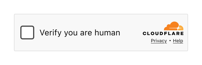
あなたはそれを見たことがあるでしょう。意識的に認識していなくても、あなたはそれを見ています。あなたが人間であることを確認するためにあなたに問いかけるあの小さなウィジェット。ウェブサイトにアクセスする前の全画面セキュリティチェック。もしあなたがインターネットで時間を過ごしたことがあれば、Cloudflare の Turnstile ウィジェットまたは Challenge Pages に遭遇しているはずです——おそらく数えきれないほど多くの回数です。
Turnstile ウィジェット——数百万のウェブサイトで見慣れた光景
インターネットの大部分が Cloudflare の背後にあると言うとき、私たちはそれを本気で言っています。私たちの Turnstile ウィジェットと Challenge Pages は、毎日 76.7 億回も提供されています。これは誤植ではありません。数十億回です。これこそが、インターネット上で最も多く見られるユーザーインターフェース(UI)かもしれません。
そして、それには莫大な責任が伴います。
数十億人の目に触れる製品を設計することは、単に難しいというだけでなく、根本的に異なるアプローチを必要とします。すべてのピクセル、すべての単語、すべてのインタラクションは、日本の田舎に住む祖母、サンパウロのティーンエイジャー、ベルリンの視覚障害を持つ開発者、そして Lagos の多忙な経営者——すべてが同時に、そしてイライラしている瞬間にでも機能するように設計されなければなりません。
今日、私たちは Turnstile と Challenge ページの再設計に関するストーリーを共有します。この物語は3つのパートに分かれており、それぞれが私たちの一人によって語られます:意思決定に影響を与えたデザインプロセスとリサーチ(Leo)、前例のない規模で変更を展開するエンジニアリング上の課題(Ana)、そして数十億人のユーザーへの計測可能な影響(Marina)。
まず、デザイン視点からどのように問題に取り組んだかを見ていきましょう。
Part 1: The design process
The problem
正直に言いましょう:自分が人間であることを証明せよと求められることを、誰も好んでいません。あなたは自分が人間だと知っています。私も自分が人間だと知っています。しかし、そのように確信していないのは、あなたがアクセスしようとしているウェブサイトの前に立っているあの小さなウィジェットだけです。最善の場合でもそれはわずかな不便さですが、最悪の場合?おそらく、怒りに任せてコンピュータを窓の外に投げ出したくなったことがあるでしょう。私たちは皆、そんな経験をしたことがあります。そして、誰もあなたを責めないはずです。
 image
image
ログインフローに統合された Turnstile
世界が不可避な AI レボリューション(AI 革命)を受け入れつつある中、セキュリティ検証の必要性はさらに高まっています。Cloudflare では、ボット攻撃の顕著な増加を目撃しており、それに対応して組織はセキュリティ対策により一層投資しています。つまり、より多くのエンドユーザーに、より頻繁に課題が課されることになります。
数字が物語を語っています:
2023 年:1 日あたり 21.4 億回
2024 年:1 日あたり 30 億回
2025 年:1 日あたり 53.5 億回
これは、前年比でセキュリティチェックが平均 58.1% 増加したことを意味します。セキュリティチェックが増えることは、エンドユーザーのフラストレーションを招く機会も増えるということです。企業が自分たちや顧客を守るためにこれらの検証システムを統合すればするほど、どこかで誰かが不快な体験をする可能性は高まります。
私たちは、主力製品を厳しく見直し、自問する必要があると知っていました。「私たちは、こうした体験に直面する数十億の人々に対して正しいことをしているだろうか?より安全なインターネットだけでなく、より人間らしいインターネットを構築するという私たちの使命を果たしているのだろうか?」
私たちが発見した答えはこうでした:「もっと良くなれる」。
デザイン監査
何かを再設計する前に、私たちはまず何に取り組んでいるのかを理解する必要がありました。Turnstile と Challenge Pages のすべての状態、すべてのエラーメッセージ、そしてすべてのインタラクションについて包括的な監査を行うことから始めました。
私たちが発見したのは、最善の状態ではなかったということです。
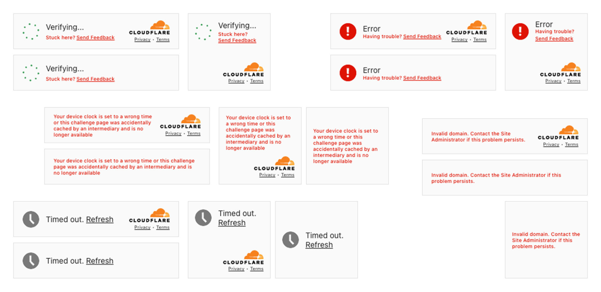 image
image
Turnstile ウィジェットにおける不整合の状態。統一されたアプローチのない複数の状態
矛盾点は明白でした。多様なエラーシナリオ全体にわたって、統一されたアプローチがありませんでした。一部のメッセージは過度に冗長で技術的であり(「デバイスの時刻設定が誤っているか、このチャレンジページが仲介者によって偶発的にキャッシュされ、もはや利用できません」)、他方では有用性を欠くほど曖昧なものでした(「タイムアウトしました」)。ビジュアル言語も大きく異なり、レイアウト、階層、トーンがバラバラでした。
また、オンライン上で寄せられたフィードバックも精査しました。ソーシャルメディア、サポートチケット、コミュニティフォーラム——すべて読み込みました。そこには明確な不満があり、その多くは回避可能なものでした。
例えば、当社のフィードバック機構を見てみましょう。「ウィジェットが時々失敗する」対「ウィジェットがいつも失敗する」といった選択肢をユーザーに提供していましたが、本当に何が違うのでしょうか?また、ユーザーはどのようにして頻度を把握すればよいのでしょうか。私たちは、最も不満を感じている瞬間に、曖昧な選択肢を解釈させるよう求めていました。解釈の余地を残せば残すほど、フィードバックは有用性を失い、ソーシャルチャネル全体で見る不満は増大しました。
以前のフィードバック画面:「ウィジェットが時々失敗する」対「ウィジェットがいつも失敗する」——何が違うのでしょうか?
私たちの Challenge ページ(不審な活動を検知した場合や、サイト所有者がセキュリティ設定を強化している場合に表示されるフルページ型のセキュリティブロック)にも同様の課題がありました。一部のステートは混乱を招くものであり、他には技術用語が多すぎました。多くのケースで、ユーザーが最も支援を必要としている際に実行可能なガイダンスを提供できていませんでした。

Challenge ページにおける不整合の状態。統一されたアプローチのない複数のステート
この監査は謙虚な気持ちになりましたが、私たちが集中すべき場所を明確に示してくれました。
ユーザーのジャーニーのマッピング
より良い体験を設計するためには、まずユーザーがたどり得るあらゆる経路を理解する必要がありました。理想的なシナリオ(ハッピーパス)とは何でしょうか?そもそもそれは存在するのでしょうか?また、ユーザーのフラストレーションが高まっていく「アンハッピー」な経路はどのようなものだったのでしょうか。

初期の遭遇からエラーシナリオ、感情の追跡に至るまでの完全なユーザージャーニーのマッピング
これは真に多機能チームによる取り組みでした。私たちは、あらゆるエッジケース(境界条件)の技術的な詳細を知るエンジニアの Ana と密接に連携し、製品がどのように動作するだけでなく、ユーザーがそれに対してどう感じているか——オンライン上で見られる「愛」と「憎しみ」——を理解していたプロダクト担当の Marina とも緊密に協力しました。
Cloudflare ではボット対策に取り組む最も賢い人々の一部が働いています。しかし、知性と明確さは同じものではありません。技術的な複雑さとユーザーのシンプルさの間には微妙なバランスが存在します。この 2 つが見事に調和して初めて、人々にとって実際に意味のある方法で情報を伝えることができるのです。
そして、重要な点は、メッセージはすべての人に機能しなければならないということです。年齢を問わず、精神面や身体能力を問わず、文化的背景を問わず、技術的な熟練度を問わず。これがスケールした設計が本当に意味するところです——エッジケース(極端な事例)を無視することはできません。なぜなら、そのような規模ではもはやそれはエッジケースではないからです。
統一された情報アーキテクチャの確立
UX デザインにおいて最も影響力のある書籍の一つに、スティーブ・クルグの『Don't Make Me Think』があります。その核心となる原則はシンプルです:ユーザーがインターフェースを解釈し、理解し、解読しようとして費やすあらゆる瞬間は、摩擦の瞬間です。そして、特にフラストレーションが生じる瞬間における摩擦は、離脱へとつながります。
私たちの監査では、ユーザーに考えさせすぎていることが明らかになりました。異なる状態において、異なる情報の断片が UI 内の同じスペースを占めていました。一貫した視覚的階層性はありませんでした。Turnstile でエラー状態に遭遇するユーザーは、Challenge Page(チャレンジページ)で情報を見つける場所とは全く異なる場所で情報を見つけます。
私たちは根本的な決断を下しました:すべてを支配する一つの情報アーキテクチャを採用することです。
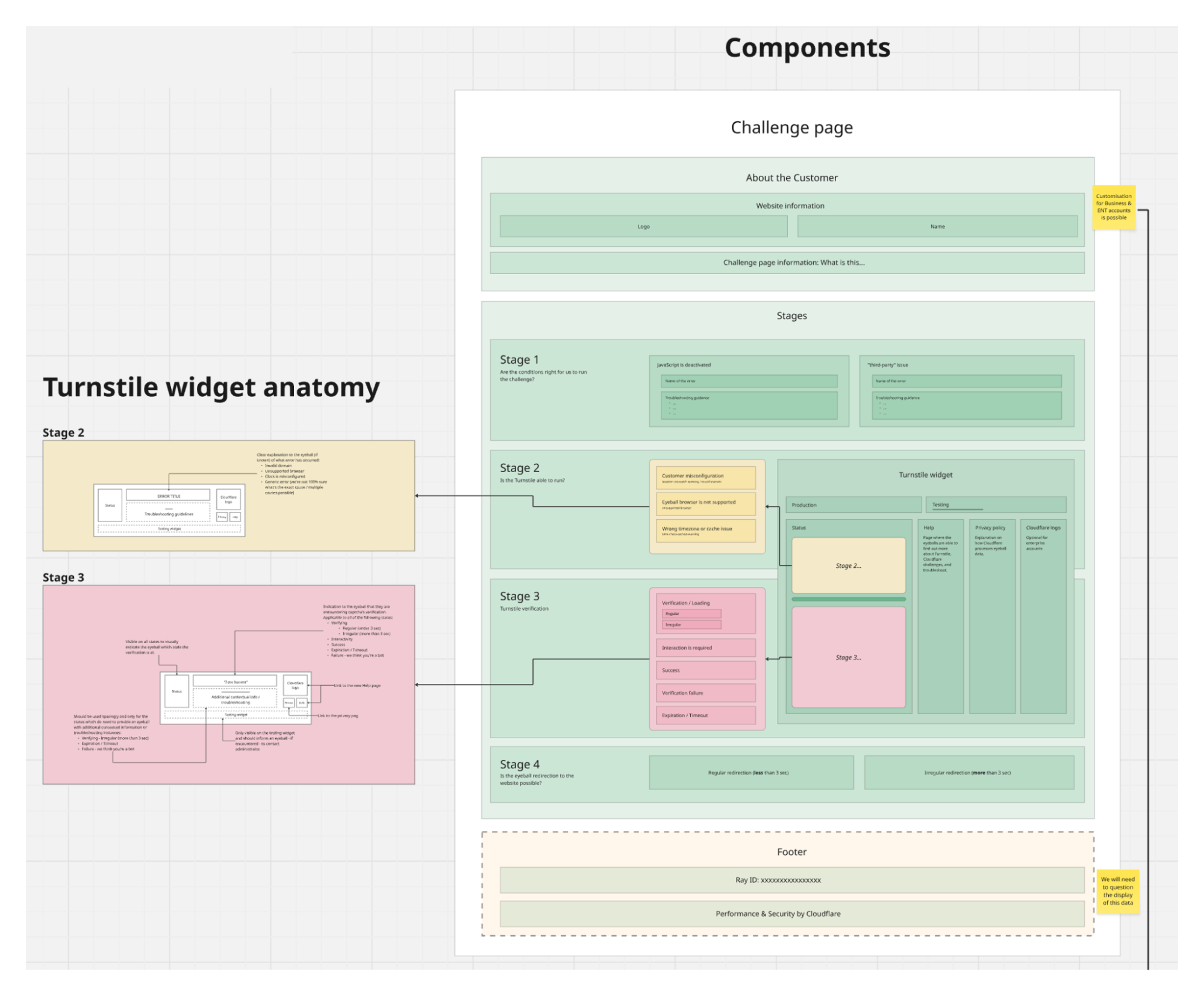
統一された情報アーキテクチャを示すビジュアル図。Turnstile ウィジェットと Challenge ページ全体で一貫した構造を有している
Turnstile と Challenge ページの両方が、現在同じ構造的パターンに従うことになります。同じ視覚的階層性。アクション、説明文、ドキュメントへのリンクの配置もすべて統一されます。
これが私たちのデザイン選択肢を制約したのでしょうか?もちろんそうです。フレームワークに適合しない多くの創造的なアイデアに対しては「ノー」と言わざるを得ませんでした。しかし、制約は良いデザインの敵ではありません——むしろその最良の友人であることが多いのです。選択肢を制限することで、実際に重要な詳細部分により深く取り組むことができました。
ユーザーにとっての恩恵は甚大です:各 UI 要素の意味を再学習する必要がありません。エラー状態も一貫して表示されます。ヘルプリンクも常に同じ場所にあります。一度一つの状態を理解すれば、すべての状態が理解できるのです。これは認知負荷を最小限に抑えた——セキュリティ検証中であるべきまさにその状態です。
ユーザー調査から得た教訓
数十億人が目にするものを再設計する際、どのようにして自分自身を責任ある態度で保つのでしょうか?テストすることです。非常に多くのテストを行います。
私たちは8カ国から8名の参加者を募集し、年齢、デジタルリテラシー、文化的背景における多様性を意図的に確保しました。技術に詳しい初期採用者を探していたのではなく、 redesign がすべてのユーザーにとってどのように機能するかを理解したかったのです。
私たちのアプローチは厳格でした:参加者は「古い」または「新しい」のどちらであるか知らされずに、現在の体験と提案された変更の両方を見ました。バイアスを排除するために配置を反転させました。また、単に新しいアイデアを検証するだけでなく、そもそも何を変える必要があるのかという前提自体にも挑戦しました。
 image
image
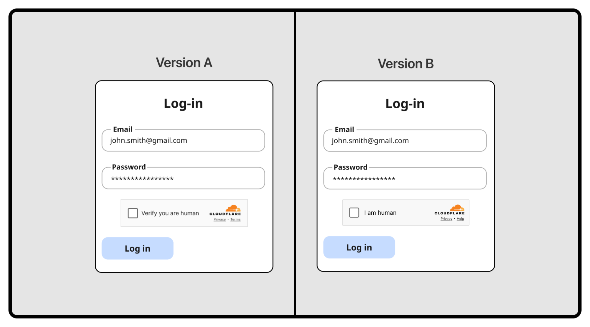
A/Bテストでテストされている2つの異なるバージョンのTurnstile
修正する必要がないものもいくつかありました
ある仮説:競合他社に合わせるべきか?多くのCAPTCHAプロバイダーはすべてのステートで「I am human」と表示しています。私たちは異なるコンテンツを使用します——「Verify you are human」、次に「Verifying...」、そして「Success!」です。
私たちはやりすぎではないかと考え、頭突きテストを行いました。
私たちのアプローチが明確に勝利しました。インタラクション状態では、「Verify you are human」が8点中5点を獲得したのに対し、「I am human」はわずか3点でした。検証中の状態ではさらに劇的な差があり、7.5対0.5となりました。ユーザーは自分が何者か知らされるだけでなく、今何が起きているのかを知りたがっていたのです。

ユーザーテストの結果:利用者は競合他社風のデザインよりも、私たちのアプローチを強く支持しました
この実験は機能としてリリースされませんでしたが、非常に貴重なものでした。単に違いをつけるために違うことをしているわけではないという確信を与えてくれました。すでに正しいとされていた部分もありました。
しかし、これらには変更が必要でした
調査により、私たちがユーザーに対して失敗していた4つの領域が浮き彫りになりました:
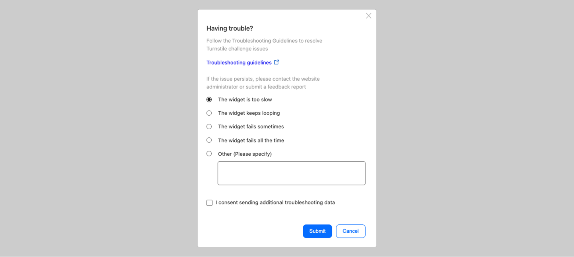
支援であり、官僚主義ではない。利用者がエラーに遭遇した際、私たちは「フィードバックを送信」を提供していました。テストでは、利用者は混乱しました。「誰に送っているのか?ウェブサイトか?Cloudflare か?私の ISP なのか?」さらに重要なことに、最大のフラストレーションが生じる瞬間には、人々は報告書を提出したいのではなく、問題を解決したいという根本的な事実が発見されました。私たちは「フィードバックを送信」を「トラブルシューティング」に置き換えました。これは官僚主義ではなくアクションを約束する単一の言葉です。
 image
image
問題のある「フィードバックを送信」プロンプト:利用者は誰にフィードバックを送っているのか分からなかった
注意喚起であって、警報ではありません。私たちはエラーに対して赤い背景を多用していました。テストでの反応は本能的なものでした——参加者は自分が失敗したと感じ、無力感を感じました。リトライすれば解決する単純な問題であっても、ユーザーは最悪の事態を想定して諦めてしまいました。彩度を最大にした赤は「対処すべきものがあります」と伝えるのではなく、「あなたは失敗しました、どうしようもありません」と伝えていました。対策:赤はアイコンにのみ使用し、テキストや背景には決して使用しないこと。

進化の過程:赤色で不明確なエラー状態の説明があった状態から、中性的な色のテキストによるはるかに明確で簡潔なエラーコミュニケーションへと変化しました。
スキャン可能であって、冗長ではない。私たちは徹底的に、技術的な詳細を説明しようとしていました。しかしそれは裏目に出ました。非技術系のユーザーには疎外感を与え、技術系のユーザーには必要ありませんでした。誰もがストレスの多い状況にあるウィジェットという限られたスペースでそれを読もうとしていたのです。教訓:少ないほど良い、特にストレスの多い瞬間における制約された空間ではなおさらです。
すべての人にアクセス可能であること。私たちの監査により、一部の状態で 10px のフォントが使用されていることが判明しました。グレーのテキストは技術的には AA(通常テキストで少なくとも 4.5:1、大文字テキストで 3:1)コンプライアンスを満たしていましたが、実際には読みづらかったです。「技術的に準拠している」だけでは、インターネット全体にサービスを提供する際には十分ではありません。
明確な目標を設定しました:WCAG 2.2 AAA 基準の達成です。これはウェブアクセシビリティ適合性における最高かつ最も厳格なレベルであり、重度の障害を持つ方を含む、あらゆるユーザーにコンテンツをアクセス可能にするために設計されています。 redesign のThroughout、視覚的な一貫性と可読性が対立した際、常に可読性が優先されました。
これは視力の問題だけではありません。スクリーンリーダー利用者、キーボードのみでのナビゲーションを行う方、色覚多様性を持つ人々のためにデザインしました。自動化された適合性ツールでは検出できない範囲まで対応しています。
そしてアクセシビリティは障害の有無だけでなく、言語の問題でもあります。英語で収まる表現がドイツ語では溢れ出し、スペイン語で簡潔な表現が日本語では曖昧になります。40 以上の言語への対応を迫られたことで、私たちは根本的な単純化を余儀なくされました。「ウェブサイトへの接続ができない / トラブルシューティング」という同じパターンが、英語、ブルガリア語、デンマーク語、ドイツ語、ギリシャ語、日本語、インドネシア語、ロシア語、スロバキア語、スロベニア語、セルビア語、フィリピン語など、多くの言語で機能するようになりました。

12 の言語にわたる再設計されたエラー状態 — 異なるテキスト長にもかかわらず一貫したレイアウト
最終的な redesign
では、実際に何を提供できたのでしょうか?
まず、変更しなかった点について話しましょう。ハッピーパス(「人間であることを確認」→「確認中…」→「成功!」)は非常に高い評価を得ました。ユーザーは各段階で何が起こっているかを理解していました。それぞれに異なるコンテンツを用意することによって複雑になりすぎるのではないかという懸念がありましたが、これはむしろ私たちの競争優位性となりました。

ハッピーパス:人間であることを確認 → 確認中 → 成功!これらの状態はテストで良好な結果を示し、ほぼ変更されませんでした
しかし、改善が必要な状態については、私たちが学んだすべての知見に基づき、大幅な変更を行いました。
簡素化され、スキャン可能なコンテンツ
エラー状態におけるテキスト量を劇的に削減しました。以前のような「デバイスの時刻設定が誤っているか、このチャレンジページが仲介者によって意図せずキャッシュされており、現在利用できません」といった冗長な説明の代わりに、現在は以下を表示しています。
明確でシンプルな状態名(例:「デバイスの時刻が正しくありません」)
目立つ「トラブルシューティング」リンク
これだけです。詳細なガイダンスは、ユーザーが必要としたときに開く専用モーダル画面に移動しました。これにより、ユーザーは実際に手順を読み、追従するための十分なスペースを得られます。

トラブルシューティングモーダル:ユーザーが必要な時に詳細なガイダンスを提供し、ウィジェットを煩雑にしない
トラブルシューティングモーダルは、文脈(「このエラーは、デバイスの時計またはカレンダーが正確でない場合に発生します。このウェブサイトのセキュリティ検証プロセスを完了するには、デバイスがあなたのタイムゾーンで正しい日付と時刻に設定されている必要があります。」)、試すべき番号付き手順、ドキュメントへのリンク、そしてユーザーが問題の解決を試みた後に表示される Cloudflare へのフィードバック送信オプションを提供します。まずはヘルプ、その後にフィードバックです。
AAA アクセシビリティ準拠
すべての状態が、コントラストと可読性に関する WCAG 2.2 AAA 基準を満たすようになりました。フォントサイズには最小値が設定されています。インタラクティブな要素は明確にフォーカス可能であり、スクリーンリーダーによって適切に読み上げられます。
Turnstile と Challenge ページ間での統一された体験
ユーザーがコンパクトな Turnstile ウィジェットに遭遇するか、フルサイズの Challenge ページに遭遇するかにかかわらず、情報アーキテクチャは現在一貫しています。同じ階層構造。同じ配置。同じメンタルモデル。
Challenge ページは現在、明確な構造を採用しています:上部にはウェブサイト名とファビコンが表示され、その下には「検証成功」や「ブラウザが古くなっています」といった明確なステータスメッセージ、さらにその下に具体的なアクションガイダンスが配置されています。もはやオレンジ色や赤色の文字の壁があるわけでもなく、文脈のない専門用語が並んでいることもありません。
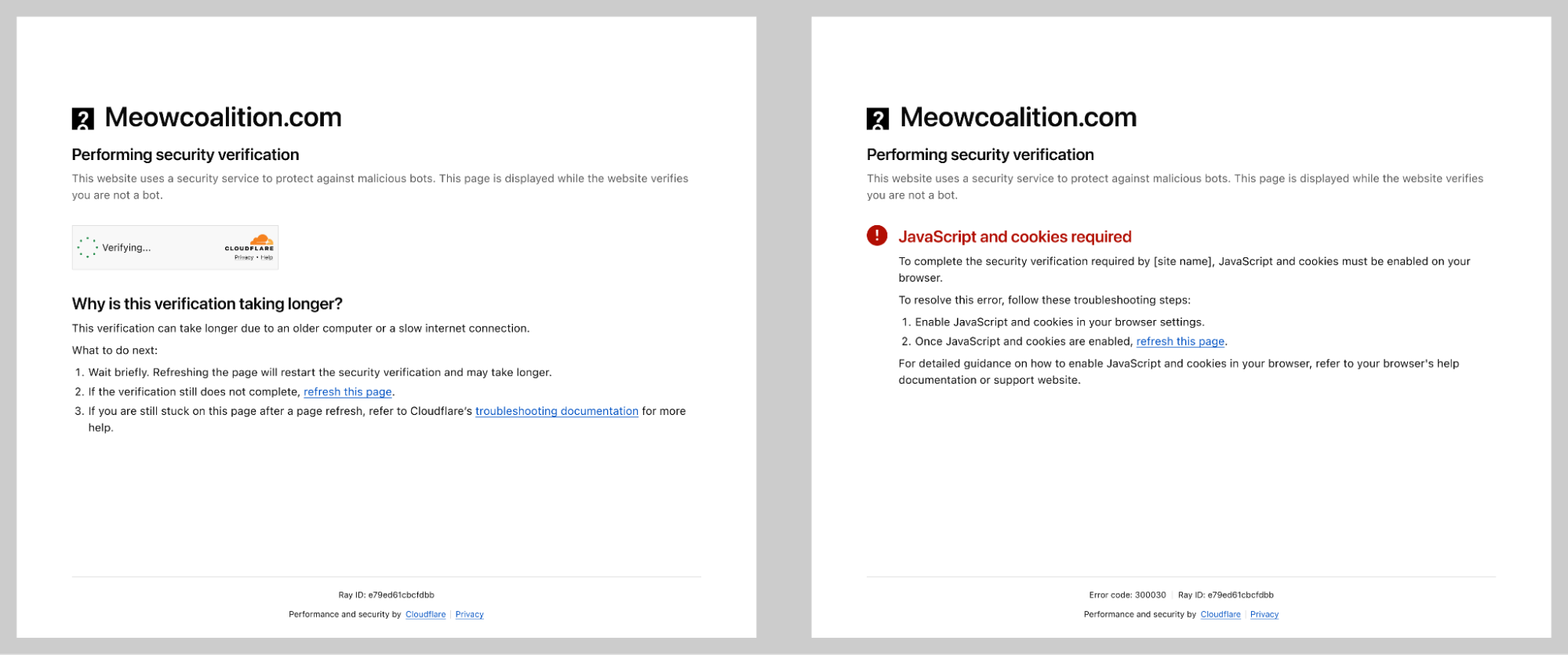
再設計された Challenge ページは、明確なトラブルシューティング手順を示しています。
多言語での検証完了
すべてのコンテンツは、サポート対象の 40 以上の言語でテストされました。私たちのプロセスには、3 つ層の検証が含まれていました:
デザインチームによる初期デザインのレビュー
認定ベンダーによる専門的な翻訳
ネイティブスピーカーである Cloudflare の従業員による最終レビュー
これは単なる翻訳の正確さの問題ではありませんでした。重要なのは、言語間でコンテンツの長さが劇的に異なる場合でも、ビジュアルデザインが機能し続けることを保証することでした。
全体像
その結果、より明確で、アクセシビリティが高く、ストレスの少ないセキュリティ検証体験が実現しました。そして何よりも重要な点は、セキュリティレベルが以前と同等に保たれていることです。私たちは、ユーザー体験を向上させるために保護を妥協したわけではありません。優れたデザインと強力なセキュリティは対立するものではないことを証明しました。

左側に再設計された Turnstile ウィジェット、右側に再設計された Challenge ページ
しかし、体験をデザインすることは戦いの半分にしかなりません。それを数十億人のユーザーに提供することこそが、Ana の役割です。
Part 2: 数十億人への展開
Beyond centering a div(div の中央配置を超えて)
一部の人は、フロントエンドエンジニアにとって最も難しい部分は div を中央に配置することだと言うかもしれません。実際には、真の課題はそれよりもはるかに深く、特にプラットフォームのプリミティブに近い場所で作業する際には顕著です。ネイティブ API を用いてインターネットインフラの重要な部分を構築することは、UI 開発、トレードオフ、そして長期的な保守性について異なる視点で考えることを強要します。
私たちのケースでは、Turnstile ウィジェットと Challenge ページの両方の UI 処理に Rust を使用しています。この決定は、プラットフォーム間での安全性と一貫性の面で明確な利点をもたらしましたが、同時にフロントエンドの複雑さも増大させました。多くの人が Rea という現代的なフレームワークの使いやすさに慣れ親しんでいますが
原文を表示
You've seen it. Maybe you didn't register it consciously, but you've seen it. That little widget asking you to verify you're human. That full-page security check before accessing a website. If you've spent any time on the Internet, you've encountered Cloudflare's Turnstile widget or Challenge Pages — likely more times than you can count.
image
The Turnstile widget – a familiar sight across millions of websites
When we say that a large portion of the Internet sits behind Cloudflare, we mean it. Our Turnstile widget and Challenge Pages are served 7.67 billion times every single day. That's not a typo. Billions. This might just be the most-seen user interface on the Internet.
And that comes with enormous responsibility.
Designing a product with billions of eyeballs on it isn't just challenging — it requires a fundamentally different approach. Every pixel, every word, every interaction has to work for someone's grandmother in rural Japan, a teenager in São Paulo, a visually impaired developer in Berlin, and a busy executive in Lagos. All at the same time. In moments of frustration.
Today we’re sharing the story of how we redesigned Turnstile and Challenge Pages. It's a story told in three parts, by three of us: the design process and research that shaped our decisions (Leo), the engineering challenge of deploying changes at unprecedented scale (Ana), and the measurable impact on billions of users (Marina).
Let's start with how we approached the problem from a design perspective.
Part 1: The design process
The problem
Let's be honest: nobody likes being asked to prove they're human. You know you're human. I know I'm human. The only one who doesn't seem convinced is that little widget standing between you and the website you're trying to access. At best, it's a minor inconvenience. At worst? You've probably wanted to throw your computer out the window in a fit of rage. We've all been there. And no one would blame you.
image
Turnstile integrated into a login flow
As the world warms up to what appears to be an inevitable AI revolution, the need for security verification is only increasing. At Cloudflare, we've seen a significant rise in bot attacks — and in response, organizations are investing more heavily in security measures. That means more challenges being issued to more end users, more often.
The numbers tell the story:
2023: 2.14B daily
2024: 3B daily
2025: 5.35B daily
That's a 58.1% average increase in security checks, year over year. More security checks mean more opportunities for end user frustration. The more companies integrate these verification systems to protect themselves and their customers, the higher the chance that someone, somewhere, is going to have a bad experience.
We knew it was time to take a hard look at our flagship products and ask ourselves: Are we doing right by the billions of people who encounter these experiences? Are we fulfilling our mission to build a better Internet — not just a more secure one, but a more human one?
The answer, we discovered, was: we could do better.
The design audit
Before redesigning anything, we needed to understand what we were working with. We started by conducting a comprehensive audit of every state, every error message, and every interaction across both Turnstile and Challenge Pages.
What we found wasn't the best.
image
The state of inconsistency in the Turnstile widget. Multiple states with no unified approach
The inconsistencies were glaring. We had no unified approach across the multitude of different error scenarios. Some messages were overly verbose and technical ("Your device clock is set to a wrong time or this challenge page was accidentally cached by an intermediary and is no longer available"). Others were too vague to be helpful ("Timed out"). The visual language varied wildly — different layouts, different hierarchies, different tones of voice.
We also examined the feedback we'd received online. Social media, support tickets, community forums — we read it all. The frustration was palpable, and much of it was avoidable.
Take our feedback mechanism, for example. We offered users feedback options like "The widget sometimes fails" versus "The widget fails all the time." But what's the difference, really? And how were they supposed to know how often it failed? We were asking users to interpret ambiguous options during their most frustrated moments. The more we left open to interpretation, the less useful the feedback became — and the more frustration we saw across social channels.
image
The previous feedback screen: "The widget sometimes fails" vs "The widget fails all the time" — what's the difference?
Our Challenge Pages — the full-page security blocks that appear when we detect suspicious activity or when site owners have heightened security settings — had similar issues. Some states were confusing. Others used too much technical jargon. Many failed to provide actionable guidance when users needed it most.
image
The state of inconsistency on the Challenge pages. Multiple states with no unified approach
The audit was humbling. But it gave us a clear picture of where we needed to focus.
Mapping the user journey
To design better experiences, we first needed to understand every possible path a user could take. What was the happy path? Was there even one? And what were the unhappy paths that led to escalating frustration?
image
Mapping the complete user journey — from initial encounter through error scenarios, with sentiment tracking
This was a true cross-functional effort. We worked closely with engineers like Ana who knew the technical ins and outs of every edge case, and with Marina on the product side who understood not just how the product worked, but how users felt about it — the love and the hate we'd see online.
We have some of the smartest people working on bot protection at Cloudflare. But intelligence and clarity aren't the same thing. There's a delicate balance between technical complexity and user simplicity. Only when these two dance together successfully can we communicate information in a way that actually makes sense to people.
And here's the thing: the messaging has to work for everyone. A person of any age. Any mental or physical capability. Any cultural background. Any level of technical sophistication. That's what designing at scale really means — you can’t ignore edge cases, since, at such scale, they are no longer edge cases.
Establishing a unified information architecture
One of the most influential books in UX design is Steve Krug's Don't Make Me Think. The core principle is simple: every moment a user spends trying to interpret, understand, or decode your interface is a moment of friction. And friction, especially in moments of frustration, leads to abandonment.
Our audit revealed that we were asking users to think far too much. Different pieces of information occupied the same space in the UI across different states. There was no consistent visual hierarchy. Users encountering an error state in Turnstile would find information in a completely different place than they would on a Challenge Page.
We made a fundamental decision: one information architecture to rule them all.
image
Visual diagram displaying a unified information architecture with a consistent structure across Turnstile widget and Challenge pages
Both Turnstile and Challenge Pages would now follow the same structural pattern. The same visual hierarchy. The same placement for actions, for explanatory text, for links to documentation.
Did this constrain our design options? Absolutely. We had to say no to a lot of creative ideas that didn't fit the framework. But constraints aren't the enemy of good design — they're often its best friend. By limiting our options, we could go deeper on the details that actually mattered.
For users, the benefit is profound: they don't need to re-learn what each piece of the UI means. Error states look consistent. Help links are always in the same place. Once you understand one state, you understand them all. That's cognitive load reduced to a minimum — exactly where it should be during a security verification.
What user research taught us
How do you keep yourself accountable when redesigning something that billions of people see? You test. A lot.
We recruited 8 participants across 8 different countries, deliberately seeking diversity in age, digital savviness, and cultural background. We weren't looking for tech-savvy early adopters — we wanted to understand how the redesign would work for everyone.
Our approach was rigorous: participants saw both the current experience and proposed changes, without knowing which was "old" or "new." We counterbalanced positioning to eliminate bias. And we did not just test our new ideas, but also challenged our assumptions about what needed changing in the first place.
image
Two different versions of a Turnstile being tested in an A/B test
Some things didn’t need fixing
One hypothesis: should we align with competitors? Most CAPTCHA providers show "I am human" across all states. We use distinct content — "Verify you are human," then "Verifying...," then "Success!"
Were we overcomplicating things? We tested it head-to-head.
Our approach won decisively. For the interactivity state, "Verify you are human" scored 5 out of 8 points versus just 3 for "I am human." For the verifying state, it was even more dramatic — 7.5 versus 0.5. Users wanted to know what was happening, not just be told what they were.
image
User testing results: users strongly favored our approach over the competitor-style design
This experiment didn't ship as a feature, but it was invaluable. It gave us confidence we weren't just being different for the sake of it. Some things were already right.
But these needed to change
The research surfaced four areas where we were failing users:
Help, not bureaucracy. When users encountered errors, we offered "Send Feedback." In testing, they were baffled. "Who am I sending this to? The website? Cloudflare? My ISP?" More importantly, we discovered something fundamental: at the moment of maximum frustration, people don't want to file a report — they want to fix the problem. We replaced "Send Feedback" with "Troubleshoot" — a single word that promises action rather than bureaucracy.
image
The problematic "Send Feedback" prompt: users didn't know who they were sending feedback to
Attention, not alarm. We'd used red backgrounds liberally for errors. The reaction in testing was visceral — participants felt they had failed, felt powerless. Even for simple issues that would resolve with a retry, users assumed the worst and gave up. Red at full saturation wasn't communicating "Here's something to address." It was communicating "You have failed, and there's nothing you can do." The fix: red only for icons, never for text or backgrounds.
image
The evolution: from the states with unclear error state description in red to much clearer and concise error communication in neutral-color text.
Scannable, not verbose. We'd tried to be thorough, explaining errors in technical detail. It backfired. Non-technical users found it alienating. Technical users didn't need it. Everyone was trying to read it in the tiny real estate of a widget. The lesson: less is more, especially in constrained spaces during stressful moments.
Accessible to everyone. Our audit revealed 10px fonts in some states. Grey text that technically met AA (at least 4.5:1 for normal text and 3:1 for large text) compliance but was difficult to read in practice. "Technically compliant" isn't good enough when you're serving the entire Internet.
We set a clear goal: to meet the WCAG 2.2 AAA standard— the highest and most stringent level of web accessibility compliance, designed to make content accessible to the broadest range of users, including those with severe disabilities. Throughout the redesign, when visual consistency conflicted with readability, readability won. Every time.
This extended beyond vision. We designed for screen reader users, keyboard-only navigators, and people with color vision variations — going beyond what automated compliance tools can catch.
And accessibility isn't just about impairments — it's about language. What fits in English, overflows in German. What's concise in Spanish is ambiguous in Japanese. Supporting over 40 languages forced us to radically simplify. The same "Unable to connect to website / Troubleshoot" pattern now works across English, Bulgarian, Danish, German, Greek, Japanese, Indonesian, Russian, Slovak, Slovenian, Serbian, Filipino, and many more.
image
The redesigned error state across 12 languages — consistent layout despite varying text lengths
Final redesign
So what did we actually ship?
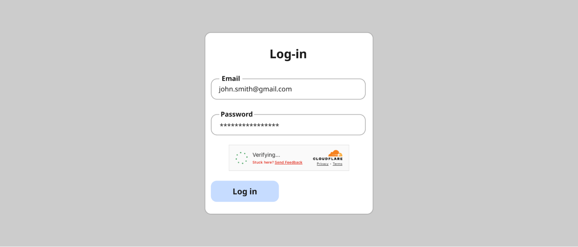
First, let's talk about what we didn't change. The happy path — "Verify you are human" → "Verifying..." → "Success!" — tested exceptionally well. Users understood what was happening at each stage. The distinct content for each state, which we'd worried might be overcomplicating things, was actually our competitive advantage.
image
The happy path: Verify you are human → Verifying → Success! These states tested well and remained largely unchanged
But for the states that needed work, we made significant changes guided by everything we learned.
Simplified, scannable content
We radically reduced the amount of text in error states. Instead of verbose explanations like "Your device clock is set to a wrong time or this challenge page was accidentally cached by an intermediary and is no longer available," we now show:
A clear, simple state name (e.g., "Incorrect device time")
A prominent "Troubleshoot" link
That's it. The detailed guidance now lives in a dedicated modal screen that opens when users need it — giving them room to actually read and follow troubleshooting steps.
image
The troubleshooting modal: detailed guidance when users need it, without cluttering the widget
The troubleshooting modal provides context ("This error occurs when your device's clock or calendar is inaccurate. To complete this website’s security verification process, your device must be set to the correct date and time in your time zone."), numbered steps to try, links to documentation, and — only after the user has tried to resolve the issue — an option to submit feedback to Cloudflare. Help first, feedback second.
AAA accessibility compliance
Every state now meets WCAG 2.2 AAA standards for contrast and readability. Font sizes have established minimums. Interactive elements are clearly focusable and properly announced by screen readers.
Unified experience across Turnstile and Challenge pages
Whether users encounter the compact Turnstile widget or a full Challenge Page, the information architecture is now consistent. Same hierarchy. Same placement. Same mental model.
Challenge Pages now follow a clean structure: the website name and favicon at the top, a clear status message (like "Verification successful" or "Your browser is out of date"), and actionable guidance below. No more walls of orange or red text. No more technical jargon without context.
image
Re-designed Challenge page states with clear troubleshooting instructions.
Validated across languages
Every piece of content was tested in over 40 supported languages. Our process involved three layers of validation:
Initial design review by the design team
Professional translation by our qualified vendor
Final review by native-speaking Cloudflare employees
This wasn't just about translation accuracy — it was about ensuring the visual design held up when content length varied dramatically between languages.
The complete picture
The result is a security verification experience that's clearer, more accessible, less frustrating, and — crucially — just as secure. We didn't compromise on protection to improve the experience. We proved that good design and strong security aren't in conflict.
image
Re-designed Turnstile widgets on the left and a re-designed Challenge page on the right
But designing the experience was only half the battle. Shipping it to billions of users? That's where Ana comes in.
Part 2: Shipping to billions
Beyond centering a div
Some may say the hardest part of being a Frontend Engineer is centering a div. In reality, the real challenge often lies much deeper, especially when working close to the platform primitives. Building a critical piece of Internet infrastructure using native APIs forces you to think differently about UI development, tradeoffs, and long-term maintainability.
In our case, we use Rust to handle the UI for both the Turnstile widget and the Challenge page. This decision brought clear benefits in terms of safety and consistency across platforms, but it also increased frontend complexity. Many of us are used to the ergonomics of modern frameworks like Rea
関連記事
今日のまとめ
AI日報で今日の重要ニュースをまとめ読み