世界で最も重要なチャートとは何か
本文の状態
日本語全文を表示中
詳細モードで約4分の本文を読めます。
同じ出来事の情報源
この情報源を基点に整理
The Zvi
著者がツイッターの回答を基に、AI モデルのソフトウェア実行能力とリリース日を示す METR グラフなど、世界で最も重要なチャートを複数紹介し、技術が常に向上していることを示唆した。
Continue in AI NEW LAB
このニュースを、実務の判断につなげる
AI NEW LABで、試したことや先に確認したい条件を共有できます。まずはログインなしで読めます。
AI NEW LABで論点を見るSource Article
元記事を日本語で読む
本文に関係しない購読案内、埋め込み通知、サイト内プロモーションは除いています。
私たちは皆、休憩が必要です。では、世界で最も重要なチャートとは何でしょうか?
私は Twitter で質問し、多くの素晴らしい回答を得ました。
そこで今日は、私が選んだいくつかのチャートを紹介しましょう:『世界で最も重要なチャート』。
認めざるを得ないでしょう、状況は良くなりつつあります。常に、あるいはほとんど常に良くなっています。
元祖・世界で最も重要なチャート
この文脈におけるのは METR グラフで、しばしばそのように呼ばれています。ここでは x 軸がリリース日、y 軸が AI モデルがソフトウェアタスクを 50% または 80% の成功率で遂行するための対数スケールでの時間的範囲を示しています。通常、人々は 50% のグラフを使用します:
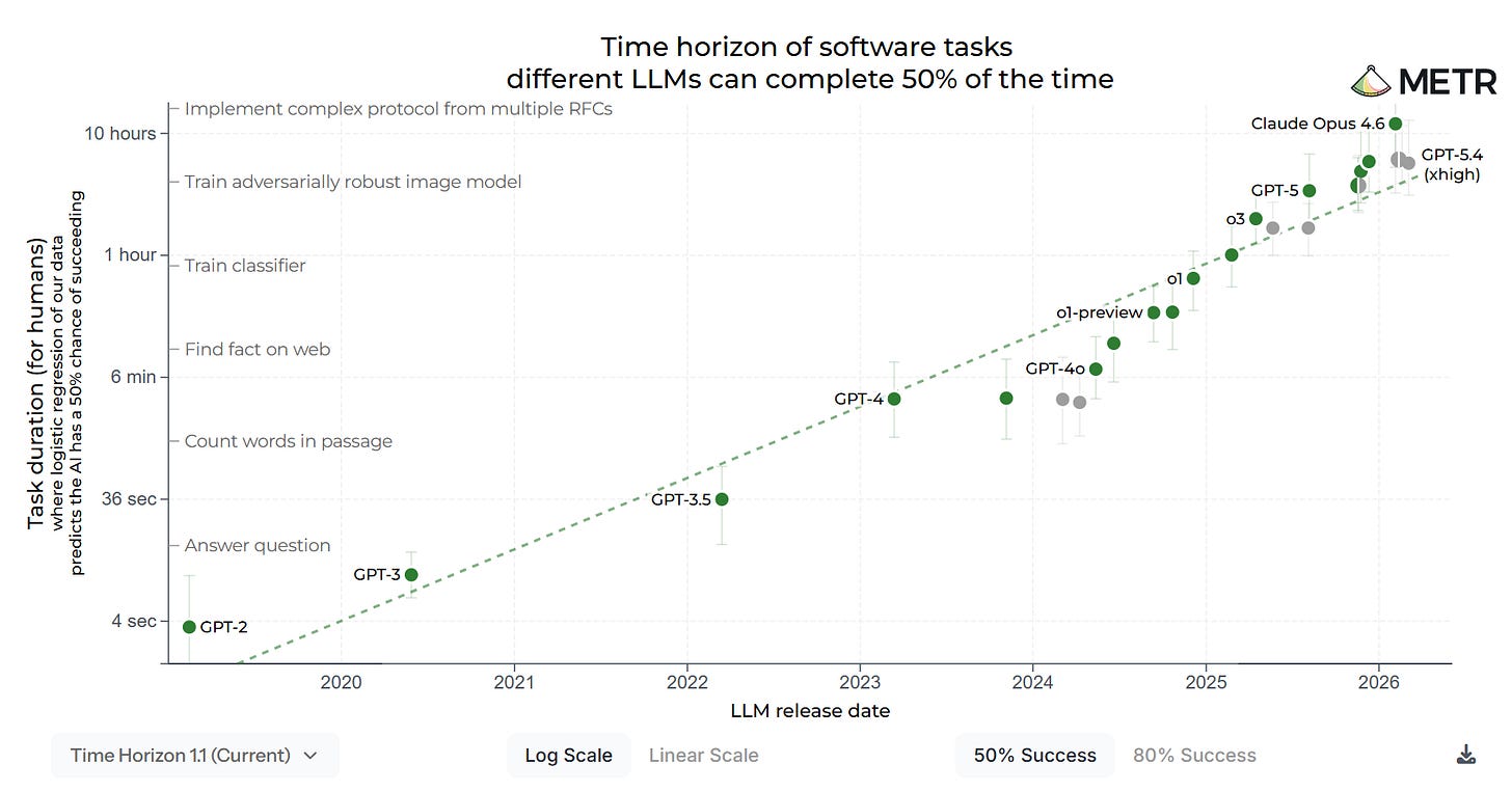
AI モデルがますます長いタスクを完全に自律的に実行し続け、かつトレンドが続く場合、これは私たちが AI が自らの AI 研究開発(R&D)を行える段階にあまり遠くないことを示唆しています。その結果は『急速な能力の向上』であり、再帰的自己改善(Recursive Self-Improvement: RSI)や『脱出速度(escape velocity)』とも呼ばれます。その後……さて、誰も本当に知りませんが、世界はおそらくさらに奇妙で説明不能なものへと変容し、そこに人間が含まれるかどうか、あるいは価値があるかどうかは定かではありません。
以上があなたの科学的ブリーフィングです。
お金の話を聞かせてください
常に基本があります。
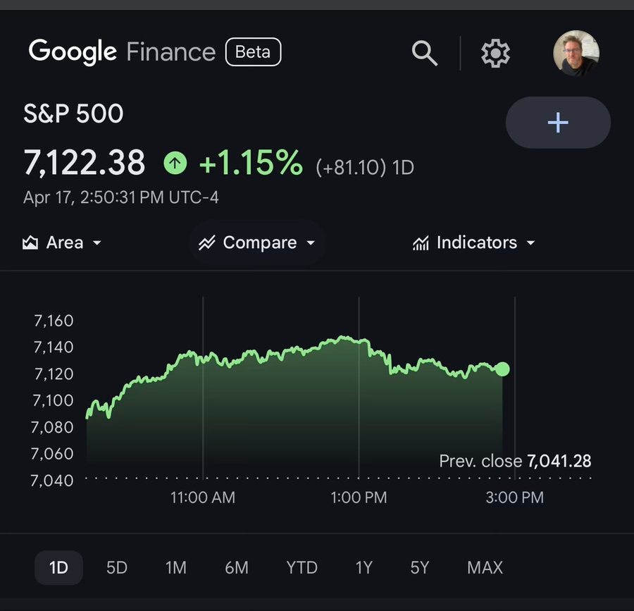
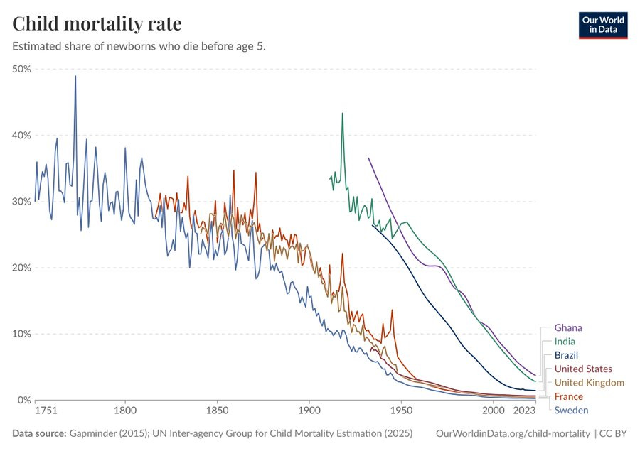
悪いことが起きる頻度は低下している
パトリック・マッケンジー:これと同じ根本的な物語を示すものは多くありますが、このグラフは私にとって特に感情的に訴えかけるものです。
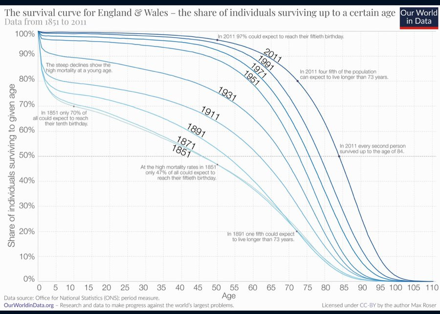
これは幼少期に限定される話ではありません。
死だけでなく、貧困についても同様です。細部について異論を唱えることは可能ですが、本質には影響しません。
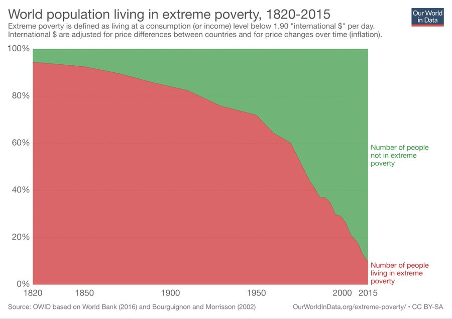
誰かが相対的な富に焦点を当てるたびに、このことを思い出してください。
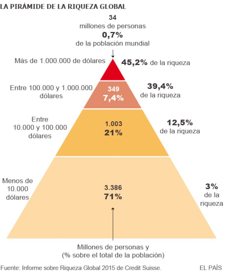
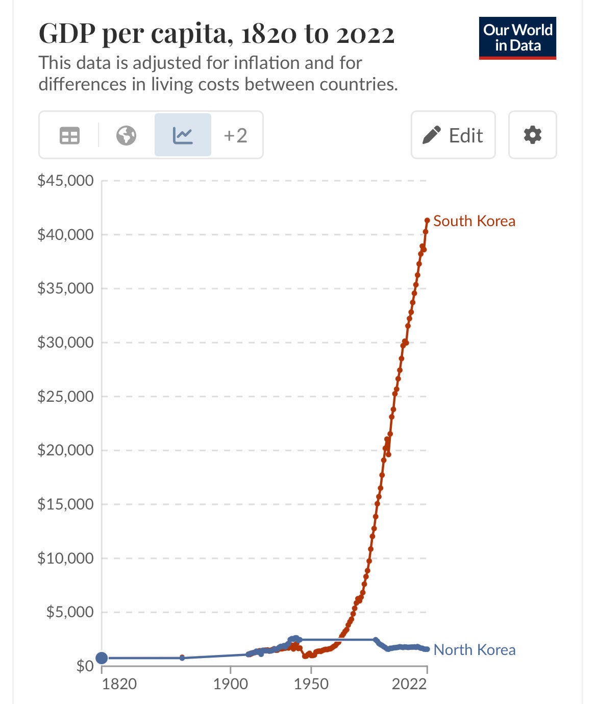
いくつかの比較は有用ですが:
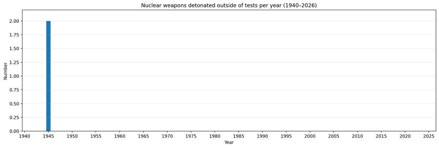
重要なのはこれ(年ごとのテスト外で不明瞭な兵器の爆発)です:
指数関数的な成長
METR グラフは、一般的なテーマの一種の変形です。
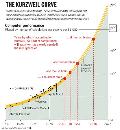
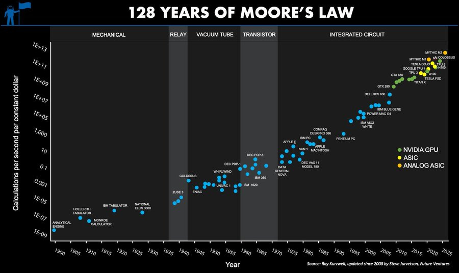
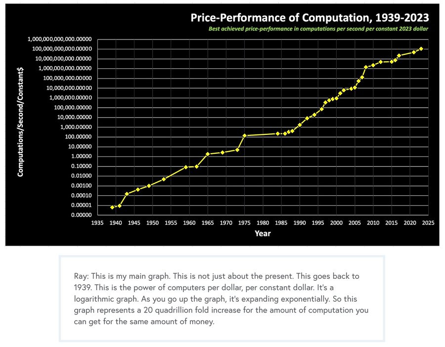
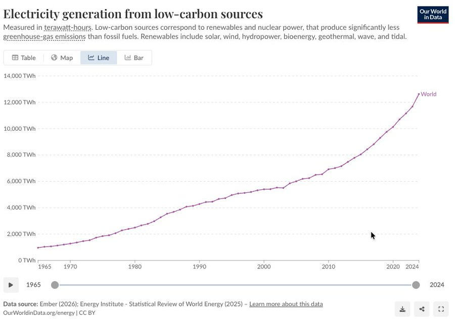
エネルギー、低炭素エネルギーを含めてですが、残念ながらこのグラフは線形です:
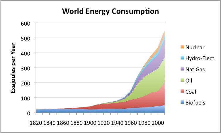
覚えておいてください:
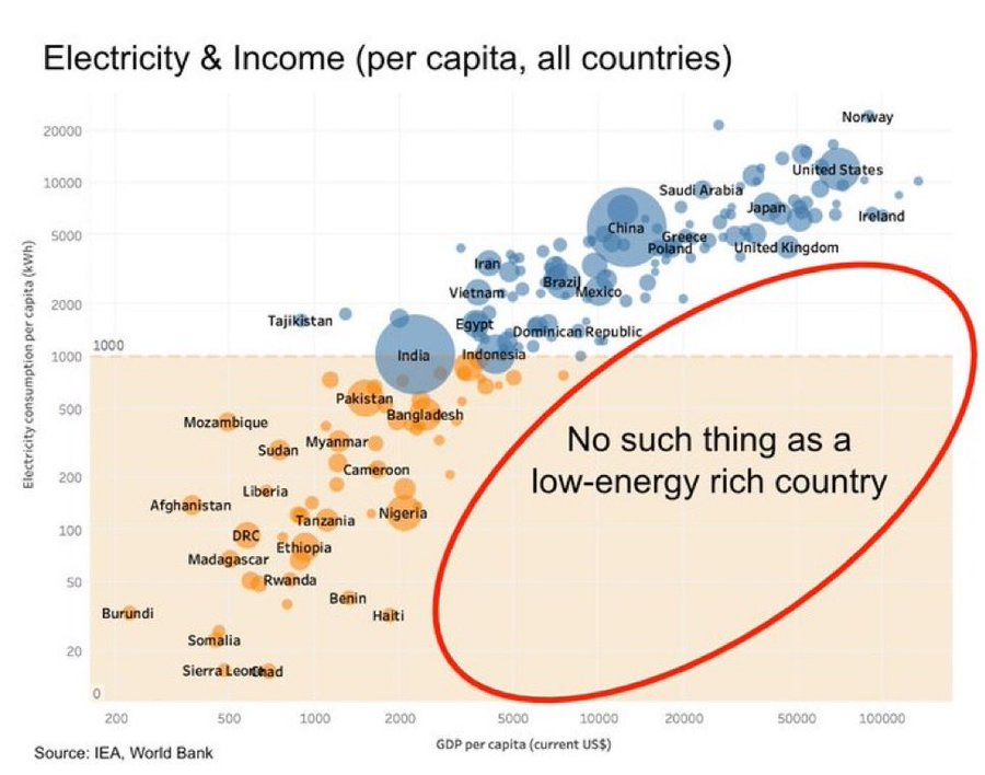
世界国内総生産(GDP)も同じように機能します。はい、縦軸は対数スケールですが、あなたが住んでいるのはおそらく続くであろう非常に普通の状況です。
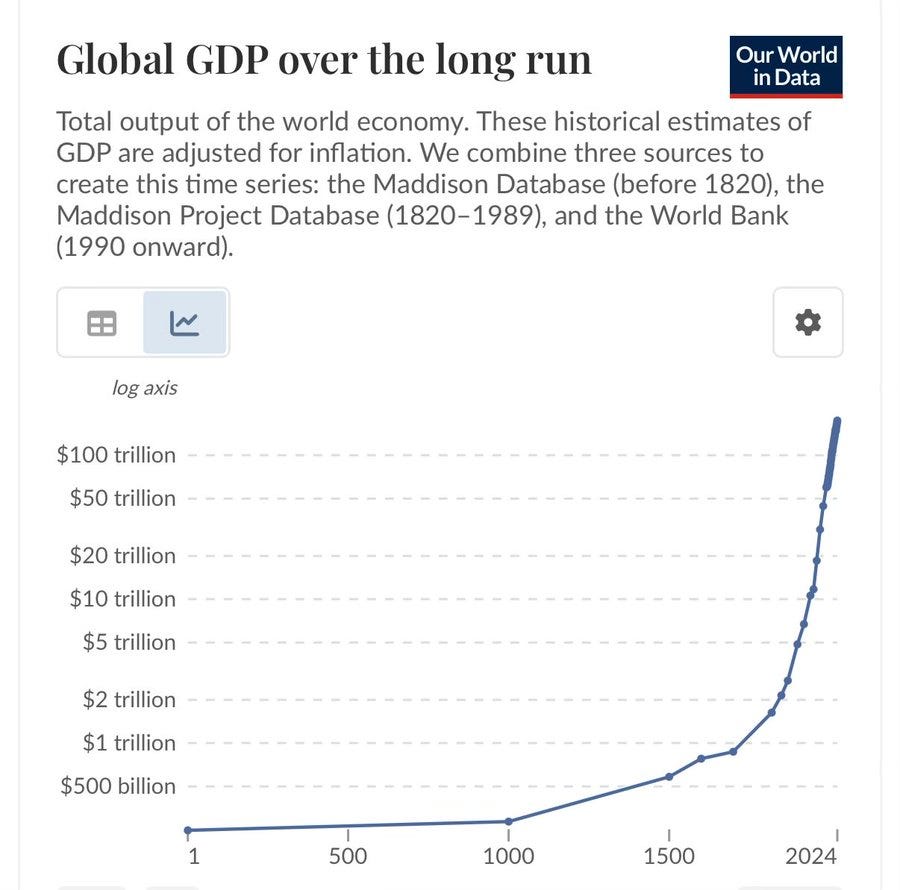
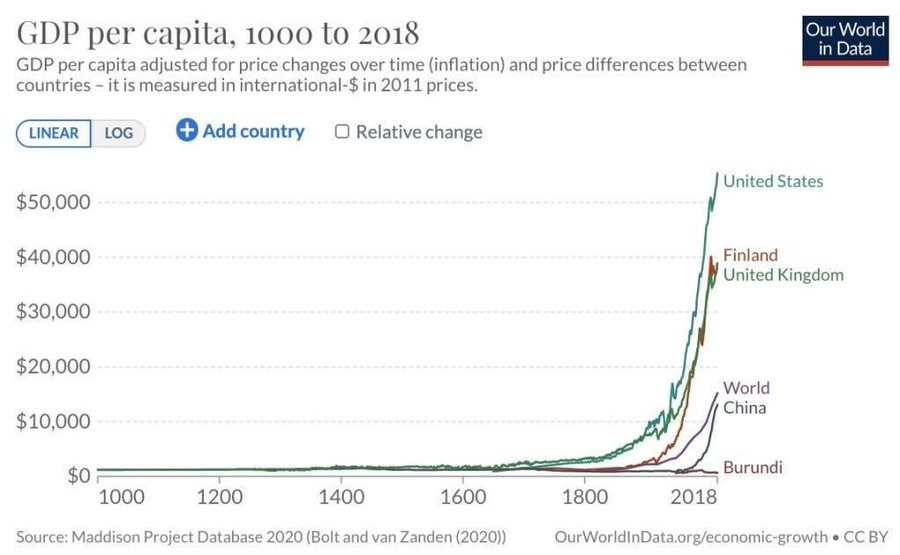
あるいは、ズームアウトして:
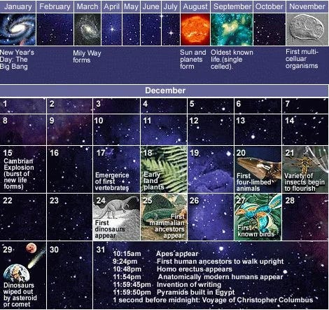
もちろん、この角度からも考えることができます:
マイケル・ルーシー:これはトリック質問ですか?
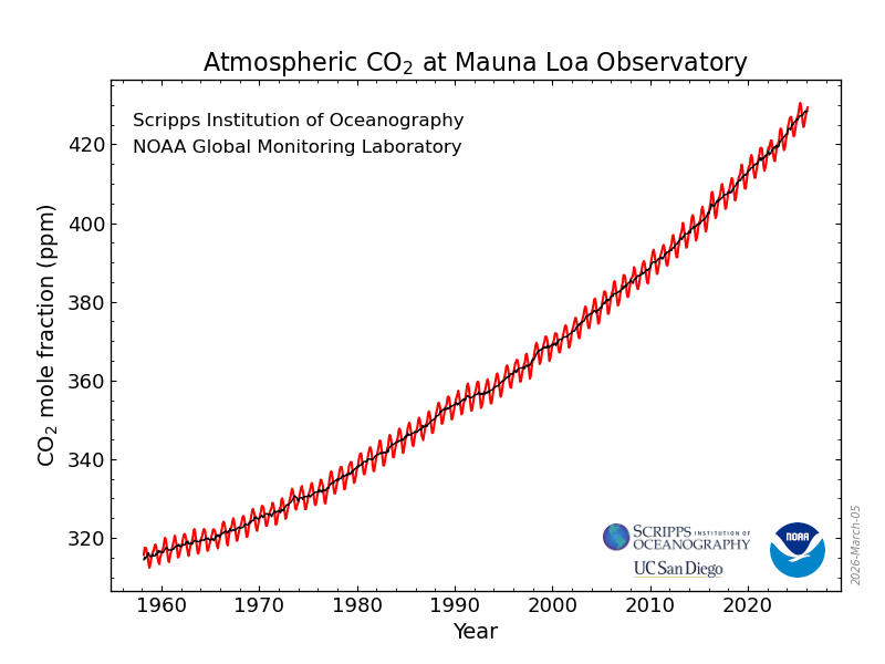
見つける
アーサー・スプリリング:確かに有力な候補です

(上記はコレラの蔓延についてです。)
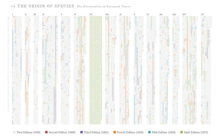
これもまた、独自のやり方で重要ですが、ここでは読むことができません。
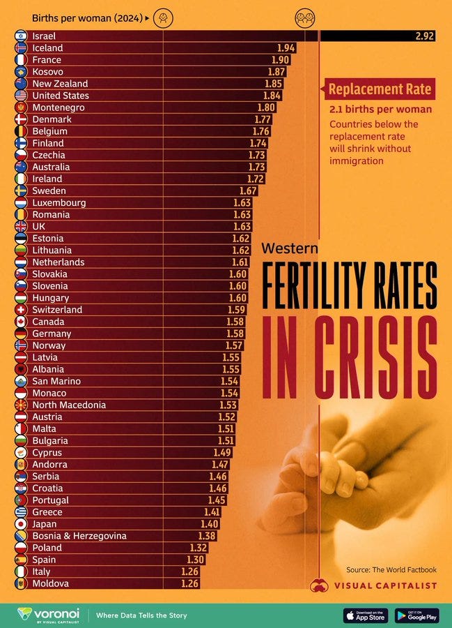
出生率危機
指数関数的な成長曲線が私たちを救ってくれなければ、これらは非常に重要になります。
どのように見ても
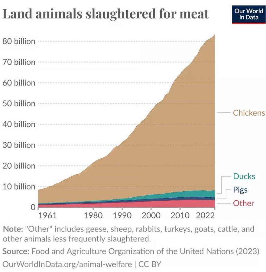
肉の消費量の増加、主に鶏肉です。
重要な知識
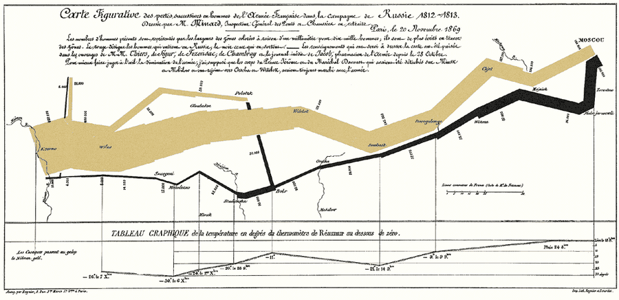
例えばアジアで陸上戦争を始めてはいけないことなどです。
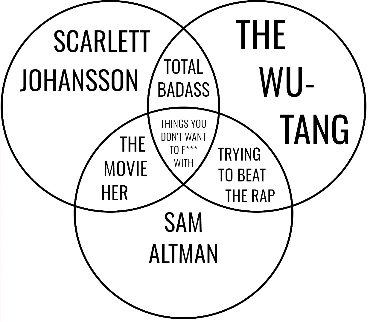
あるいは、誰と戦ってはいけないか:
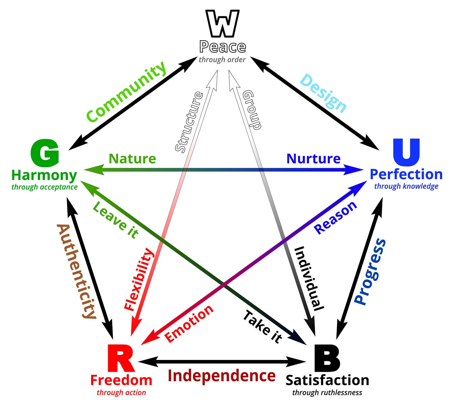
あるいは五色:
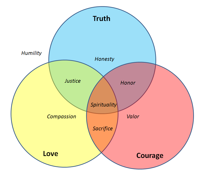
あるいはアバターの八つの徳のうち、私たちの中には覚えている者もいます:
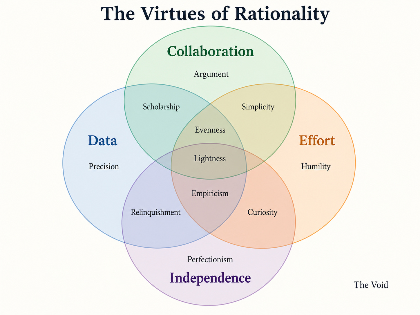
いや、待ってください、十二の徳があります。私たちは合理主義者ですから。
知るべきことがあまりにも多い。
アンディ・ライアン:世界で最も重要なチャートは明らかにこれだ
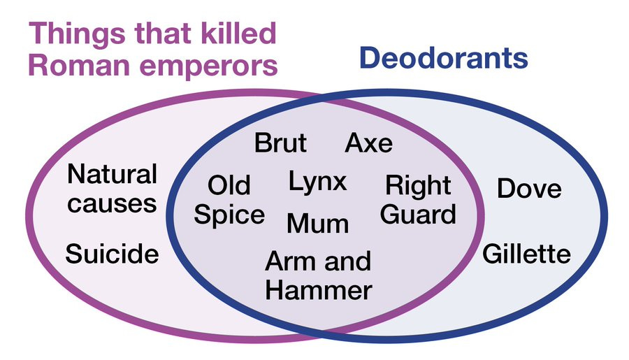
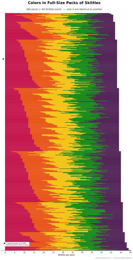
歪んだ虹を味わえ。スキットルズ(Skittles)は独立して分布しているのか?
デイビッド・カーラン:スキットルズは私たちに嘘をついている。
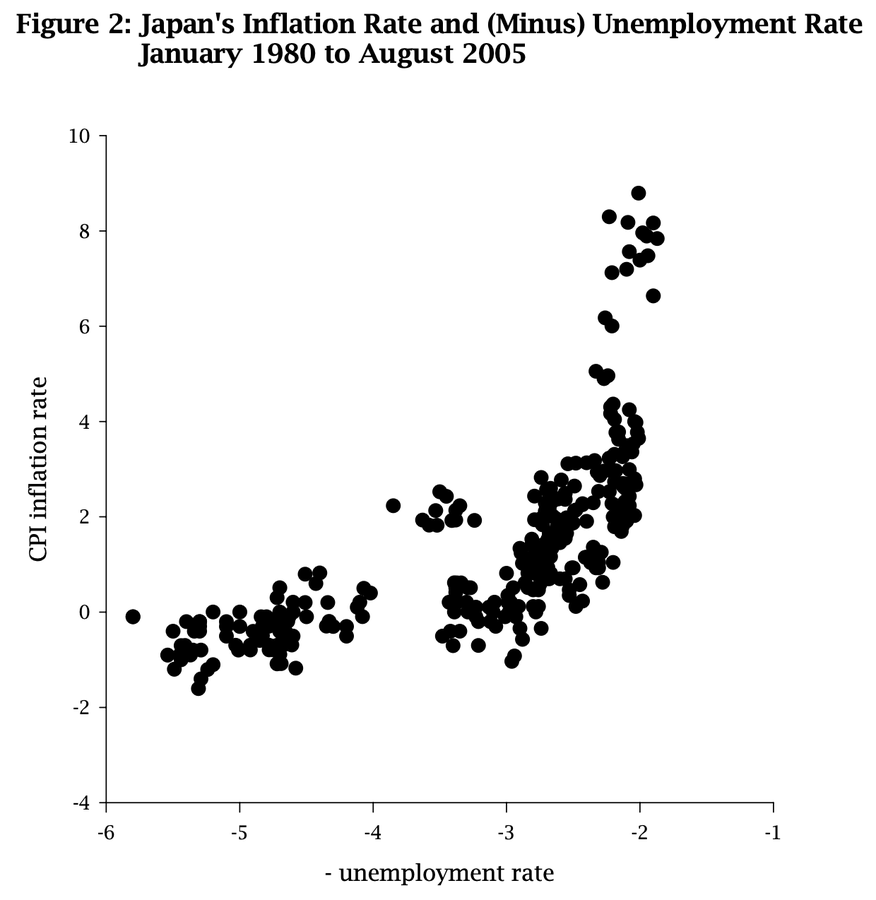
トッド・ジョーンズ:日本のフィリップス曲線(Phillips Curve)は日本そのもののようだ
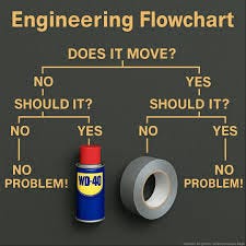
他の人々は実践的な助言を必要としている:
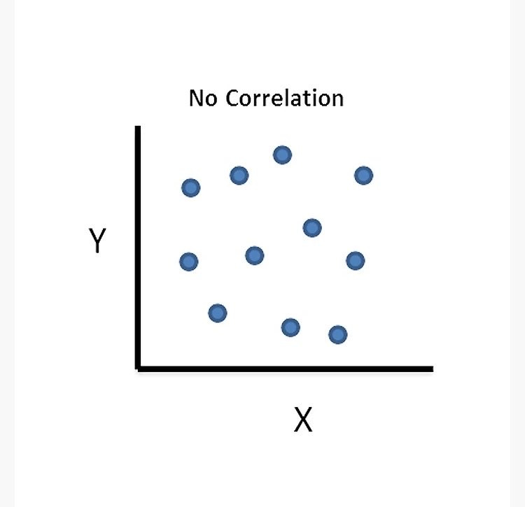
決して忘れてはならないのは、そのすべてを支えているのがこれかもしれないということです:
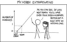
あるいはこれかもしれません:
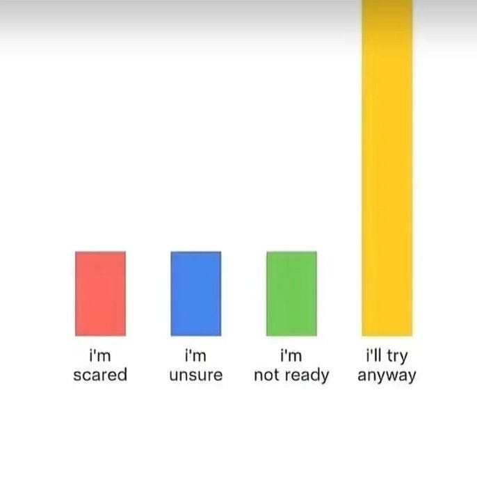
あるいはまた、これかもしれません:
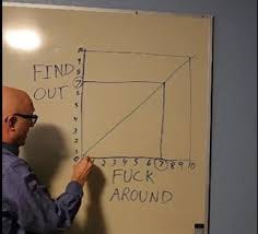
もちろん、これかもしれません:
原文を表示
We all need a break so: What is the most important chart in the world?
I decided to ask Twitter, and got a lot of good answers.
So today, with few of my picks, I present: The Most Important Charts In The World.
You’ve got to admit it’s getting better. Better all the time. Mostly.
The Original Most Important Chart
The context for this is the METR graph, which is often given that label, where the x-axis is release date and the y-axis is the log-scale time horizon for AI models doing software tasks with a 50% or 80% success rate, usually people use the 50% graph:
If AI models continue to be able to do increasingly long tasks fully autonomously, and trends continue, this suggests we are not too far from a point where AI can do its own AI R&D, with the result of ‘rapid capability advancement,’ also known are Recursive Self-Improvement (RSI) or ‘escape velocity,’ after which… well, no one really knows, but the world presumably transforms into something even more bizarre and inexplicable, which may or may not contain humans or have any value.
This has been your scientific briefing.
Show Me The Money
There are always the basics.
Bad Things Happen Less
Patrick McKenzie: There are many which show this same fundamental story but this one is particularly emotionally moving to me.
It doesn’t stop with childhood.
Along with death, poverty. You can quibble with details, but it doesn’t matter.
Remember that every time someone focuses on relative wealth:
Although some comparisons are useful:
Importantly also this (unclear weapons detonated outside tests, by year):
The Exponential
The METR graph is one variant of a common theme.
Energy, including low-carbon energy, alas this graph is only linear:
Remember:
Global GDP works the same way, yes this is a log scale on the y-axis, remember you live in a very normal situation that is likely to continue.
Or, zooming out:
You can also consider this angle, of course:
Michael Lucy: is this a trick question
Find Out
Arthur Spirling: surely a contender
(The above is about the spread of cholera.)
In its own way, also this, although you can’t read it here.
Fertility Crisis
If the exponential growth curves don’t bail us out, these get rather important.
However You Look At It
The rise of meat consumption, which is mainly chickens.
Important Things To Know
Such as not starting a land war in Asia.
Or who not to f*** with:
Or the five colors:
Or the eight virtues of the avatar, some of us remember:
No, wait, there are twelve virtues, we’re rationalists.
So many things to know.
Andy Ryan: The most important chart in the world is obviously this
Taste the lopsided rainbow. The Skittles are independently distributed?
David Curran: Skittles are lying to us.
Todd Jones: Japan's Phillips Curve Looks Like Japan
Other people need practical advice:
Never forget that it could also be this one underneath it all:
Or this:
Or it could also be this:
Or, of course, this one:
関連記事
今日のまとめ
AIデイリーブリーフで今日の重要ニュースをまとめ読み