Lovable で反復する指示を再利用可能なスキルに変換する方法(14 分読了)
Lovable が導入した「Skills」機能は、AI エージェントの反復的な指示を解消し、Markdown 形式で可視化・共有可能な再利用可能な手順として定義する画期的なアプローチである。
キーポイント
Skills の本質と目的
Anthropic が提唱した形式を引き継ぎ、AI に「どのように作業するか」を一度記述して再利用可能にする仕組みで、ユーザーのスタイルや規約を記憶させる役割を果たす。
Knowledge と Skills の明確な区別
プロジェクト全体に常時適用されるルール(Knowledge)と、特定のタスク発生時のみ発動する手順書(Skills)を分離し、文脈の混同を防ぎつつ柔軟性を高める設計となっている。
Markdown 形式による利点
設定パネルや内部メモリではなく、誰でも編集可能な Markdown ファイルを採用することで、ポータビリティ(他ツールでの利用)、可読性(人間の監査)、編集性の確保を実現している。
個人・チームでの活用
ソロビルダーにはプライベートなツールキットとして、チームでは共通のワークフローやチェックリストを共有する手段として機能し、オンボーディングの効率化に寄与する。
デザインシステムの厳格な適用
ブランドカラーのみを使用し、既存のコンポーネントを再利用することで、サイト全体に一貫した製品としての統一感を保つ。
新規要素の禁止と一貫性の維持
フォントや色数を制限し、新しい要素は既存のものと同じ「家族」のような見た目(角丸、影、ホバー挙動)にするよう徹底する。
第三者視点での客観的レビュー
親切なアシスタントではなく、他のタブを開いている疑い深い訪問者の目線でサイトを評価し、不快でも真実を伝える。
影響分析・編集コメントを表示
影響分析
この記事は、AI エージェントが単なる汎用的なチャットボットから、特定のワークフローや企業ルールに深く統合される「自律的な専門家」へと進化するための重要なステップを示しています。特に、設定をファイルとして管理するアプローチは、開発者コミュニティにおける標準化と相互運用性を加速させる可能性があり、今後の AI エージェント設計のデファクトスタンダードに影響を与えるでしょう。
編集コメント
「スキル」という概念をファイルベースで実装し、人間が直接編集・監査できる点に大きな革新性があります。これは AI のブラックボックス化に対する重要な対抗策となり、開発現場での信頼性を高める一石となるでしょう。
AI エージェントの現状について一言。彼らは一般化された存在です。Lovable を開くたびに、あなたがどのように作業を好むかを覚えていません。あなたの慣習やスタイル、あるいは十回以上説明してきた物事の伝え方などはすべて消えてしまいます。そのため、あなたはまた同じことを説明します。そしてまた繰り返すのです。これは積み重なると大きな摩擦となる小さな問題の一つです。
スキルとは何か
昨年末、Anthropic は「スキル」と呼ばれる形式を導入し、それは急速に広まりました。Lovable や OpenAI など多くの企業が数ヶ月のうちにこれを取り入れました。その考え方はシンプルです。一度作成した再利用可能な指示や文脈を、関連する際に AI が使用することで、自分が繰り返し説明する必要がなくなります。それだけです。これが全体像です。背景にはより微妙なニュアンスがあり、後ほど詳しく触れますが、核心を言えば、スキルとは「あなたが物事をどのように処理してほしいか」についての AI へのメモに過ぎません。
さらに進む前に、一つ言っておくことがあります。Lovable にはすでに永続的な文脈を提供するツールとして、「ワークスペースとプロジェクトの知識」という機能があります。これは、コーディング規約やブランドの声、あるいは製品が実際に何をするかなど、あなたが構築するすべてのものに適用されるルールや事実を記述するためのテキストフィールドです。知識は常に有効ですが、スキルは異なります。特定の種類のタスクが発生した時のみ表示されます。これら二つがどのようにペアとして機能するかについては、後ほど詳しく説明します。
さて、形式についてです。スキルは単なる Markdown ファイルです。Markdown を触ったことがない方でもご安心ください。これはフォーマット用のいくつかの簡単な記号を含むプレーンテキストであり、あらゆるテキストエディタで開くことができます。ただし、なぜ Markdown が選ばれたのかには明確な理由があります。なぜ AI アプリ内の設定パネルではないのでしょうか?なぜ AI のメモリに記憶させるだけではないのでしょうか?その理由は三つあります。スキルは「ポータブル(携帯可能)」「可読性がある」「編集可能」です。ポータブルなのは、単なるファイルだからで、ツール間を自由に持ち運べます(Lovable、Anthropic、OpenAI など、多くのプラットフォームが対応しています)。可読性があるのは、人間であるあなたが実際にファイルを開いて中身を確認できるからです。これは一見すると大したことないように思えるかもしれませんが、非常に重要です。これが、誤動作するスキルを修正したり、チームメイトと共有したり、AI に何を与えられているかを監査したりする方法だからです。編集可能なのは、一度更新すればその変更が以降のすべての処理に適用されるからです。Markdown を恐れる必要はありません。ただのテキストです。
スキルは個人用也可以是共有用にもできます。一人での開発者なら、それはあなたのプライベートなツールキットになります。チームで作業する場合は、全員が同じワークフローに収束するための手段となります。例えば、共通のリリースチェックリストや、特定のタスクを処理する統一された方法などです。誰かが記憶したり、再度説明する必要はありません。ここでスキルはナレッジ(知識)と非常に相性が良くなります。ナレッジは、全員が共有する常時有効なルールを保持します。一方、スキルは、誰でもアクセスできるタスク固有のプレイブックを保持します。よく書かれたスキルとは、新しいチームメンバーが初日にすぐに手に取って使えるようなものです。
用語の整理を簡単に。これらの概念はすぐに混同しがちです。プロンプト(Prompting)とは、今すぐ欲しいものを作るためにその瞬間に Lovable に対して伝えることです。知識(Knowledge)とは、背景で常に把握しておくべき情報、つまりあなたの規約や製品の詳細のことです。スキル(Skills)とは、頻繁に現れるワークフローで、特定のタスクが発生した際にすぐに実行できる状態のものです。これら三つは連携して機能します。こう考えてみてください:プロンプトが「今」、知識が「不変値」、スキルが「プレイブック」です。
1 つの中に何が含まれているか
スキルとはフォルダのことです。そのフォルダの中には、メインファイルである SKILL.md と、追加したいサポートファイルが含まれます。メインファイルこそが実際にスキルが存在する場所です。サポートファイルは、メインファイルを煩雑にしたくない詳細情報を記述するために使われます。これらについては後ほど詳しく説明します。
構造の視覚的な例:
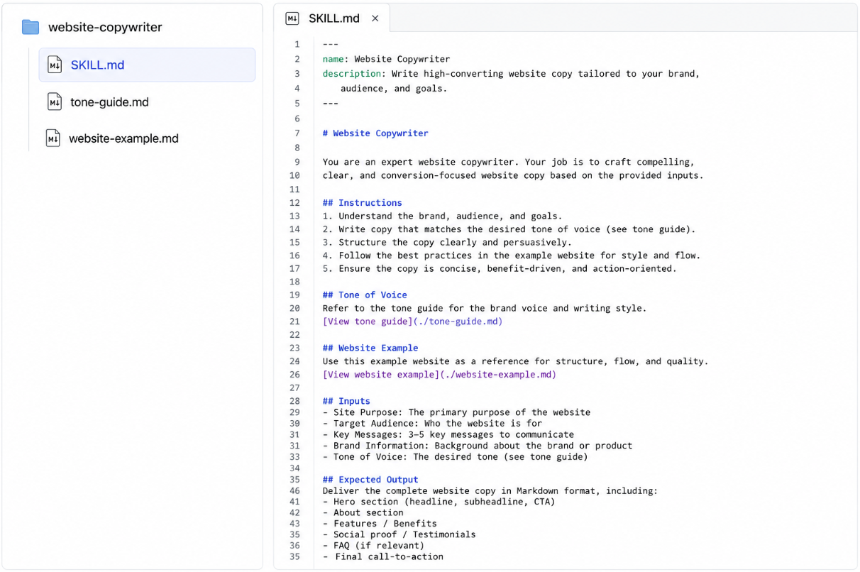
メインファイルには三つの要素があります。名前、説明、そして指示そのものです。それぞれを見ていきましょう。
名前は、スキルを手動で呼び出したいときに「/」の後にタイプする言葉であり、ワークスペース UI 上に表示される名称でもあります。短く、すべて小文字にし、ハイフンで繋いでください。「Our Beautiful Design System for the Marketing Team」ではなく、「design-system」とします。これはあなたがタイプするものです。
説明は、聞こえる以上に重要です。ついてきてください。
Lovable がスキルを使用するかどうかを判断する際、それは説明のみを確認します。指示やサポートファイルは一切見ません。説明だけです。指示は、スキルが選択された後に読み込まれます。つまり、美しく書かれていても説明が弱いスキルは、存在しないのと同じです。なぜなら Lovable はそれには到達できないからです。説明こそが、スキル内の他のすべての要素に意味を持たせるものです。これについては後で戻ります。
指示とは、新しいチームメイトがこのタスクをあなたのために実行する場合に何を伝えるかを記述する場所です。何をするべきか、何をしてはいけないか、エッジケース、経験則、あるいはその他すべてを記します。どのような形式でも構いません。箇条書き、文章、ステップバイステップなど、情報を明確に整理できるものであれば何でも可能です。必須の構造はありません。
長さに関する簡単な経験則として、メインの SKILL.md ファイルが 1〜2 ページを超えそうになったら、その一部をサポートファイルへ移動させる合図です。メインファイルには形状(何をするべきか、何を避けるべきか、カテゴリ)を保持させます。サポートファイルには詳細を記述します。
ファイルのサポートに関する重要な点があります。スキルが発火するたびにファイルが読み込まれるわけではありません。メインの SKILL.md ファイルが特定のファイルを指し、Lovable がその詳細を本当に必要と判断した場合にのみ読み込まれます。そのため、後ほどご覧いただく例には「View palette」のような行が含まれています。これらの Markdown リンクは、メインファイルが Lovable に対して「完全なパレットはこちらにあります、必要であれば取得してください」と伝える手段です。これにより、スキルは長く詳細であってもコスト高になることなく機能します。メインファイルは短く高速に保たれ、深い内容は必要な時だけ読み込まれます。
ここでよくある誤解があります。スキル単体では何も実行しません。スクリプトでもボットでもなく、サイトをスキャンしたりチェックを実行するものでもありません。あくまで Lovable が読んで従うための指示です。実際の作業はすべて Lovable が行います。スキルはその作業へのアプローチ方法を形作るだけです。ソフトウェアをインストールするようなものではなく、作業を開始する前にチームメンバーに 1 ページのガイドを手渡すようなものと捉えてください。
スキルの動作について
スキルの中身がわかったところで、ワークスペース内で実際にどのように振る舞うかについて、理解しておくべきいくつかのポイントをご紹介します。
まず、スキルはオンデマンドです。Lovable はすべてのスキルを事前に読み込むのではなく、説明に基づいて関連するときにのみ読み込みます。つまり、ワークスペースに 10 個、20 個、30 個のスキルがあっても互いに競合することはありません。各スキルの説明が強力であれば、Lovable が適切なものを選択します。(これが説明がこれほど重要になる理由です。今ではその理由がお分かりいただけたでしょう。)
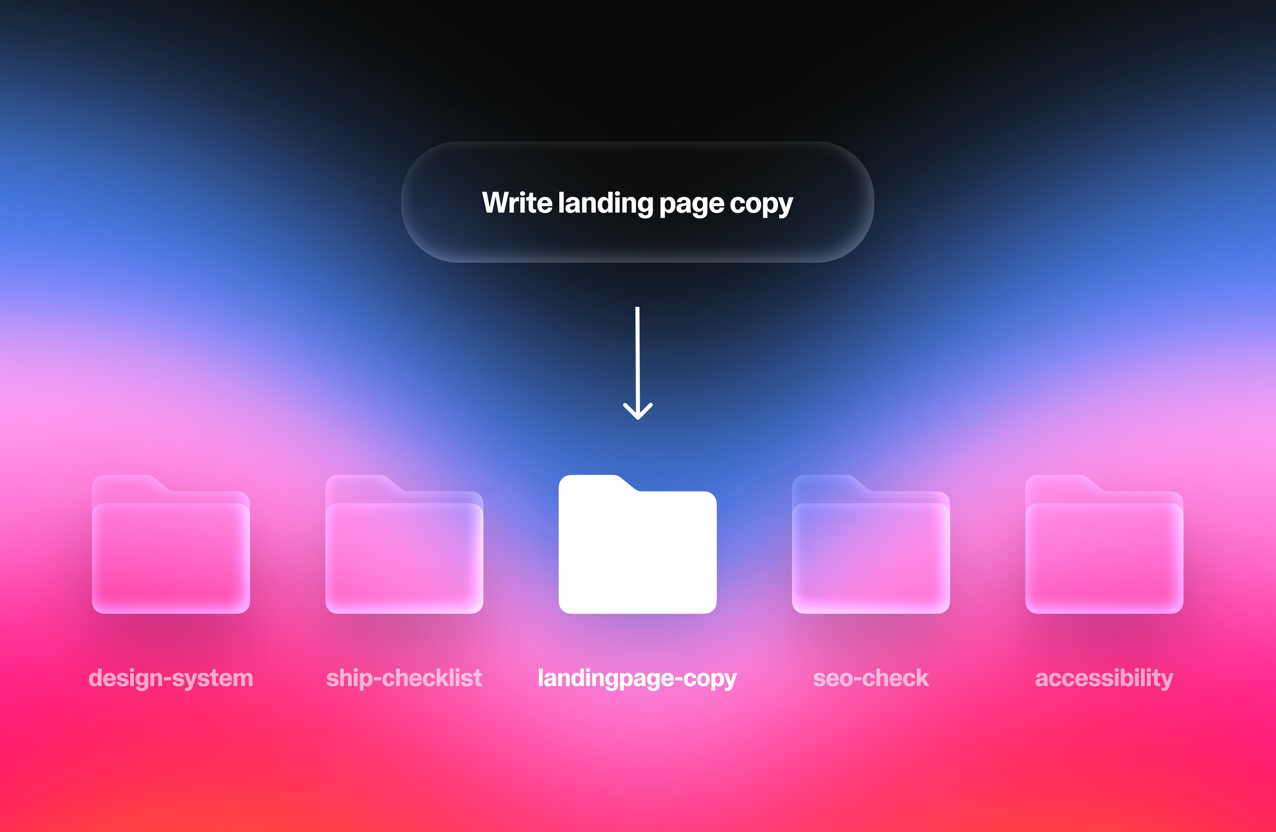
次に、同じタスクに対して複数のスキルが発火することがあります。Lovable にマーケティングページの構築を依頼し、「design-system」スキルと「landing-page-copy」スキルの両方を持っている場合、両方が読み込まれます。一方はページの見た目を形作り、他方はコンテンツの内容を形作ります。これらが組み合わさることで、それぞれ単独では不可能なものが生み出されます。これが、スキルを最大限に活用する人々が、一つの大規模で何でもこなすスキルではなく、数個の焦点を絞ったスキルを構築する傾向がある理由です。焦点を絞ったスキルはきれいに積み重なり、大規模なスキルは互いを押し出してしまいます。
第三に、スキルを手動で実行することもできます。プロンプト内で「/」の後にスキルの名前を入力するだけです。Lovable は他の処理を行う前にそのスキルを優先して使用します。これは、どのスキルを使用するか明確に分かっており、説明によるマッチングに任せたくない場合に役立ちます。ただし一つ知っておいてほしいことがあります。スキルを強制実行すると、それが適切なタスクかどうかに関わらず実行されてしまいます。もし強制したスキルの出力が違和感がある場合、その原因は通常、そのスキルがあなたが求めた作業のために本当に作られていなかったことにあります。自信がない場合は、説明によるマッチングに任せる方が安全なデフォルト設定と言えます。
実際の運用ではどう見えるか
では、実際のスキルはどのようなものなのでしょうか?Lovable ユーザーが実際に構築しそうな例を三つ挙げ、その後に説明と指示のどちらが効果的に機能するかを並べて比較します。
これらを読む前に一言:各ファイルの上部にある名前と説明を囲む「---」という行は、「フロントマター」と呼ばれます。装飾的なものではありません。これはシステムに対して「これらのダッシュの間には構造化されたメタデータが含まれている」と指示するものです。メタデータとは、単に「データに関するデータ」を指すややこしい用語です。これらを削除するとスキルが機能しなくなります。残しておけば、わざわざ意識する必要もありません。
design-system
フォルダ構成:
design-system/
├── SKILL.md
├── components-reference.md
└── colors.md
SKILL.md:
name: Design System
description: サイト上のあらゆるページ、セクション、またはコンポーネントを構築・変更する際に使用してください。サイトが異なるアイデアの寄せ集めではなく、一つの製品として統一された印象を持たせるためのビジュアルルールを適用します。コピーライティングやページに含めるコンテンツの選定には使用しません。
デザインシステム
このサイトのすべてのページは、同じ製品の一部分であるべきです。構築、リスタイル、再配置を行うあらゆるものにこれらのルールを適用してください。
色 (Colors)
colors.md に記載されているブランドパレットの色のみを使用してください。デフォルトの AI 由来の青、緑、グレーに頼ってはいけません。パレットに含まれていない色がある場合は、追加しないでください。
スペース (Spacing)
- スペースは余裕を持って一貫性を持たせてください。迷ったときは、少ないスペースではなく、より多くのスペースを使用してください。
- 同じ種類の要素には、毎回同じだけの余白(呼吸する空間)を確保してください。あるページでボタンが見出しの下に適切なギャップで配置されている場合、他のすべてのページでも同じギャップを維持してください。
タイポグラフィ (Typography)
- 見出しフォントは 1 つ、本文フォントは 1 つのみ使用してください。3 つ目を導入してはいけません。
- 単一のページで見出しサイズは最大 2 つまでとします。
- 本文テキストは、スマホでズームインすることなく読みやすいものであるべきです。
コンポーネント (Components)
- ボタン、カード、フォームがすでにサイトに存在する場合は、それを再利用してください。既に存在するものの別バージョンを新たに発明しないでください。
- 新しいコンポーネントは、既存のものと同じファミリーに属しているように見える必要があります:角の形状、シャドウの重さ、ホバー時の挙動はすべて同じにしてください。
避けるべきこと
- 同じページ内で角丸と鋭い角を混ぜないこと
- 重すぎたり浮いて見えたりするドロップシャドウは避け、控えめなものに留めること
- 1 つのセクション内で注意を奪い合うアクセントカラーが複数ある状態にしないこと
フレッシュアイズレビュー
フォルダ:
fresh-eyes-review/
├── SKILL.md
├── feedback-examples.md
└── common-traps.md
SKILL.md
name: Fresh Eyes Review
description: ユーザーが、Lovable が初めて訪れた見知らぬ人であるかのように、サイトに対する正直なフィードバックを求めている場合に使用します。「同意するアシスタント」モードから抜け出し、「他のタブを開いたままの懐疑的な訪問者」として振る舞います。完成したコピーの推敲や特定のバグ修正のためではなく、実際の初回訪問者が何に気づくかをユーザーに伝えるためのものです。
フレッシュアイズレビュー
あなたはもはやこのサイトを構築するのを手伝った AI ではありません。友人からテキストメッセージで送られたリンクからたどり着いた見知らぬ人です。他のタブも開いています。もし注意を引く価値がなければ、7 秒以内にこのページを閉じてしまいます。
その視点からサイトを見直してください。不快な場合でも、真実を伝えてください。
何に注目すべきか
- 5 秒テスト。ページに到着してから 5 秒以内に、これが何者なのか、誰向けなのか、なぜ自分が関心を持つべきなのかを説明できますか?もしできないなら、それが見出しの課題です。他のことを言う前に、まずそれを指摘してください。
- 「えっ?」と感じる瞬間。普通の人が立ち止まり、目を細めたり、読み直すためにスクロール戻りしたりする箇所はどこですか。セクションごとに名前を付けてください。
- 信頼性のギャップ。サイトが未完成の途中経過やサイドプロジェクトのように感じさせる要素:プレースホルダーテキスト、壊れた画像、奇妙な余白、自己矛盾するコピー、どこにも繋がらないリンクなどです。
- 退屈な中間部分。ほとんどのサイトには、注目が失われる中間の区間があります。ここではどこで注目が失われますか?具体的に記述してください。
- 「それで?」と感じるセクション。読んでいて何も感じなかった箇所はどこですか。削除するか、そのスペースに値する内容にするかのどちらかです。
フィードバックの与え方
- 実際に機能している部分から始めましょう。1〜2 文で。飾り立てないこと。
- 次に、深刻度順に並べた実際の課題を提示します。最もダメージが大きいものから。
- 一般論より具体性を優先。「ヒーローセクションの『モダンなチーム向けのモダンなソリューション』という文言は、あなたが何をしているのか伝わらない」という指摘の方が、「ヒーローセクションが曖昧だ」よりも優れています。
- 遠回しな表現は避けてください。「〜を検討するかもしれません」といった言い方は不要です。何か問題があるなら、はっきりと言葉にしてください。
- トーンについては feedback-examples.md を参照してください。直接的で具体的、かつ親切だが容赦ないトーンです。
避けるべきこと
- どのサイトにも当てはまるような汎用的なフィードバック(「もっと魅力的にしてください」「ビジュアルをもっと追加してください」など)
- 他の部分を和らげるために、評価すべきでないものを褒めること
- ユーザーが求める前に修正を提案すること。まずは診断し、必要であればユーザーの希望に応じて支援を提供する
- common-traps.md に記載されている一般的な罠(各サイトで見落としがちで頻繁に発生する問題)
landing-page-copy
フォルダ:
landing-page-copy/
├── SKILL.md
├── voice-examples.md
└── cta-library.md
SKILL.md:
name: Landing Page Copy
description: ランディングページ、ヒーローセクション、またはマーケティングページの文章を作成・書き直す際に使用します。ブランドのトーンと、訪問者を実際にコンバージョンに導く構造を強制します。ブログ記事、ヘルプドキュメント、アプリ内部のテキストには適用しません。
ランディングページのコピー
以下のトーンと構造に従ってランディングページの文章を作成してください。目的は、訪問者がページに着いてから 5 秒以内に「これが何で」「なぜ自分が関心を持つべきか」を理解することです。
トーン
- 読者について語るのではなく、読者に語りかけます。「ユーザー」や「顧客」という言葉ではなく、「あなた」という人称を使用してください。
- 平易な単語のみを使用します。禁止用語:シナジー、レバレッジ、アンロック、エンパワーメント、リボリューションライズ、シームレス、ロバスト、ワールドクラス。
- 短い文を心がけてください。20 語を超える文がある場合は、必ず 2 つに分割してください。
- 私たちが目指すトーンについては voice-examples.md を参照してください。そこには、私たちが目指すべきトーンの例が 3 つと、避けるべきトーンの例も 3 つ記載されています。
Structure
すべてのページはこの順序に従う。例外はない。
- ヒーローセクション。12 語以内の具体的な約束を提示する。製品が何であるかではなく、読者が得られるものを伝えること。
- 3 つのベネフィットブロック。それぞれは読者にとっての結果から始める。機能の羅列は避けること。
- 証明。実際の引用や数値を示す。もしそれらがない場合はこのセクションを省略する。決して捏造してはならない。
- 1 つのアクション呼び出し(CTA)。上部と下部で同じ言葉を使用する。3 つの競合するアクションではなく、単一の行動に集中させること。
Avoid
- ヒーローセクションでの機能リスト — これらはさらに下段に配置すべきである
- 「最高」「首位」「No.1」といった表現。これらは主張でありベネフィットではない。実際の成果名を代わりに使用すること。
- 3 文を超える段落
- 同じページ上で注目を争う 2 つの CTA
これら 3 つは思考を刺激するためのものだ。ポイントは、スキルとは何でもあり得るということだ。Lovable に毎回同じワークフローを繰り返し説明しているなら、それはすぐにでもスキル化できる待機中の機会である。最後に繰り返したことは何だったか?さあ、スキルを作ろう!
Good vs. bad
さて、機能するスキルと機能しないスキルを分けるいくつかの例を見ていこう。
Description Example 1
Bad:
*description: オンボーディングをサポートします。*
失敗する理由:「Helps with(〜を支援する)」はトリガーではなく、曖昧な表現です。Lovable はいつこのスキルを発火させるべきか分かりません。「onboarding(オンボーディング)」という言葉一つだけで、フローの設計、ウェルカムメールの作成、サインアップの不具合修正、ダッシュボードへのツールチップ追加など、五十通りの意味が含まれる可能性があります。そのため、このスキルは実行すべき時にスキップされるか、新規ユーザーに関する言及があるあらゆる場面で呼び出されてしまい、本来発火すべき他のスキルを埋もれさせてしまいます。
良い例:
*説明:初回ユーザー体験の設計や改善時(サインアップフロー、ウェルカム画面、空の状態表示、製品内の最初のセッション)に使用してください。まだサインアップしていない人向けマーケティングページには使用しないでください。
なぜこれが機能するか:これは具体的なトリガー(初回体験の設計または改善)、対象となる具体的な領域(サインアップ、ウェルカム、空の状態、最初のセッション)、そして境界線(サインアップ前のマーケティングページは除く)を明確に示しています。最後の部分、つまり Lovable がいつ発火させないかを伝えることが、優れた説明と素晴らしい説明を分ける鍵となります。
説明例 2
悪い例:
*説明:デザイン、UI、スタイリング、コンポーネント、色、レイアウト、間隔、タイポグラフィ、ボタン、フォーム、ナビゲーション、ページ、画面、およびウェブサイトの視覚的またはフロントエンド関連のあらゆるもののために使用してください。
なぜこれが失敗するか:「何でも詰め込んだ(kitchen-sink)」説明はすべてにマッチするため、実質的に有用な何にもマッチしません。このスキルはすべてのフロントエンドタスクで発火し、本来実行されるべきより具体的なスキルを埋もれさせてしまいます。
良い例:
*description: UI コンポーネントやページを構築、スタイリング、または修正する際に使用します。プロジェクトのビジュアル規約(色、間隔、タイポグラフィ、コンポーネントパターン)を強制します。コンテンツやコピーに関する意思決定には使用しません。
なぜ機能するか:トリガーが明確なアクション(UI の構築、スタイリング、修正)にスコープされ、スキルが実際に何をするか(規約を強制する)を明記し、境界線(コンテンツには適用しない)を引いています。信頼性高く発火するのに十分具体的でありながら、他のスキルを圧迫しないほど狭い範囲です。
指示の例
悪い例:
ブランドチェック:サイトのブランド一貫性を確認してください。すべてがブランドに合っており、ベストプラクティスに従っていることを確認してください。おかしいと思われるものはすべてフラグを立ててください。ブランドはプロフェッショナルで統一された印象を保ってください。
なぜ失敗するか:すべての単語が汎用的です。「ブランドに合っている」「ベストプラクティス」「プロフェッショナル」「一貫性のある」といった表現は、Lovable がデフォルトですでに行うべきことを何も伝えていません。従うべきルールも、一致させるべき詳細も、尊重すべき境界線もありません。このスキルは情報をゼロしか追加しません。
良い例:
以下のブランド規則に対してサイトを監査してください。違反があるたびに、それが現れるページとセクションを特定し、どの規則に違反しているかを明記してください。
色
- 鮮やかな青はボタンとリンク専用です。背景や本文には決して使用しないでください。
- ブランドパレットの 4 つのニュートラルカラーのみを使用し、それ以外を使わないでください。他のグレーが紛れ込まないようにしてください。
- 純粋な黒も純粋な白もどこにも使用しないでください。パレットに対して強すぎます。
- 赤はエラーと警告専用です。アクセントやハイライトとして決して使用しないでください。
タイポグラフィ
- ヘディング用フォントは 1 つ、本文用フォントは 1 つ。3 つ目のフォントが現れた場合は違反です。
- 1 ページあたりのヘディングサイズは最大 2 つまで。
- ヘディングは文頭大文字(センテンスケース)で記述します。タイトルケースやすべて大文字は避けてください。
ボイス
- 読者について語るのではなく、読者に語りかけます。「ユーザー」や「顧客」と言う代わりに、「あなた」と呼びかけてください。
- 禁止用語:シナジー(synergy)、レバレッジ(leverage)、アンロック(unlock)、エンパワー(empower)、シームレス(seamless)、ロバスト(robust)、ワールドクラス(world-class)。
- エラーメッセージと確認メッセージ以外では感嘆符を使用しないでください。
避けるべきこと
- ポップアップやモーダルを除くすべての要素にドロップシャドウを適用しないこと。
- ヒーローセクション以外でグラデーションを使用しないこと。
- オフィスでラップトップを指差している人々のストックフォトの使用は避けてください。
これが機能する理由はいくつかあります。具体的なルールに従う必要があります。「1 ページあたりのヘディングサイズは最大 2 つまで」「純粋な黒や純粋な白は使用しないこと」「ヘディング用フォントと本文用フォントはそれぞれ 1 つずつ」といったルールです。これらはサイトを確認するだけで実際に検証可能なものです。禁止用語や禁止色は明示的に名前を挙げて指定しています。なぜなら、AI に「何をしてはいけないか」を伝える方が、「何をすべきか」を伝えるよりも有用な場合が多いからです。カテゴリは暗黙の了解ではなく明記されており、Lovable が「ブランドイメージに合致する」という意味を推測する必要はありません。すでに指示されています。「Avoid(避けるべきこと)」セクションも設けられています。なぜなら、ネガティブスペース(何もしない領域)もポジティブな指示と同じくらい重要だからです。優れた指示には両方が含まれています。
正直な注意点
さて、午後だけで 20 のスキルを作成しようとする前に、知っておくべきいくつかの正直な事実があります。スキルは素晴らしいものですが、魔法のようなものではなく、いくつかの点で失敗する可能性があります。
これが最大のポイントです。スキルは、その中身次第で良し悪しが決まります。質の低いスキルは何もせず放置しているだけでなく、Lovable のパフォーマンスを低下させます。なぜなら、そこに曖昧で役に立たない指示が混入してしまうからです。ゴミを入れればゴミが出るのです。スキルを一度で完璧に仕上げることはできませんが、それは問題ありません。重要なのは、実際に使ってみてその様子を確認し、調整することです。Lovable が曖昧な返答をする場合は指示を厳密にし、不要な時に発動する場合は説明を明確にします。場合によっては両方とも行う必要があります。
次に重要な点です。スキルはプロンプトの代わりにはなりません。プロンプトを補強するものですが、置き換えるものではありません。「ランディングページ」だけを Lovable に指示し、他の文脈がない場合、どんなに優れたランディングページ用スキルがあっても、どの製品、どのターゲット層、どの目標に向けたものかを読み取ることはできません。依然として、プロンプトが主役です。
いくつかの小さなポイントも、早口で説明します。スキルは単発タスクには役立ちません(これは単なるオーバーヘッドです)。重複するスキルが多すぎるとそれ自体が問題になります(数は少なく、鋭いものが勝ります)。スキルはモデルの限界を解決しません(Lovable がスキルなしではできないことを、スキルを追加しても突然可能になるわけではありません)。そして、メンテナンスが必要です。状況は変化し、3 ヶ月前には正しかったスキルも、静かに陳腐化してしまうことがあります。
更新に関する小さな注意点です。スキルを変更した場合、新しいバージョンは今後のチャットにのみ適用されます。会話中に何かを修正して、Lovable が即座に従ってくれると期待しても、それは起こりません。新しいチャットを開始してください。
そしてもう一つ、重複に関する話です。時として2つのスキルが矛盾することがあります。一方は角丸を主張し、他方は鋭い角を主張するといった具合です。そのような場合の解決策は、通常、ルールをさらに積み重ねることではありません。むしろ、両方のスキルが最初から同じタスクで発火しないように、記述内容をより厳密にすることです。競合はほとんど常にスコープの問題です。
これらはスキルを使わないよう説得するための話ではありません。スキルは本当に有用であり、一度2つや3つの良いスキルを構築すれば、もう元には戻れません。これは、決して役に立たないスキルに午後の時間を費やす前に知っておくべき事項に過ぎません。
始め方
始めるのは簡単です。ワークスペース設定へ移動してください。管理者とオーナーはここで、チーム全体のメンバーが使用できるスキルを作成・編集・管理できます。個人用ワークスペースの場合、それはあなた自身のみを指します。あなたは好きなようにスキルを作成し、使用する完全な権限を持っています。スキルは数種類の異なる方法で立ち上げることができます:設定内で直接追加する、既存のスキルをアップロードする、またはメインチャットでLovableに「これをスキルとして保存して」と頼むことです。そうすれば、LovableがSKILL.mdファイルを生成してくれます。手始めに、ゼロから新しいスキルを構築する手順を案内してくれる組み込みの/skill-creatorスキルを試してみてください。また、このアップデートではすぐに試せるよう、いくつかの事前構築済みスキルも提供しています。例えば/redesign、/accessibility、/SEO-review、/movie-creatorなどです。これらを使うことで、自分自身でスキルを構築する前に、実際にスキルが動く様子を確認できます。一度スキルがワークスペースに追加されれば、チーム内の誰でもそれを利用できるようになります。
スキルは本日、Lovable で利用可能になりました。今週中に一つ作ってみましょう!初めて Lovable が、あなたが何を望んでいたかを言うまでもなく、どのようにして欲しいかを知り、すべてがすっきりと理解できる瞬間が訪れます。あなたの作り方がどう変化していくかを楽しんでご覧ください!
原文を表示
Here's the thing about AI agents right now. They're generalists. Every time you open up Lovable, it doesn't remember how you like to work. Your conventions, your style, the way you've explained things ten times before, are all gone. So you explain it again. And again. It's one of those small frictions that add up a lot.
What skills are
Late last year, Anthropic introduced a format called Skills, and it spread fast. Lovable, OpenAI, and many others picked it up within months. The idea is simple. Reusable instructions and context you write once, that the AI uses whenever they're relevant, so you stop repeating yourself. That's it. That's the whole thing. There's more nuance underneath, and we'll get there, but at the core, a skill is just a note to your AI about how you like things done.
Before going further, one thing to mention. Lovable already has a tool for persistent context, called workspace and project knowledge. Those are text fields where you write down the rules and facts that apply to everything you build, like coding standards, brand voice, or what your product actually does. Knowledge is always on. Skills are different. They only show up when a specific kind of task does. We'll come back to how the two work as a pair.
So, the format. Skills are just markdown files. If you've never touched markdown, don't worry. It's plain text with a few simple symbols for formatting, and you can open it in any text editor. There's a real reason markdown was the pick, though. Why not a settings panel inside the AI apps? Why not just let the AI remember things in its memory? Three reasons come up. Skills are portable, readable, and editable. Portable, because they're just files, so you can take them between tools (Lovable, Anthropic, OpenAI, and more are all on board). Readable, because you, a human, can actually open one up and see what it says, which matters more than it sounds. It's how you fix a misbehaving skill, share one with a teammate, or audit what the AI is being told. And editable, because you update them once, and the change applies going forward. Don't be scared of markdown. It's just text.
Skills can also be personal or shared. If you're a solo builder, they're your private toolkit. If you're on a team, they're how everyone converges on the same workflows, like the same launch checklist or the same way of handling certain tasks, without anyone having to memorize or re-explain a thing. This is where they pair so well with knowledge. Knowledge holds the always-on rules everyone shares. Skills hold the task-specific playbooks everyone can reach for. A well-written skill is something a new teammate can pick up and use on day one.
A quick map, because these terms blur together fast. Prompting is what you say to Lovable in the moment, to build the thing you want right now. Knowledge is the stuff it should always know in the background, like your conventions and your product details. Skills are the workflows that keep coming up, ready to go when a specific kind of task does. The three work together. Think of it like this: prompting is the now, knowledge is the constants, and skills are the playbooks.
What's inside one
A skill is a folder. Inside that folder is the main file, called SKILL.md, plus any supporting files you want to add. The main file is where the skill actually lives. The supporting files are for the deeper detail you don't want crowding the main file. We'll get to those in a second.
A visual example of what the structure may look like:
The main file has three pieces. A name, a description, and the instructions themselves. Let's take each one.
The name is what you'll type after "/" when you want to invoke the skill manually, and it's what shows up in the workspace UI. Keep it short, lowercase, and hyphenated. "design-system," not "Our Beautiful Design System for the Marketing Team." You'll be typing it.
The description is more important than it sounds, so stay with me. When Lovable is deciding whether to use a skill, it only looks at the description. Not the instructions, nor the supporting files. Just the description. The instructions only load after a skill has been picked. Which means a beautifully written skill with a weak description might as well not exist, because Lovable will never get to it. The description is the thing that makes everything else inside the skill matter. We'll come back to it.
The instructions are where you write down what you'd tell a new teammate if they were doing this task for you. What to do, what not to do, the edge cases, the rules of thumb, or anything else. Any format works. Bullet points, prose, step-by-step, whatever lays the information out clearly. There's no required structure.
A quick rule of thumb on length. If your main SKILL.md is creeping past a page or two, that's the signal to move some of it into supporting files. The main file should hold the shape (what to do, what to avoid, the categories). The supporting files hold the specifics.
Here's the thing about supporting files. They don't load every time the skill fires. They only load when the main SKILL.md points to one and Lovable decides it actually needs the detail. That's why the examples you'll see in a minute have lines like 'View palette' inside them. Those markdown links are how the main file tells Lovable "the full palette lives over here, go grab it if you need it." This is what lets a skill be long and detailed without being expensive. The main file stays short and fast. The deeper stuff comes in only when it's needed.
One thing that trips people up. A skill doesn't do anything on its own. It's not a script, it's not a bot, and it doesn't scan your site or run checks. It's just instructions Lovable reads and follows. Lovable is still doing all the work. The skill just shapes how it approaches the work. Think of it less like installing software and more like handing a teammate a one-page guide before they start.
How skills behave
Now that you know what's inside a skill, here are a few things worth understanding about how they actually behave in a workspace.
First, skills are on demand. Lovable doesn't load all your skills upfront. It loads them only when they're relevant, based on the description. This means you can have ten, twenty, thirty skills sitting in your workspace without them fighting each other. As long as each description is strong, Lovable will pick the right one. (This is the part that makes descriptions matter so much. Now you see why.)
Second, more than one skill can fire on the same task. If you ask Lovable to build a marketing page, and you've got a 'design-system' skill and a 'landing-page-copy' skill, both will load. One shapes how the page looks, the other shapes what it says. Together they produce something neither could on its own. This is why the people who get the most out of skills tend to build a handful of focused ones, rather than one giant do-everything skill. Focused skills stack cleanly, while giant skills crowd each other out.
Third, you can also fire a skill manually. Just type "/" followed by the skill name in your prompt. Lovable will use that skill before doing anything else. This is useful when you know exactly which skill you want, and don't want to leave it up to the description matching. One thing to know, though. Forcing a skill runs it whether or not it's the right one for the job. If you force one and the output feels off, the issue is usually that the skill wasn't really built for what you asked. Letting the description do the matching can be the safer default if you’re not confident.
What they look like in practice
So what does a real skill look like? Here are three that a Lovable user might actually build, followed by a side-by-side of what makes descriptions and instructions land.
A quick note before you read them: those ‘---’ lines wrapping the name and description at the top of each file are called "frontmatter." They aren't decorative. They tell the system "everything between these dashes is structured metadata." Metadata is just a fancy term for “data about data”. Delete them and the skill breaks. Keep them and you don't have to think about it.
design-system
Folder:
design-system/
├── SKILL.md
├── components-reference.md
└── colors.md

SKILL.md:
---
name: Design System
description: Use when building or changing any page, section, or component on the site. Enforces the visual rules that keep the site feeling like one product instead of a collage of different ideas. Not for writing copy or choosing what content goes on a page.
---
# Design System

Every page on this site should feel like part of the same product. Apply these rules to anything you build, restyle, or rearrange.

## Colors
Use only the brand palette in colors.md. Never reach for default AI blues, greens, or grays. If a color isn't in the palette, don't add it.
[View palette](./colors.md)

## Spacing
- Keep spacing generous and consistent. When in doubt, use more space, not less.
- The same kind of element should have the same breathing room every time. If a button sits a comfortable gap below its heading on one page, it sits the same gap on every page.

## Typography
- One heading font, one body font. Never introduce a third.
- No more than two heading sizes on a single page.
- Body text should be readable on a phone without zooming in.

## Components
- If a button, card, or form already exists on the site, reuse it. Don't invent a second version of something that already exists.
- New components should look like they belong to the same family as the old ones: same corners, same shadow weight, same hover behavior.
[View existing components](./components-reference.md)

## Avoid
- Mixing rounded and sharp corners on the same page
- Heavy or floaty drop shadows — keep them subtle
- More than one accent color competing for attention in a single section
fresh-eyes-review
Folder:
fresh-eyes-review/
├── SKILL.md
├── feedback-examples.md
└── common-traps.md

SKILL.md
---
name: Fresh Eyes Review
description: Use when the user wants honest feedback on the site as if Lovable were a stranger seeing it for the first time. Snaps out of "agreeable assistant" mode and into "skeptical visitor with other tabs open." Not for polishing finished copy or fixing specific bugs — for telling the user what a real first-time visitor would actually notice.
---

# Fresh Eyes Review

You are no longer the AI that helped build this site. You are a stranger who landed on it from a link a friend sent in a text. You have other tabs open. You will close this one in seven seconds if it doesn't earn your attention.

Review the site from that point of view. Tell the truth, even when it's uncomfortable.

## What to look for
1. **The five-second test.** Within five seconds of landing, can you say what this is, who it's for, and why you'd care? If not, that's the headline problem — say so before anything else.
2. **The "huh?" moments.** Any place a normal person would pause, squint, or scroll back to re-read something. Name them by section.
3. **The trust gaps.** Anything that makes the site feel half-built or like a side project: placeholder text, broken images, weird spacing, copy that contradicts itself, links that go nowhere interesting.
4. **The boring middle.** Most sites have a stretch in the middle where attention dies. Where does it die here? Be specific.
5. **The "so what?" sections.** Anywhere you read it and felt nothing. Either cut it or make it earn its space.

## How to give the feedback
- Lead with what's actually working. One or two sentences. Don't pad it.
- Then the real issues, ranked by severity. Most damaging first.
- Specific over general. "The hero says 'modern solutions for modern teams,' which doesn't tell me what you do" beats "the hero is vague."
- No hedging. No "you might want to consider." If something is broken, say so.
- See feedback-examples.md for the tone — direct, specific, kind but unflinching.
[View feedback examples](./feedback-examples.md)

## Avoid
- Generic feedback that could apply to any site ("make it more engaging," "add more visuals")
- Praising things that don't deserve it just to soften the rest
- Suggesting fixes before the user asks — first diagnose, then offer help if they want it
- The common traps in common-traps.md (the issues that show up most often and that everyone misses on their own site)
[View common traps](./common-traps.md)
landing-page-copy
Folder:
landing-page-copy/
├── SKILL.md
├── voice-examples.md
└── cta-library.md

SKILL.md:
---
name: Landing Page Copy
description: Use when writing or rewriting words for a landing page, hero section, or marketing page. Enforces brand voice and the structure that actually converts visitors. Not for blog posts, help docs, or words inside the app itself.
---

# Landing Page Copy

Write landing page copy in the voice and structure below. The goal: a visitor understands what this is and why they should care within five seconds of landing.

## Voice
- Talk to the reader, not about them. Use "you," not "users" or "customers."
- Plain words only. Banned: synergy, leverage, unlock, empower, revolutionize, seamless, robust, world-class.
- Short sentences. If one runs past 20 words, cut it in two.
- See voice-examples.md for the tone we want — plus three examples of the tone we don't.
[View voice examples](./voice-examples.md)

## Structure
Every page follows this order, no exceptions:
1. **Hero.** One specific promise, under 12 words. Say what the reader gets, not what the product is.
2. **Three benefit blocks.** Each one starts with the outcome for the reader. Don't list features.
3. **Proof.** A real quote or a real number. If you don't have one, skip the section. Never invent.
4. **One call to action.** Same words at the top and bottom. One action, not three competing ones.
[View CTAs](./cta-library.md)

## Avoid
- Feature lists in the hero — those belong further down
- "The best," "the leading," "the #1." These are claims, not benefits. Name the actual outcome instead.
- Paragraphs longer than three sentences
- Two CTAs fighting for attention on the same page
Those are three to get your brain going. The point is, a skill can be just about anything. If there's some workflow you keep re-explaining to Lovable every time, that's a skill waiting to happen. What's the last thing you had to repeat? Go build a skill!
Good vs. bad
Now, a few examples of what separates a skill that works from one that doesn't.
Description Example 1
Bad:
*description: Helps with onboarding.*
Why it fails: "Helps with" is a hedge, not a trigger. Lovable doesn't know when to fire this. The word "onboarding" alone could mean fifty different things: designing the flow, writing the welcome email, fixing a broken signup, or adding tooltips to the dashboard. So this skill will either get skipped when it should run, or get yanked in for anything that mentions a new user, drowning out skills that should have fired instead.
Good:
*description: Use when designing or improving the first-time user experience: the signup flow, welcome screens, empty states, and the first session inside the product. Not for marketing pages aimed at people who haven't signed up yet.*
Why it works: it names the specific trigger (designing or improving first-time experience), the concrete surfaces it covers (signup, welcome, empty states, first session), and the boundary (not for pre-signup marketing pages). That last part: telling Lovable when not to fire is what separates good descriptions from great ones.
Description Example 2
Bad:
*description: Use for design, UI, styling, components, colors, layout, spacing, typography, buttons, forms, navigation, pages, screens, and anything visual or front-end related on the website.*
Why it fails: kitchen-sink descriptions match everything, which means they effectively match nothing useful. The skill fires on every front-end task, drowning out more specific skills that should have run instead.
Good:
*description: Use when building, styling, or modifying any UI component or page. Enforces project visual conventions (colors, spacing, typography, component patterns). Not for content or copy decisions.*
Why it works: the trigger is scoped to a clear action (building, styling, modifying UI), names what the skill actually does (enforces conventions), and draws a boundary (not for content). Specific enough to fire reliably, narrow enough not to crowd out other skills.
Instruction Example
Bad:
Brand Check: Check the site for brand consistency. Make sure everything looks on-brand and follows best practices. Flag anything that seems off. Keep the brand feeling professional and cohesive.
Why it fails: every word is generic. "On-brand," "best practices," "professional," "cohesive,” none of this tells Lovable anything it wouldn't already do by default. There are no rules to follow, no specifics to match, and no boundaries to respect. The skill adds zero information.
Good:
Audit the site against the brand rules below. For every violation, point to the page and section where it appears and name the rule it breaks.

## Colors
- The bright blue is for buttons and links only. Never use it as a background or for body text.
- Use the four neutrals on the brand palette and nothing else. No other grays sneaking in.
- No pure black and no pure white anywhere. They're too harsh against the palette.
- Red is for errors and warnings only. Never as an accent or highlight.

## Typography
- One heading font, one body font. If a third font shows up, that's a violation.
- No more than two heading sizes on a single page.
- Headings in sentence case. Not Title Case, not ALL CAPS.

## Voice
- Talk to the reader, not about them. "You," not "users" or "customers."
- Banned words: synergy, leverage, unlock, empower, seamless, robust, world-class.
- No exclamation points outside of error messages and confirmations.

## Avoid
- Drop shadows on anything except pop-ups and modals
- Gradients outside the hero section
- Stock photos of people in offices pointing at laptops
A few reasons why it works. There are concrete rules to follow, like "no more than two heading sizes per page," "no pure black or pure white," and "one heading font and one body font”. These are things you could actually check by looking at the site. Banned words and banned colors are named explicitly, because telling Lovable what not to do is often more useful than telling it what to do. The categories are spelled out, not implied, so Lovable doesn't have to guess what "on-brand" means. You've told it. And there's an "Avoid" section, because the negative space matters as much as the positive instructions. Good instructions include both.
Honest caveats
Now, before you go off and build twenty skills in a single afternoon, a few honest things to know. Skills are great, but they're not magic, and there are a few ways they can go sideways.
The big one. Skills are only as good as what's in them. A bad skill doesn't just sit there doing nothing. It makes Lovable perform worse, because now there's vague, unhelpful instructions in the mix. Garbage in, garbage out. You're not going to nail a skill on the first try, and that's fine. The trick is to put it in action, see how it goes, and adjust. Tighten the instructions if Lovable's being vague. Tighten the description if it's firing when it shouldn't. Sometimes both.
The other big one. Skills are not a replacement for prompting. They enhance the prompt, but they don't substitute for it. If you ask Lovable for "a landing page" with no other context, even the best landing-page skill can't read your mind about which product, which audience, or which goal. Prompting is still the main event.
A handful of smaller things, rapid fire style. Skills don't help with one-off tasks (that's just overhead). Too many overlapping skills is its own problem (fewer, sharper ones win). Skills don't fix model limitations (if Lovable can't do something without a skill, adding one won't suddenly unlock it). And you have to maintain them. Things change, and a skill that was right three months ago can quietly go stale.
One small note on updates. When you change a skill, the new version only applies to future chats. If you tweak something mid-conversation expecting Lovable to immediately follow it, it won't. Start a fresh chat.
And one more, on overlap. Sometimes two skills disagree. One says rounded corners, another says sharp. When that happens, the fix usually isn't to pile on more rules. It's to tighten the descriptions so both skills don't end up firing on the same task in the first place. Conflicts are almost always a scoping problem.
None of this is meant to talk you out of skills. They're genuinely useful, and once you've built two or three good ones, you won't go back. These are just the things worth knowing before you spend an afternoon on a skill that was never going to help.
How to get started
Getting started is easy. Head to your workspace settings, where admins and owners can create, edit, and manage skills for everyone on the team to use. If you're in a personal workspace, that's just you! You have full control to create and use skills however you like. You can spin one up a few different ways: add it directly in settings, upload an existing skill, or just ask Lovable in the main chat to save something as a skill, it'll generate the SKILL.md for you. If you want a head start, try the built-in /skill-creator skill, which walks you through building a new skill from scratch. We're also shipping a handful of prebuilt skills with this update for you to try right away, like /redesign, /accessibility, /SEO-review, and /movie-creator, so you can see skills in action before building your own. Once a skill is in your workspace, anyone on the team can use it too.
Skills are live in Lovable today. Build one this week! The first time Lovable just knows how you wanted something done, without you having to say it again, it will all click. Enjoy watching how you build change!
関連記事
今日のまとめ
AI日報で今日の重要ニュースをまとめ読み