OpenRouter、エージェント・モデル別利用状況分析機能を公開
本文の状態
日本語全文を表示中
詳細モードで約11分の本文を読めます。
同じ出来事の情報源
この情報源を基点に整理
OpenRouter Blog
OpenRouter は、エージェント導入企業のコストと価値を可視化するため、エージェント・モデル・リクエスト単位での使用状況を追跡できる Activity ダッシュボードとベータ版 Analytics API を発表した。
AI深層分析を開く2026年8月17日 21:37
AI深層分析
キーポイント
詳細なコスト分析機能の提供
OpenRouter は新機能により、企業はエージェント、アプリ、チームメンバーごとの支出内訳を把握し、どのモデルやタスクがコストを駆動しているかを特定できるようになる。
キャッシュ効果とコスト削減の可視化
ダッシュボードではキャッシュヒット率やプロンプト/コンプリートトークンの内訳、キャッシュによる請求額削減効果を明確に示し、最適化の機会を提示する。
API を通じたデータ抽出と統合
提供されるベータ版 Analytics API を利用することで、開発者は自社のダッシュボードへデータを連携したり、ターミナル上でクエリを実行して即座に分析結果を得たりできる。
トレンド分析による異常検知
Trends 機能はサイズではなく変動順でデータをソートし、急増するエージェントや台頭中のモデル、組織全体へ広がりつつあるツールを早期に発見するためのパネルを提供する。
自由な分析ビューの構築
メトリクス、グループ化軸、集計時間軸、チャートタイプを組み合わせて任意の質問に答える視点を構築できる。
重要な引用
Every company that spent the last two years deploying agents is now asking the same question: what are they costing us, and which ones are worth it?
OpenRouter's Activity dashboard and beta Analytics API answer that question per agent, per model, per request.
Use it to spot a runaway agent, a new model gaining traction, or a tool spreading across your org.
Every card on Overview and Trends links into Explore, where you assemble the view yourself
編集コメントを表示
編集コメント
エージェント運用の成熟に伴い、コスト管理は単なる経費削減ではなく、戦略的なリソース配分の判断材料として不可欠なものとなっている。OpenRouter のようなプラットフォームが提供する詳細な分析機能は、企業の AI 投資効率を最大化する上で重要な役割を果たすだろう。
Source Article
元記事を日本語で読む
本文に関係しない購読案内、埋め込み通知、サイト内プロモーションは除いています。
過去 2 年間、エージェントの導入に注力してきた企業は皆、同じ疑問を抱いています。「これらはどれほどのコストがかかり、どのものが価値があるのか?」OpenRouter の Activity ダッシュボード やベータ版の Analytics API は、エージェント、モデル、リクエストごとにその答えを提示します。
Activity を開けば、エージェント、アプリ、チームメンバーごとの支出内訳を確認できます。どのモデルやタスクがコスト増の要因となっているか、キャッシュによって請求額がどう削減されているかを把握しましょう。独自のビューを作成して保存すれば、任意のグラフから個別のリクエストまで詳細を掘り下げることができます。
すべてのデータは ベータ版 Analytics API を通じて利用可能です。エージェントで openrouter-analytics skill を指し示せば、使用状況を詳しく調べたり、ターミナルですぐに回答を得たり、数値を自社のダッシュボードに取り込んだりできます。
全体像から始めよう
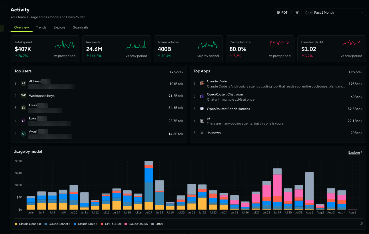
「Overview」では、利用状況を一目で把握できます。画面の上部には主要な 5 つの指標が表示され、それぞれにスパークライン(折れ線グラフ)と前年同期との比較が含まれています。
- 総支出額
- リクエスト数
- トークン使用量
- キャッシュヒット率
- 100 万トークンあたりのブレンドコスト
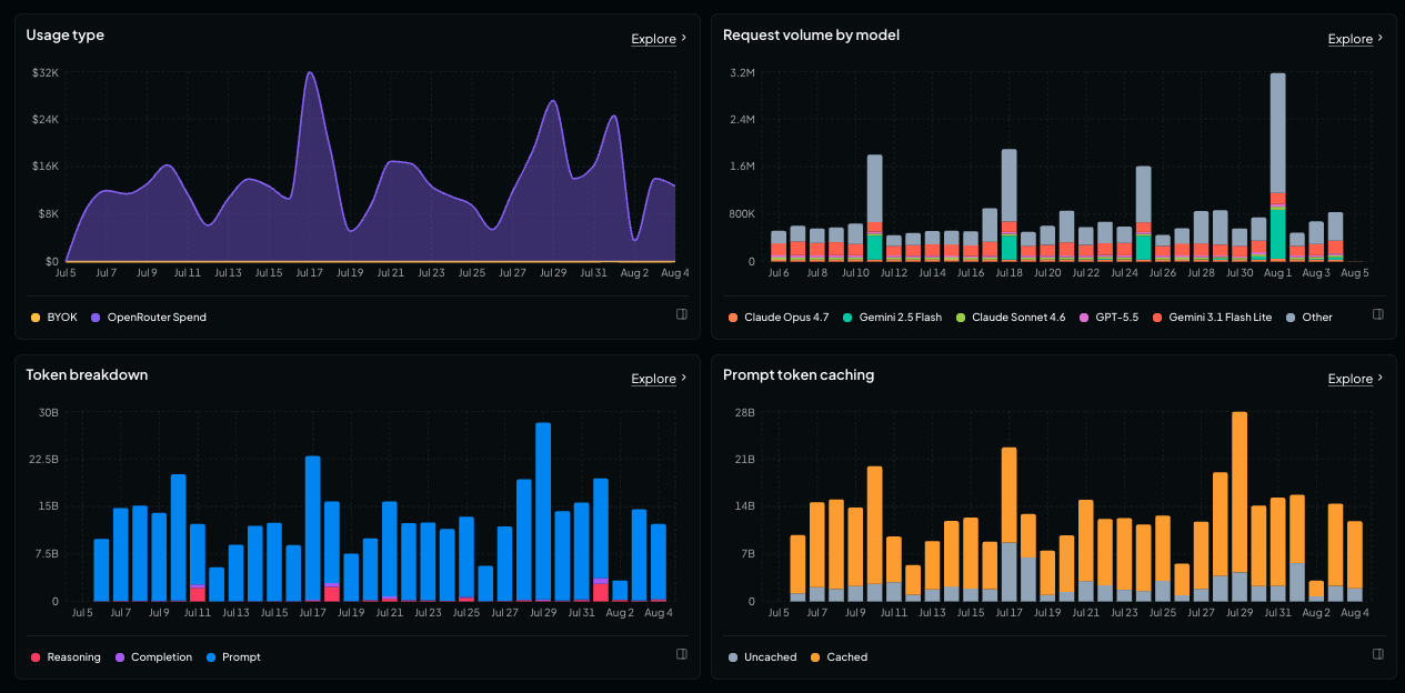
同じ画面内では、上位ユーザーやアプリ、モデル別の支出、OpenRouter クレジットと BYOK(Bring Your Own Key)の支出比較、モデル別リクエスト数、プロンプトと completion トークンの内訳、そしてプロンプトキャッシングの詳細も確認できます。
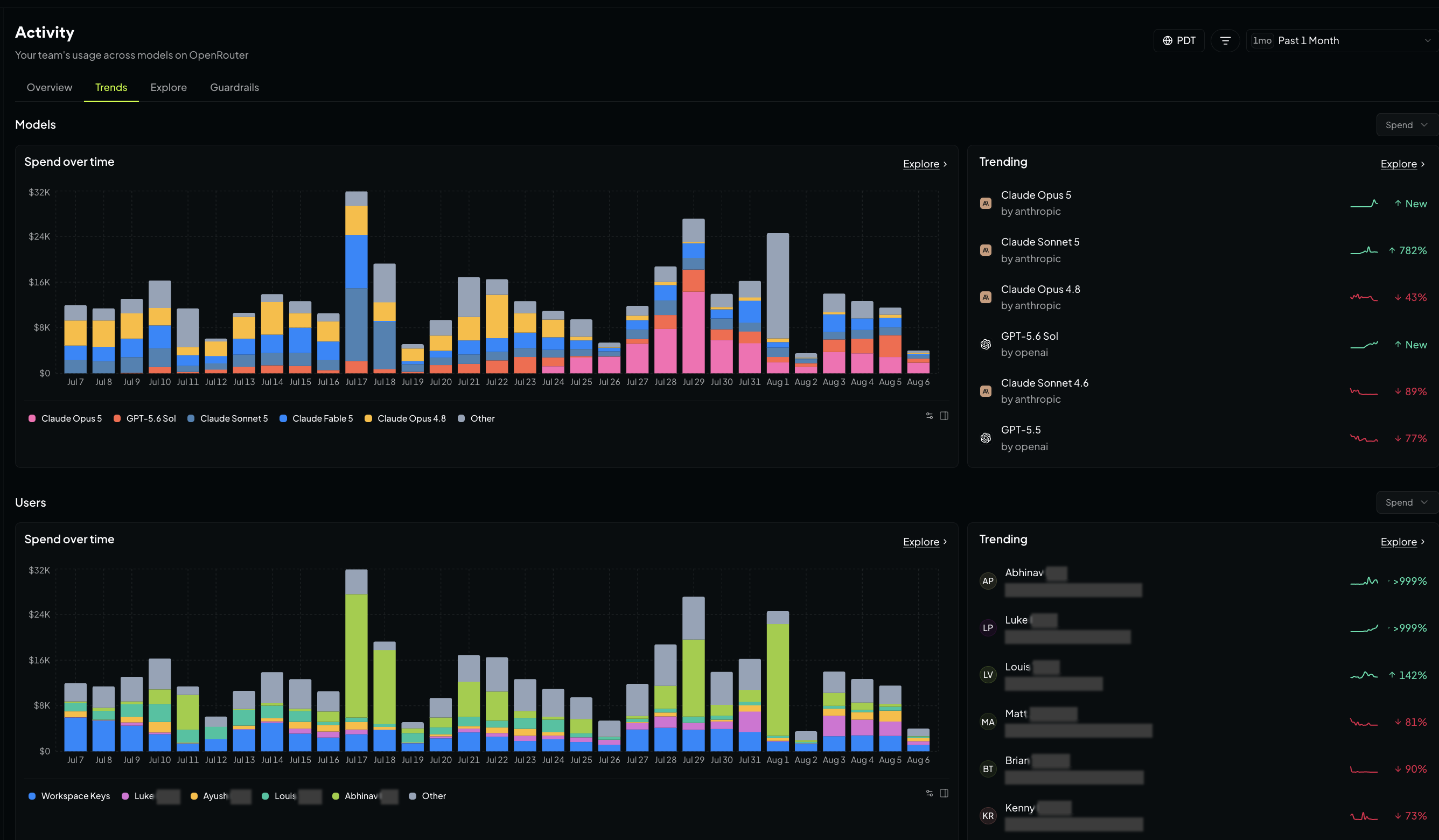
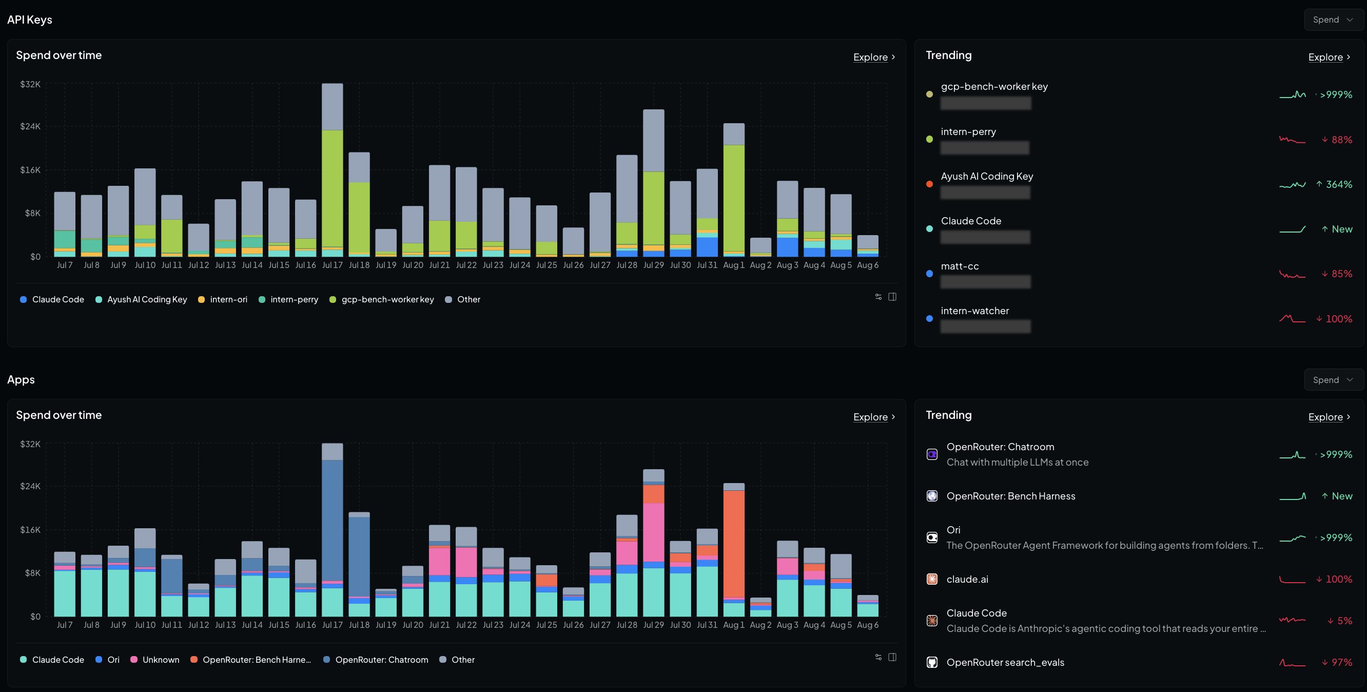
「Trends」は、同じデータを使用しますが、規模ではなく「増減」の動きでソートします。画面には上昇中・下降中の項目をまとめたパネルも表示されます。
モデル、ユーザー、API キー、アプリ全体でのトレンドを確認し、制御不能になったエージェントや、急激に利用が増えている新しいモデル、あるいは組織内で急速に普及したツールなどを早期発見できます。
気になる質問に即座に答える
「概要」や「推移」の各カードは、[Explore(探索)] ページへリンクしています。ここでは自分好みのビューを自由に組み立てることができます。
- メトリクス: 支出額、リクエスト数、トークン数(プロンプト、コンプリーション、推論、キャッシュ)、キャッシュヒット率、百万トークンあたりのブレンドコスト、BYOK とクレジットの使い分け、P50/P90/P99 のレイテンシやスループットなど
- グループ化(最大 2 つの次元まで): モデル、バリアント、プロバイダー、API キー、アプリ、ユーザー、ワークスペース、オリジン、国、データリージョン、終了理由、コンテキスト長、セッション、生成、カスタムユーザー ID、あるいは定義済みの classifier 次元
- 集約間隔: 分、時間、日、週、月。あるいは時間を軸から外してランキング形式のテーブルを表示することも可能
- チャートタイプ: バー、ライン、ドットプロット
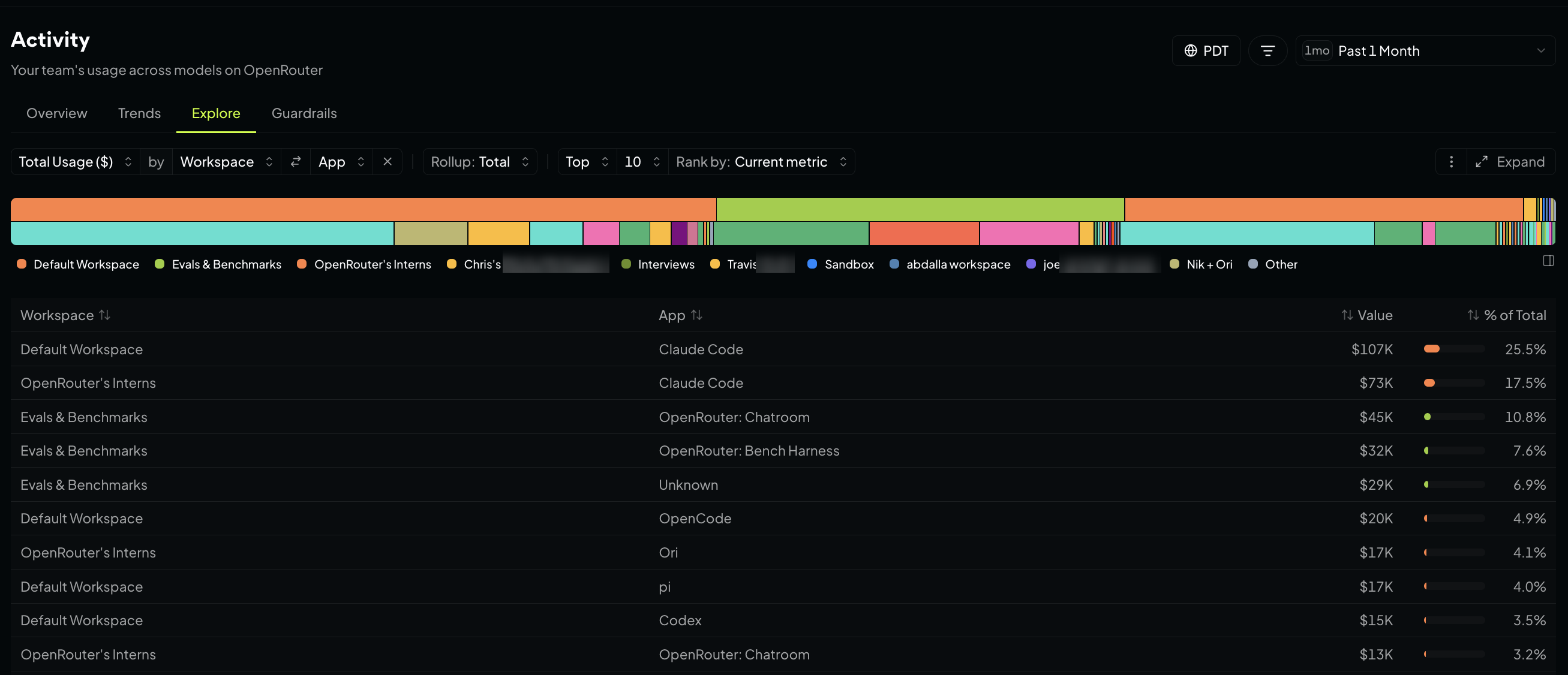
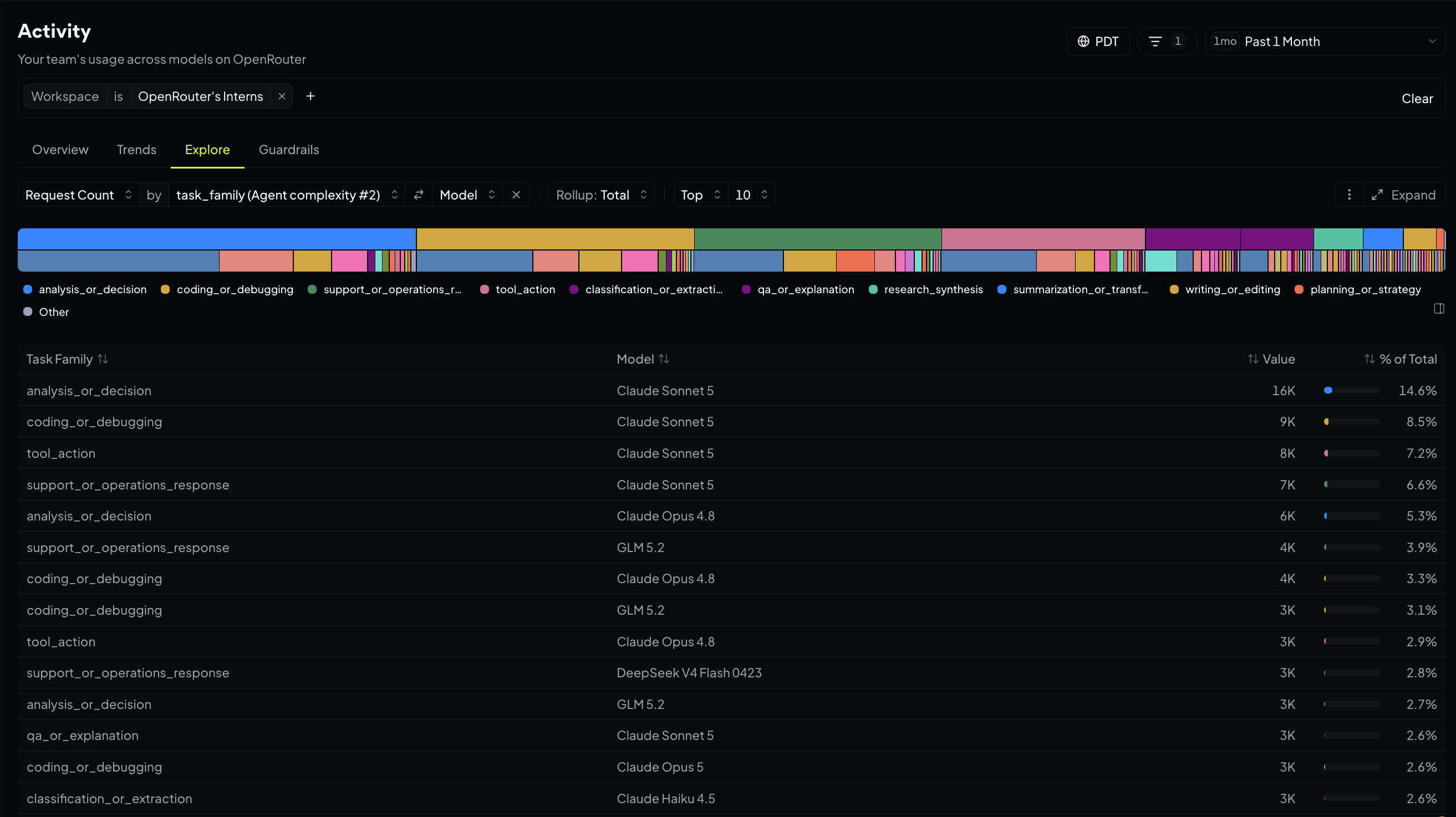
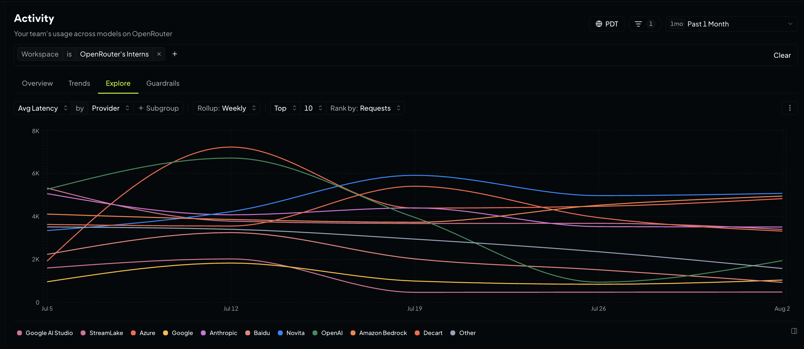
これを使えば、各ワークスペースでどのアプリが利用を牽引しているか、エージェントがタスク種別ごとにどのモデルを選んでいるか、プロバイダーのレイテンシが時間とともにどう推移しているかなどを確認できます。
お気に入りのビューを保存しましょう。オプションメニューを開き、Save current chartを選択して名前を付けます。組織内で利用する場合は、閲覧者をOnly me(自分だけ)またはEveryone in my organization(組織内の全員)から選べます。
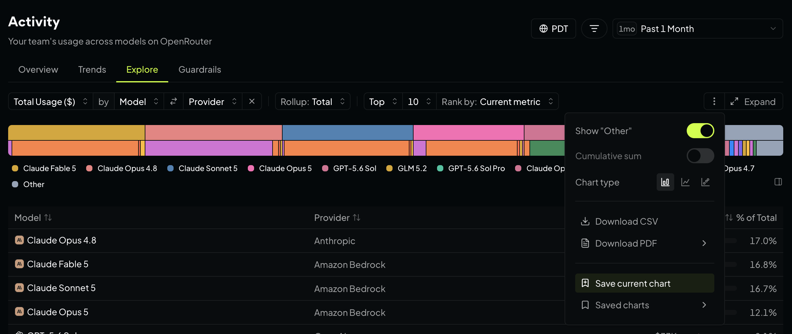
Download CSVまたはDownload PDFをクリックすれば、グラフのデータを直接スプレッドシートやレポートに出力できます。
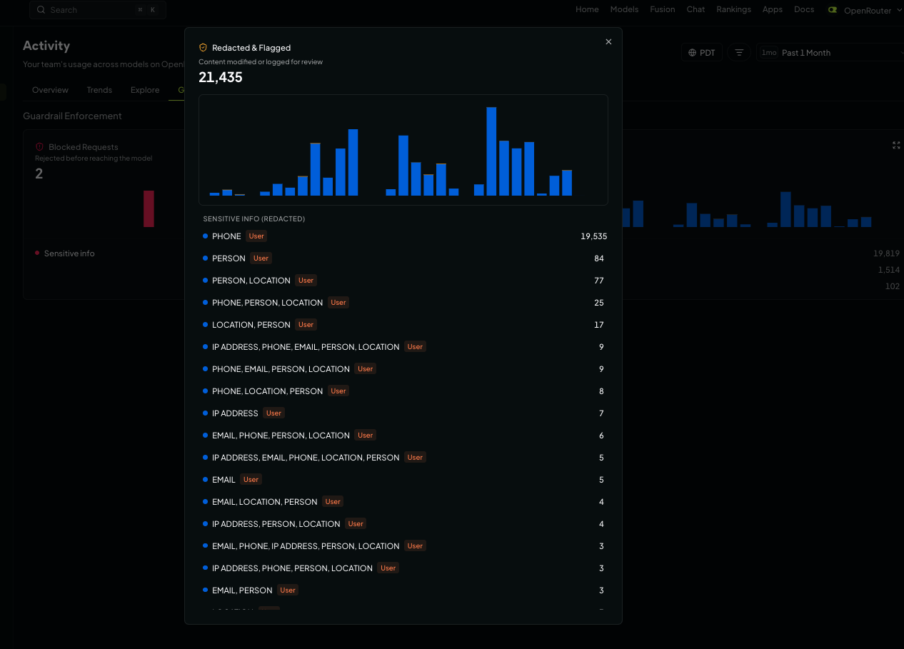
Guardrailsでは、プロンプトインジェクションや機密情報に関するルールによってブロックされた内容、赤acted(隠去)された部分、フラグが立った項目を確認でき、どのルールが機能しているかも把握できます。これを使って、プロンプトに流入する機密データの頻度や、それを検知しているルール・データタイプを監視しましょう。ワークスペースや分類器で絞り込むことで、問題の発生源を特定しやすくなります。
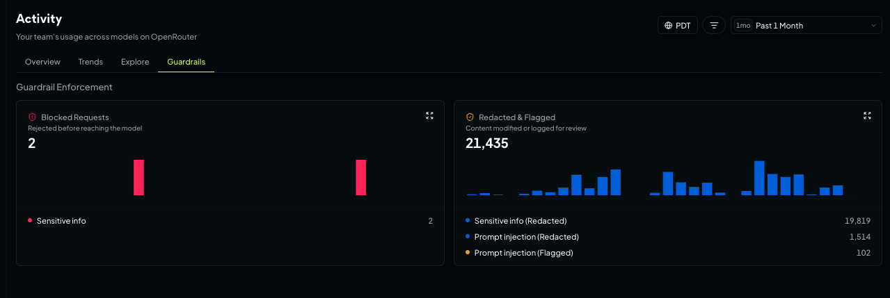
カードを展開すると、どの検出パターンがブロックや内容の隠蔽、フラグ付けを誘発したのかを含む、詳細な内訳を確認できます。
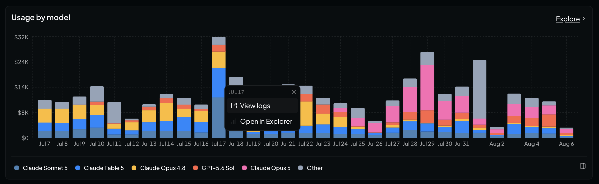
チャートをクリックしてログへ移動
集計データは「どこにお金がかかったか」を教えてくれます。次に重要なのは、どのリクエストが原因だったかを特定することです。
Activity のすべてのチャートとランキング表には、背後にあるログへのリンクが用意されています。火曜日のバーや、積み上げグラフ内の特定のモデルのセクション、あるいはランキング表の行をクリックすると、該当するリクエストに絞り込まれた logs に移動できます。
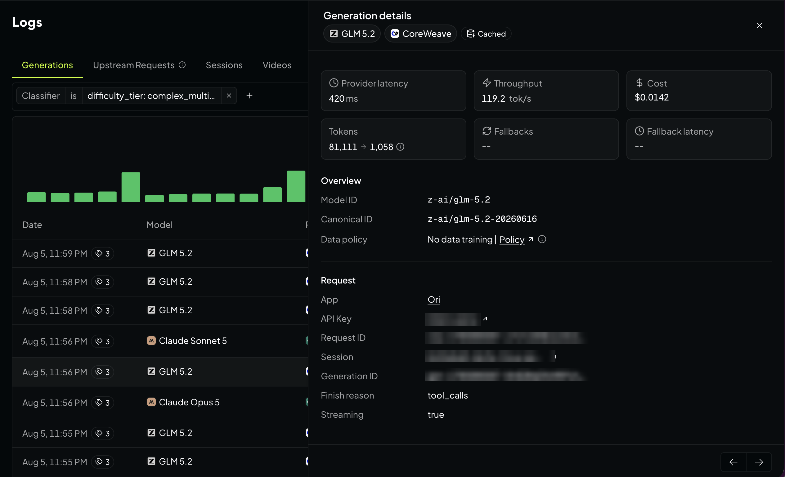
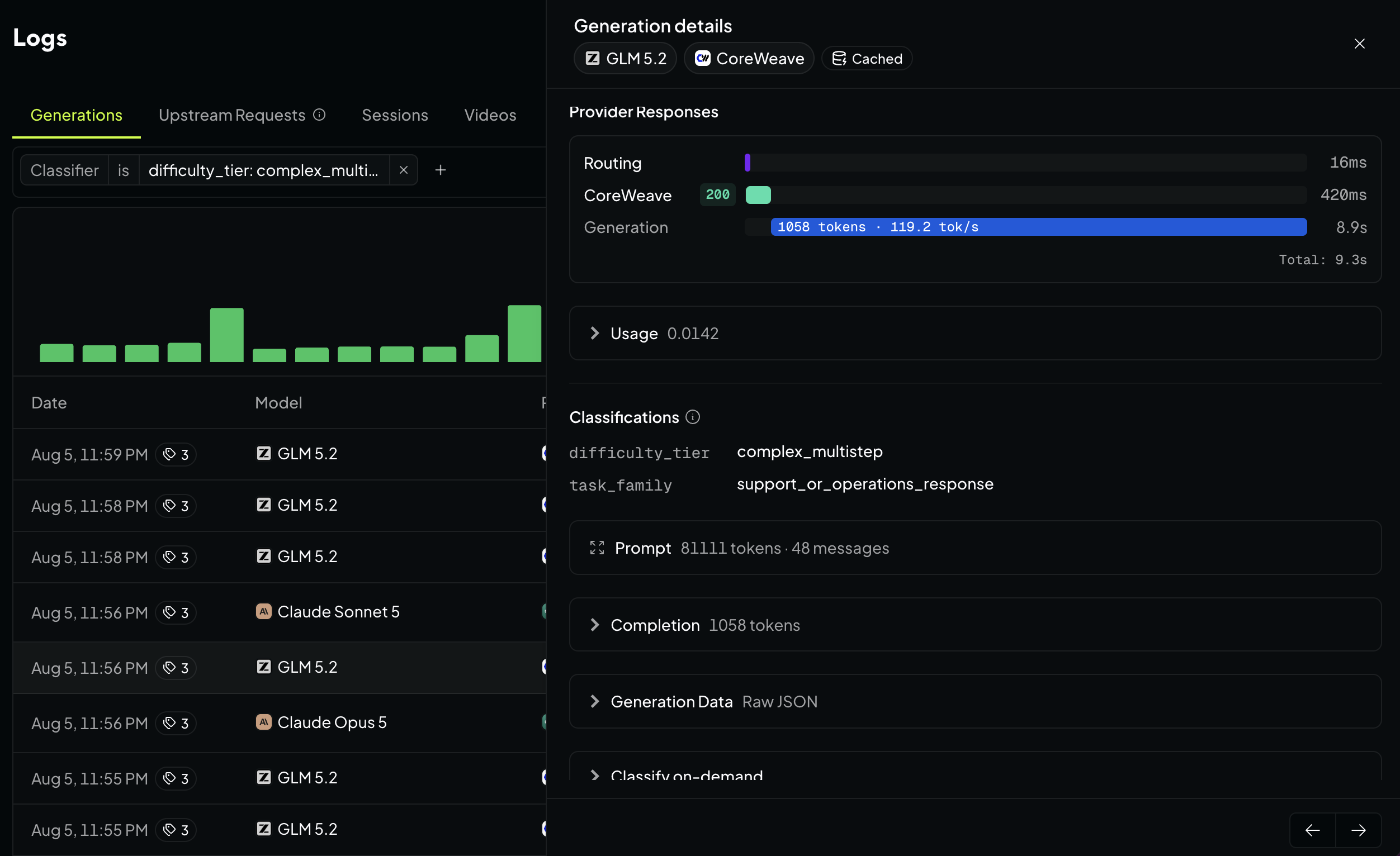
logs の任意の行を開くと、Generationの詳細ビューが表示されます。そこには以下のような情報が含まれます。
- コスト: 推論、キャッシュ、ウェブ検索、ファイル処理にかかる費用に加え、適用された割引やキャッシュによる節約額
- パフォーマンス: プロバイダーのレイテンシ、スループット、最初のトークンまでの時間
AI の利用状況を把握する:エージェント、モデル、リクエストすべてを可視化
ルーティング: どのプロバイダーがリクエストを担当したか、他のプロバイダーへのフォールバックが発生したかどうか、そして完了理由を確認できます。
帰属情報: アプリケーション、API キー、ワークスペースの背景情報に加え、セッション ID、リクエスト ID、データリージョンも表示されます。
コンテキスト: ガードレールのイベント、分類タグ、生メタデータなど、関連するすべての情報が含まれます。
プロンプトの詳細ビューでは、メッセージ配列全体と、システム、ユーザー、アシスタント、ツールという役割ごとに色分けされた推定トークン数のフレイムグラフが表示されます。想定よりも 3 倍の費用がかかった会話の場合、ここではツールの呼び出しが広帯域として、あるいは重いシステムプロンプトとして視覚化されることがよくあります。キャッシュされたプレフィックスは着色表示されるため、キャッシュがどこまで有効だったか、どのメッセージでキャッシュが破綻したかを一目で把握できます。
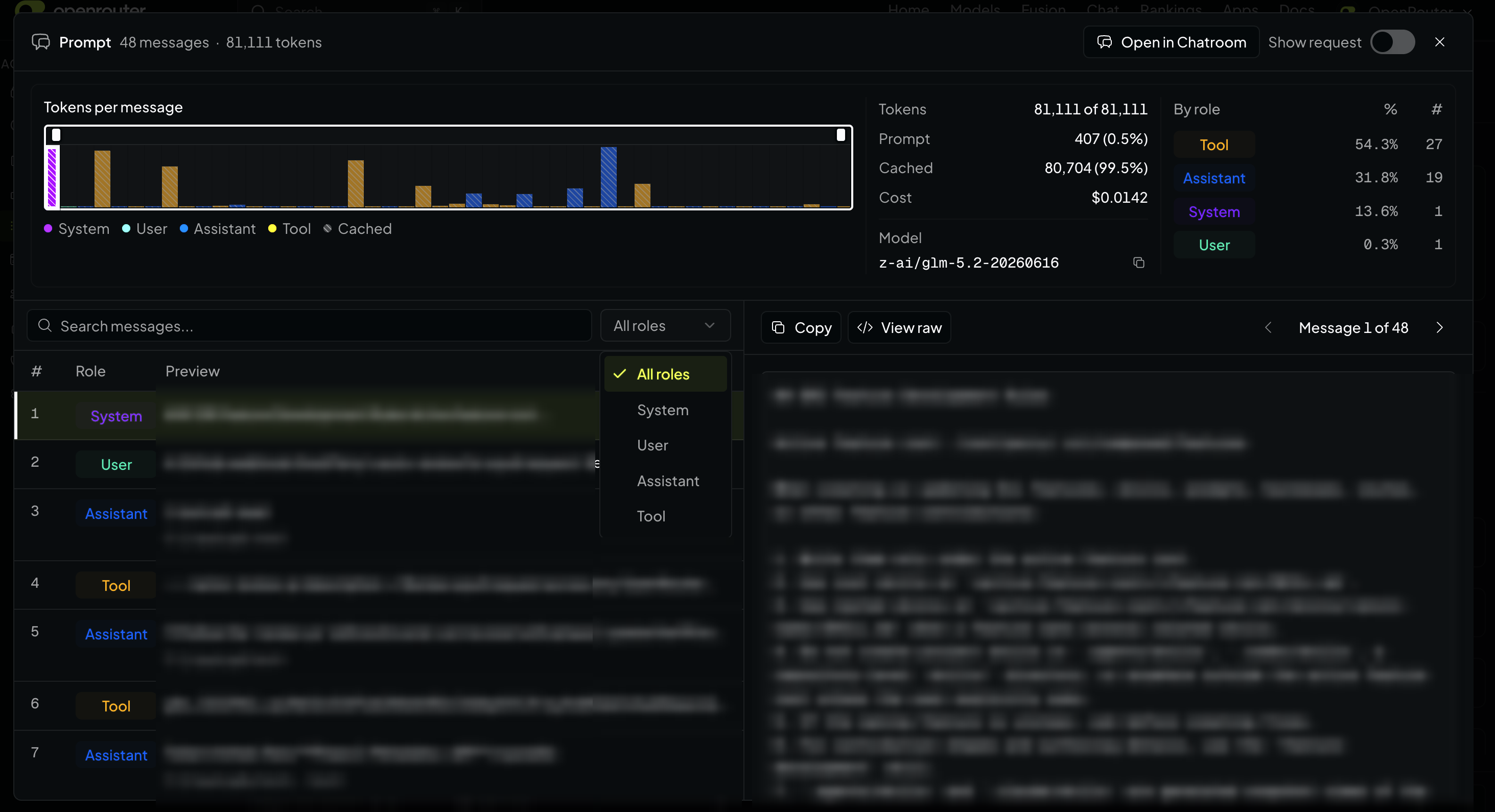
メッセージごとのトークン数はメッセージサイズから算出された推計値であり、生成自体に記録されるのは実際の使用量です。プロンプトとコンプリートの詳細情報が存在するのは、リクエスト実行時にプライベートな入力/出力ログが有効になっていた場合に限られます。この機能はワークスペースの観測設定で有効化できます。
Explore と同じデータを API でも取得可能
Explore で利用できる情報はすべて、ベータ版 Analytics API を通じてアクセス可能です。エージェントに分析を実行させればターミナルですぐに回答が得られるし、必要な数値を独自のダッシュボードに取り込むこともできます。Analytics クエリには 管理キー が必要です。
- `GET /api/v1/analytics/meta`: 現在サポートされているメトリクス、ディメンション、フィルター演算子、粒度を返します。まずこのメタデータエンドポイントを呼び出して利用可能な項目を確認してください。今後も新しいメトリクスやディメンションを追加し続けています。
POST /api/v1/analytics/query エンドポイントを実行すると、クエリが処理され、Explore チャートで表示される集計データと同じ結果が返されます。
curl -X POST https://openrouter.ai/api/v1/analytics/query \
  -H "Authorization: Bearer $OPENROUTER_API_KEY" \
  -H "Content-Type: application/json" \
  -d '{
    "metrics": ["total_usage", "tokens_total", "cache_hit_rate"],
    "dimensions": ["model"],
    "granularity": "day",
    "time_range": {"start": "2026-07-01T00:00:00Z", "end": "2026-08-01T00:00:00Z"},
    "limit": 20
  }'
エージェント向け
コスト管理のレシピ を活用すれば、エージェントに支出分析の権限を付与できます。コーディング用エージェントに管理キーと openrouter-analytics スキル を割り当てて、OpenRouter アカウントのコストレビューを実行させましょう。これにより、組織の平均単価(ブレンデッドレート)を何倍も上回るコストがかかるモデルを特定し、関連するキーやパイプラインを追跡して、優先順位付きの改善提案を返します。
社内でこの手法を試したところ、プレビューモデルが月間約 6,200 ドル(組織の平均単価の約 25 倍)を浪費していることが判明しました。詳細なクエリを実行すると、そのコストの 98% が、最先端モデルを必要としないタスクを実行していた単一のバッチパイプラインキーに起因することが突き止められました。解決策は、モデル名を 1 行書き換えるだけでした。
実際に使用したクエリのレシピやエージェントのプロンプトについては、レシピ集 をご覧ください。
はじめに
Open Activity ページ(Open Activity)で確認するか、すでに知りたい質問が決まっている場合は Explore から始めましょう。ターミナルから操作したい場合は、管理キー を取得し、ベータ版の Analytics API(beta Analytics API)を利用してください。
Discord の #feedback チャンネルで、今後追加してほしい機能や改善点を教えてください。
原文を表示
Every company that spent the last two years deploying agents is now asking the same question: what are they costing us, and which ones are worth it? OpenRouter’s Activity dashboard and beta Analytics API answer that question per agent, per model, per request.
Open Activity to see how spend breaks down across agents, apps, and team members. Find out which models and tasks drive costs, and where caching cuts your bill. Create and save custom views, then drill from any chart down to the individual requests.
All of the data is available through the beta Analytics API. Point your agent at the openrouter-analytics skill to dig into your usage, get a quick answer in your terminal, or pull the numbers into your own dashboards.
Start with the big picture
Overview is your usage at a glance. Five metrics at the top: total spend, requests, token volume, cache hit rate, and blended cost per million tokens, each with a sparkline and a comparison against the previous period. On the same screen, your top users and apps, spend by model, OpenRouter credits versus BYOK spend, request volume by model, prompt and completion token breakdown, and prompt caching.
Trends takes the same data and sorts by movement instead of size, with a panel showing what’s rising and falling. See your trends across models, users, API keys, and apps. Use it to spot a runaway agent, a new model gaining traction, or a tool spreading across your org.
Explore any question
Every card on Overview and Trends links into Explore, where you assemble the view yourself:
- Metric: spend, request count, tokens (prompt, completion, reasoning, or cached), cache hit rate, blended cost per million tokens, BYOK versus credit spend, or latency and throughput down to P50/P90/P99
- Group by (up to two dimensions): model, variant, provider, API key, app, user, workspace, origin, country, data region, finish reason, context length, session, generation, custom user IDs, or any classifier dimension you’ve defined
- Rollup: minute, hour, day, week, or month, or drop the time axis for a ranked table
- Chart type: bar, line, or dot plot
Use it to see which apps are driving usage in each workspace, which models your agents are using for each task type, or how your provider latency is trending over time.
Save your go-to views. Open the options menu, choose Save current chart, and name it. In an organization you also choose who sees it: Only me, or Everyone in my organization.
Download CSV or Download PDF to send any chart’s data straight into a spreadsheet or report.
Guardrails shows what your prompt injection and sensitive-information rules blocked, redacted, or flagged, and which rules are doing the work. Use it to monitor the rate of sensitive data entering your prompts, and which rules and data types are catching it. Filter by workspace or classifier to narrow in on where it’s coming from.
Expand a card to get the full breakdown, including which combinations of detected patterns drove each block, redaction, and flag.
Click a chart, land in the logs
Aggregates show you that something got expensive. The next question is which requests.
Every chart and ranked table in Activity links through to the logs behind it. Click Tuesday’s bar, one model’s slice of a stacked chart, or a row in a ranked table, and you land in your logs filtered to those requests.
Open any row in logs for the Generation detail view. It shows:
- Cost: upstream inference, caching, web search, and file processing, plus the discounts and cache savings applied
- Performance: provider latency, throughput, and time to first token
- Routing: which provider served the request, whether it fell back to another one, and the finish reason
- Attribution: the app, API key, and workspace behind it, plus session and request IDs and data region
- Context: any guardrail events, classifier tags, and the raw metadata
The Prompt detail view renders the full messages array and a flamegraph of estimated tokens per message colored by role: system, user, assistant, and tool. A conversation that costs three times what you expected usually shows it here as a wide band of tool calls or a heavy system prompt. The cached prefix is shaded, so you can see how far into the prompt the cache held and which message broke it.
Per-message token counts are estimates derived from message size; the totals on the generation itself are recorded usage. Prompts and completions detail only exist if private input/output logging was enabled when the request ran, which you can enable in your workspace observability.
Same data as Explore, via API
Everything in Explore is also available through the beta Analytics API: let your agent run the analysis, get a quick answer in your terminal, or pull the numbers into your own dashboards. Analytics queries require a management key. Two endpoints:
- GET /api/v1/analytics/meta returns the currently supported metrics, dimensions, filter operators, and granularities. Call the metadata endpoint first to see what’s available; we’re always adding new metrics and dimensions.
- POST /api/v1/analytics/query runs the query and returns the same aggregates the Explore charts are drawn from.
curl -X POST https://openrouter.ai/api/v1/analytics/query \
  -H "Authorization: Bearer $OPENROUTER_API_KEY" \
  -H "Content-Type: application/json" \
  -d '{
    "metrics": ["total_usage", "tokens_total", "cache_hit_rate"],
    "dimensions": ["model"],
    "granularity": "day",
    "time_range": {"start": "2026-07-01T00:00:00Z", "end": "2026-08-01T00:00:00Z"},
    "limit": 20
  }'
For agents
The cost control cookbook puts your agent in charge of spend analysis. Give your coding agent a management key and the openrouter-analytics skill and have it run a cost review on your OpenRouter account. It finds the models costing a multiple of your blended rate per million tokens, traces them back to the keys and pipelines responsible, and returns ranked recommendations.
We ran this internally and found a preview model burning ~$6.2K/month at roughly 25x the org’s blended rate. One drill-down query later, 98% of it traced to a single batch-pipeline key running a task that never needed a frontier model. The fix was a one-line model swap. See the query recipes and agent prompts we used in the cookbook.
Get started
Open Activity, or start in Explore if you already know the question you want answered. To work from your terminal instead, grab a management key and hit the beta Analytics API.
Tell us what you’d like to see next in #feedback on Discord.
関連記事
今日のまとめ
AIデイリーブリーフで今日の重要ニュースをまとめ読み