Python と AI を活用し CSV から経営報告書へ自動化する手法
本文の状態
日本語全文を表示中
詳細モードで約10分の本文を読めます。
同じ出来事の情報源
この情報源を基点に整理
KDnuggets
この記事は、Python と Claude Opus 4.8 を活用して CSV データを自動処理し、分析からレポート作成まで行うパイプライン構築の具体的な手順とコードを示している。
AI深層分析を開く2026年8月5日 21:59
AI深層分析
キーポイント
自動化されたレポート作成パイプライン
CSV のクリーニング、数値計算、チャート描画、そして AI による洞察のドラフト作成までを自動化する Python ベースのワークフローが提示されている。
Claude Opus 4.8 の活用
AI モデルとして Anthropic の Claude Opus 4.8 が採用され、数秒間でナラティブ(物語)の初稿を生成する役割を果たす。
データ処理と意思決定の分離
AI は洞察のドラフトを作成するが、事実の真偽や最終的な判断は人間が行うという明確な役割分担が定義されている。
データクリーニングの重要性
完了していない取引や失敗した支払いを除外し、完了済みのトランザクションのみを対象にすることで正確な集計が可能になる。
リファウンド率の計算方法
リファウンド金額は負の数で記録されているため、総売上額に対する比率を算出する際に符号を反転させる必要がある。
重要な引用
The AI here is Claude Opus 4.8. The model writes the first draft of the narrative in seconds.
We still decide what is true.
If we had reported straight off the raw file, we would have counted a failed payment as a sale.
Refunds are already negative, so net revenue is just the sum of the amount column.
編集コメントを表示
編集コメント
本記事は、最新の AI モデルを業務プロセスに組み込むための実践的なガイドとして機能する。技術の導入において人間が最終判断を下す責任を持つという点は、実務における重要な指針となる。
Source Article
元記事を日本語で読む
本文に関係しない購読案内、埋め込み通知、サイト内プロモーションは除いています。

手作業での分析から脱却する
データアナリストなら、誰もが一度はこんな経験があるはずです。メールに CSV ファイルが届き、「どうだった?」と聞かれて、午後の時間を費やして列のクリーニングを行い、いくつかのチャートを作成し、その意味を文章にする。そんな作業です。
しかし、こうした作業の多くは自動化できます。このチュートリアルでは、Python で小さなパイプラインを構築します。生データの売上 CSV を読み込み、データをクリーニングし、数値を集計し、チャートを描画し、最後に AI にインサイトのドラフト作成を依頼する仕組みです。ここで使用する AI は Claude Opus 4.8 です。このモデルは、数秒で物語の最初のドラフトを作成します。ただし、最終的に何が事実かを判断するのは人間です。
その前に、レポートには明確な問いが必要です。今回の問いは「過去 5 週間で、私たちはどれだけの収益を維持できたのか?また、残りの資金はどこへ行ったのか?」というものです。以下の各ステップが、この問いの一部分に答える役割を果たします。データクリーニングでは、どの行を「お金」としてカウントするかを決定します。集計処理では、損失が発生した場所と時期を明らかにします。そして AI のステップで、これらの数値を実行役員が読むための要約に変換します。
再現可能なよう、すべてのコードを以下に示します。この手順は、ほぼあらゆるデータセットに適用可能です:
CSV → クリーニング → 探索 → チャート作成 → AI によるインサイト → レコメンデーション → レポート
データについて
ここでは、45件の取引レコードを含む product_sales.csv ファイルを使用します。このデータセットは、こちら の面接問題で使われているものです。ただし本記事では、その元の課題を解くわけではありません。
各レコードは1回の支払いイベント(購入または返金)を表しており、国名、日付、金額、ステータスという情報が含まれています。
以下に生データのテーブルプレビューを示します。
| transaction_id | product_id | country | transaction_date | amount | status | type | original_transaction_id |
|---|---|---|---|---|---|---|---|
| TXN-10001 | PROD-2891 | US | 2025-04-15 | 449.99 | completed | purchase | |
| TXN-10002 | PROD-2891 | US | 2025-04-15 | 449.99 | completed | purchase | |
| TXN-10003 | PROD-2891 | CA | 2025-04-15 | 449.99 | completed | purchase | |
| TXN-10004 | PROD-2891 | US | 2025-04-17 | 449.99 | completed | purchase | |
| … | … | … | … | … | … | … | … |
| TXN-10045 | PROD-2891 | US | 2025-05-11 | -449.99 | completed | refund | TXN-10044 |
2 つの重要な点が見えてきます。返金は負の数値として記録されており、すべての行が完済された売上を意味するわけではありません。この 2 点は報告数値に直結します。
これらを Pandas で読み込みます:
import pandas as pd

df = pd.read_csv("product_sales.csv")
データのクリーニング
**
集計結果が正しいかどうかは、このクリーニング工程で決まります。3 行は保留中または失敗した取引なので、まだ確定した金額ではありません。型を正しく設定し、完了したトランザクションのみを残します:
df["transaction_date"] = pd.to_datetime(df["transaction_date"])
df["amount"] = pd.to_numeric(df["amount"], errors="coerce")

# Pending and failed transactions are not revenue yet.
settled = df[df["status"] == "completed"].copy()
settled["is_refund"] = settled["type"].eq("refund")
これにより 45 行のうち 3 行が除外され、42 件の完済済み取引が残ります。もし生データからそのまま報告していたら、失敗した支払いを売上としてカウントしてしまっていたでしょう。
探索的解析
質問の前半は「どれくらい残ったか」です。購入と返金を分けて集計すれば、主要な数値が浮かび上がります。返金はすでに負の数で記録されているため、純収益は amount カラムの合計値を計算するだけで得られます。
gross = settled.loc[~settled["is_refund"], "amount"].sum()
refunds = settled.loc[settled["is_refund"], "amount"].sum()   # negative
net = settled["amount"].sum()
refund_rate = -refunds / gross

print(f"gross   {gross:,.0f}")
print(f"refunds {refunds:,.0f}")
print(f"net     {net:,.0f}")
print(f"refund rate (value) {refund_rate:.0%}")
出力結果:
gross   12,975
refunds -4,875
net     8,100
refund rate (value) 38%
たった 4 行で全体像がわかります。売上は約 13,000 ドル、返金総額は 4,875 ドルなので、純収益は 8,100 ドルです。38% という返金率は高く、正の値だけを単純に合計するだけでは決して現れない重要な数値です。
これで合計額がわかりました。質問の後半は「お金がどこへ行ったか」です。データを 2 つの方向で切り分けて分析します。まずは国別に見て、どの市場が純収益を担っているかを確認しましょう:
by_country = (settled.groupby("country")["amount"]
             .agg(net_revenue="sum", transactions="count")
             .sort_values("net_revenue", ascending=False))
print(by_country)| 国 | 純収益 | 取引数 |
|---|---|---|
| US | 7199.84 | 38 |
| GB | 449.99 | 1 |
| MX | 449.99 | 1 |
| CA | 0.00 | 2 |
カナダは予期せぬ結果となりました。完了した注文が 2 つありましたが、どちらも返金されたため、純収益は正確にゼロです。
次に、週ごとの購入額と返金額を内訳で示します。
settled["week"] = settled["transaction_date"].dt.to_period("W").dt.start_time
weekly = settled.pivot_table(index="week", columns="is_refund",
                             values="amount", aggfunc="sum").fillna(0)
weekly.columns = ["purchases", "refunds"]
weekly["net"] = weekly.sum(axis=1)
print(weekly)| 週 | 購入数 | 返品数 | 純利益 |
|---|---|---|---|
| 2025-04-14 | 4649.89 | -449.99 | 4199.90 |
| 2025-04-21 | 4274.90 | -299.99 | 3974.91 |
| 2025-04-28 | 3599.92 | 0.00 | 3599.92 |
| 2025-05-05 | 449.99 | -1799.96 | -1349.97 |
| 2025-05-12 | 0.00 | -1424.96 | -1424.96 |
| 2025-05-19 | 0.00 | -899.98 | -899.98 |
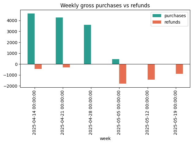
最初の3週間は純利益がプラスでしたが、最後の3週間はマイナスに転じました。5月初旬には購入が止まりつつある一方、返金請求は続いています。
この乖離を説明するもう一つの数字があります。original_transaction_id を用いて、各購入から返金が到着するまでの期間を測定しました。
purch_dates = (settled.loc[~settled["is_refund"], ["transaction_id", "transaction_date"]]
               .set_index("transaction_id")["transaction_date"])
ref = settled[settled["is_refund"]].copy()
ref["lag_days"] = (ref["transaction_date"]
                   - ref["original_transaction_id"].map(purch_dates)).dt.days
print(ref["lag_days"].median())    # 20.0
返金の中央値は販売から20日後に到達します。4月の収益の一部が5月になってもまだ返金されている状態です。
# チャートの作成
Matplotlib を用いて3つのチャートを描画し、PNG ファイルとして保存しました。
import matplotlib.pyplot as plt

weekly[["purchases", "refunds"]].plot(kind="bar", color=["#2a9d8f", "#e76f51"])
plt.axhline(0, color="black", linewidth=0.8)
plt.title("Weekly gross purchases vs refunds")
plt.tight_layout(); plt.savefig("chart_weekly.png")
週次チャートからはパターンが明確に見て取れます。4月は高い緑色の棒グラフが目立ちますが、5月になると返金に関する棒グラフが支配的になります。
**
settled.groupby("transaction_date")["amount"].sum().sort_index().cumsum().plot()
plt.title("Cumulative net revenue over time")
plt.tight_layout(); plt.savefig("chart_cumulative.png")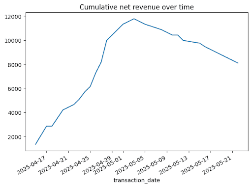
by_country["net_revenue"].plot(kind="barh", color="#2a9d8f")
plt.title("Net revenue by country")
plt.tight_layout(); plt.savefig("chart_country.png")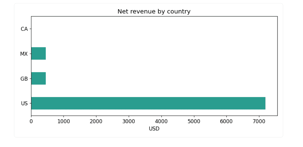
# AI によるインサイトの生成
次に、これらの数値をモデルに渡します。発見した内容を要約する短いテキストを作成し、プロンプトを出力します。このプロンプトを Claude に貼り付けて回答を取得し、その回答を再びノートブックに戻すという手順です。
weekly_net = {d.date().isoformat(): round(v) for d, v in weekly["net"].items()}

summary = f"""Product sales, {settled['transaction_date'].min().date()} to {settled['transaction_date'].max().date()}.
Gross: ${gross:,.0f}  Refunds: ${-refunds:,.0f}  Net: ${net:,.0f}
Refund rate by value: {refund_rate:.0%}
Net revenue by country: {by_country['net_revenue'].round(0).to_dict()}
Weekly net: {weekly_net}
Median days from purchase to refund: 20"""

prompt = (
    "You are a data analyst writing for executives. "
    "Based on this summary, write 3 insights and 3 business "
    "recommendations. Be specific and cautious about small sample size.\n\n"
    + summary
)

print(prompt)
出力:
You are a data analyst writing for executives. Based on this summary, write 3 insights and 3 business recommendations. Be specific and cautious about small sample size.

Product sales, 2025-04-15 to 2025-05-22.
    Gross: $12,975  Refunds: $4,875  Net: $8,100
    Refund rate by value: 38%
    Net revenue by country: {'US': 7200.0, 'GB': 450.0, 'MX': 450.0, 'CA': 0.0}
    Weekly net: {'2025-04-14': 4200, '2025-04-21': 3975, '2025-04-28': 3600, '2025-05-05': -1350, '2025-05-12': -1425, '2025-05-19': -900}
    Median days from purchase to refund: 20
モデルが参照するのは要約された数値のみです。クリーンな集計データに対して推論が行われるため、行レベルのデータがお客様のマシンから外部へ流出することはありません。Claude Opus 4.8 が返した回答は以下の通りです:
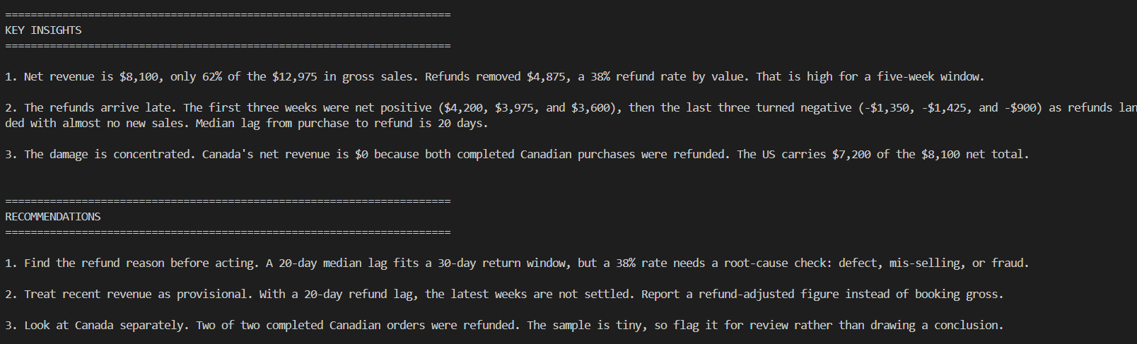
ここが人間の判断が不可欠な部分です。モデルは要約を正しく読み取りましたが、これが 5 週間にわたる 42 行のデータからなる単一製品のレポートであるという文脈までは理解していません。サンプルサイズに関する注意喚起は妥当ですが、これらの数値をより多くの履歴情報なしに取締役会での発表資料として使うことはできません。
# エグゼクティブ・レポートの作成
最後のステップでは、主要指標をカード形式で表示し、3 つのチャートと AI による文章を組み込んだ、独立した report.html ファイルを生成します。このビルダーの全貌は こちら で確認できます。
レポートのスクリーンショットが以下に示されています。
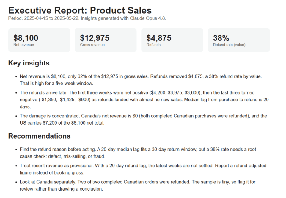
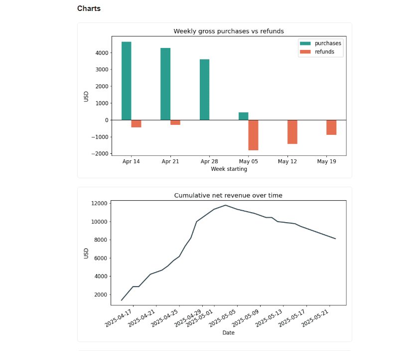
完全なレポートを確認したい場合は、この HTML ファイル をダウンロードしてブラウザで開いてください。
# 結論
このパイプラインは非常にシンプルです。データのクリーニングを行い、正直な集計計算をいくつか実行し、3 つのチャートを描画した上で、モデルに文章作成を任せます。レポートが正しいかどうかを決めるのは、データクリーニングと集計処理です。AI が活用することで、原本を作成する際に要する 1 時間の時間を節約できます。
Claude Opus 4.8 は要約から明確かつ慎重な洞察を導き出し、サンプル数が少ない点も正しく指摘しました。ただし、このモデルはデータそのものを検証することはできず、ビジネスの文脈を知ることもできません。そのため、提案された内容はあくまで編集前のドラフト段階です。
ご自身の CSV ファイルでコンパニオンスクリプトを実行し、列名を変更するだけで、次々と届くファイルに対応できるレポート作成ツールとして活用できます。
原文を表示
**
# Moving Beyond Analysis By Hand
Every analyst has done this by hand. A CSV lands in your inbox, someone asks "so how did we do," and you spend an afternoon cleaning columns, building a few charts, and typing up what they mean.
We can automate most of that. In this walkthrough, we build a small pipeline in Python that takes a raw sales CSV, cleans it, runs the numbers, draws the charts, and asks an AI to draft the insights. The AI here is Claude Opus 4.8**. The model writes the first draft of the narrative in seconds. We still decide what is true.
Before any of that, the report needs a question. Ours is: how much revenue did we keep over these five weeks, and where did the rest go? Every step below answers a piece of it. Cleaning decides which rows count as money. The aggregates say where and when we lost it. The AI step turns those numbers into a summary an executive will read.
All the code is below so you can reproduce it, and the steps are the same for almost any dataset:
CSV → clean → explore → chart → AI insights → recommendations → report
# The Data
**
We use the product_sales.csv file, which contains 45 transaction rows. It is a dataset used in this interview question**. Keep in mind that in this article we are not solving the original problem. Each row is one payment event: a purchase or a refund, with a country, a date, an amount, and a status.
Here is the raw table preview.
| transaction_id | product_id | country | transaction_date | amount | status | type | original_transaction_id |
|---|---|---|---|---|---|---|---|
| TXN-10001 | PROD-2891 | US | 2025-04-15 | 449.99 | completed | purchase | |
| TXN-10002 | PROD-2891 | US | 2025-04-15 | 449.99 | completed | purchase | |
| TXN-10003 | PROD-2891 | CA | 2025-04-15 | 449.99 | completed | purchase | |
| TXN-10004 | PROD-2891 | US | 2025-04-17 | 449.99 | completed | purchase | |
| … | … | … | … | … | … | … | … |
| TXN-10045 | PROD-2891 | US | 2025-05-11 | -449.99 | completed | refund | TXN-10044 |
Two things already stand out. Refunds are stored as negative amounts, and not every row is a completed sale. Both matter for the numbers we report.
We load it with Pandas:
import pandas as pd

df = pd.read_csv("product_sales.csv")
# Cleaning the Data
**
The cleaning step decides whether the totals are right. Three rows are pending or failed, so they are not money yet. We fix the types and keep only completed transactions:
df["transaction_date"] = pd.to_datetime(df["transaction_date"])
df["amount"] = pd.to_numeric(df["amount"], errors="coerce")

# Pending and failed transactions are not revenue yet.
settled = df[df["status"] == "completed"].copy()
settled["is_refund"] = settled["type"].eq("refund")
That drops 3 of 45 rows and leaves 42 completed transactions. If we had reported straight off the raw file, we would have counted a failed payment as a sale.
# Exploratory Analysis
The first half of the question: how much did we keep? Separate purchases from refunds and the headline numbers fall out. Refunds are already negative, so net revenue is just the sum of the amount column.
gross = settled.loc[~settled["is_refund"], "amount"].sum()
refunds = settled.loc[settled["is_refund"], "amount"].sum()   # negative
net = settled["amount"].sum()
refund_rate = -refunds / gross

print(f"gross   {gross:,.0f}")
print(f"refunds {refunds:,.0f}")
print(f"net     {net:,.0f}")
print(f"refund rate (value) {refund_rate:.0%}")
Output:
gross   12,975
refunds -4,875
net     8,100
refund rate (value) 38%
That is the whole story in four lines. We sold about $13,000 and gave back $4,875, so net revenue is $8,100. A 38% refund rate is high, and it is the kind of number that never shows up if you only sum positive amounts.
That gives the total. The second half of the question is where the money went, so we cut the data two ways. By country, to see which markets carry the net figure:
by_country = (settled.groupby("country")["amount"]
             .agg(net_revenue="sum", transactions="count")
             .sort_values("net_revenue", ascending=False))
print(by_country)| country | net_revenue | transactions |
|---|---|---|
| US | 7199.84 | 38 |
| GB | 449.99 | 1 |
| MX | 449.99 | 1 |
| CA | 0.00 | 2 |
Canada is the surprise. Two completed orders, both refunded, so its net revenue is exactly zero.
Then by week, splitting purchases from refunds:
settled["week"] = settled["transaction_date"].dt.to_period("W").dt.start_time
weekly = settled.pivot_table(index="week", columns="is_refund",
                             values="amount", aggfunc="sum").fillna(0)
weekly.columns = ["purchases", "refunds"]
weekly["net"] = weekly.sum(axis=1)
print(weekly)| week | purchases | refunds | net |
|---|---|---|---|
| 2025-04-14 | 4649.89 | -449.99 | 4199.90 |
| 2025-04-21 | 4274.90 | -299.99 | 3974.91 |
| 2025-04-28 | 3599.92 | 0.00 | 3599.92 |
| 2025-05-05 | 449.99 | -1799.96 | -1349.97 |
| 2025-05-12 | 0.00 | -1424.96 | -1424.96 |
| 2025-05-19 | 0.00 | -899.98 | -899.98 |
The first three weeks are net positive. The last three are net negative. Purchases stop in early May while refunds keep coming.
One more number explains the gap. Using original_transaction_id, we measure how long after a purchase each refund arrives.
purch_dates = (settled.loc[~settled["is_refund"], ["transaction_id", "transaction_date"]]
               .set_index("transaction_id")["transaction_date"])
ref = settled[settled["is_refund"]].copy()
ref["lag_days"] = (ref["transaction_date"]
                   - ref["original_transaction_id"].map(purch_dates)).dt.days
print(ref["lag_days"].median())    # 20.0
The median refund lands 20 days after the sale. April's revenue is still being refunded in May.
# Building the Charts
We draw three charts with Matplotlib** and save them as PNG files.
import matplotlib.pyplot as plt

weekly[["purchases", "refunds"]].plot(kind="bar", color=["#2a9d8f", "#e76f51"])
plt.axhline(0, color="black", linewidth=0.8)
plt.title("Weekly gross purchases vs refunds")
plt.tight_layout(); plt.savefig("chart_weekly.png")
The weekly chart makes the pattern obvious: tall green bars in April, then the refund bars take over in May.
**
settled.groupby("transaction_date")["amount"].sum().sort_index().cumsum().plot()
plt.title("Cumulative net revenue over time")
plt.tight_layout(); plt.savefig("chart_cumulative.png")by_country["net_revenue"].plot(kind="barh", color="#2a9d8f")
plt.title("Net revenue by country")
plt.tight_layout(); plt.savefig("chart_country.png")# Generating AI Insights
Now we hand the numbers to the model. We build a short text summary of everything we found and print a prompt. You paste that prompt into Claude and paste the reply back into the notebook.
weekly_net = {d.date().isoformat(): round(v) for d, v in weekly["net"].items()}

summary = f"""Product sales, {settled['transaction_date'].min().date()} to {settled['transaction_date'].max().date()}.
Gross: ${gross:,.0f}  Refunds: ${-refunds:,.0f}  Net: ${net:,.0f}
Refund rate by value: {refund_rate:.0%}
Net revenue by country: {by_country['net_revenue'].round(0).to_dict()}
Weekly net: {weekly_net}
Median days from purchase to refund: 20"""

prompt = (
    "You are a data analyst writing for executives. "
    "Based on this summary, write 3 insights and 3 business "
    "recommendations. Be specific and cautious about small sample size.\n\n"
    + summary
)

print(prompt)
Output:
You are a data analyst writing for executives. Based on this summary, write 3 insights and 3 business recommendations. Be specific and cautious about small sample size.

Product sales, 2025-04-15 to 2025-05-22.
    Gross: $12,975  Refunds: $4,875  Net: $8,100
    Refund rate by value: 38%
    Net revenue by country: {'US': 7200.0, 'GB': 450.0, 'MX': 450.0, 'CA': 0.0}
    Weekly net: {'2025-04-14': 4200, '2025-04-21': 3975, '2025-04-28': 3600, '2025-05-05': -1350, '2025-05-12': -1425, '2025-05-19': -900}
    Median days from purchase to refund: 20
The model only sees the summary numbers. It reasons over clean aggregates, and no row-level data leaves your machine. Here is what Claude Opus 4.8 returned:
This is where a human has to stay in the loop. The model read the summary well, but it does not know that this is one product across five weeks and 42 rows. The caution about sample size is right, and we would not take any of these numbers to a board meeting without more history.
# Assembling the Executive Report
The last step assembles a self-contained report.html file with the headline metrics as cards, the three charts, and the AI text. The full builder is here.
Here is a snapshot of the report:
If you want to see the full report, download this HTML file and open it in your browser.
# Conclusion
The pipeline is short: clean the data, compute a few honest aggregates, draw three charts, and let the model draft the narrative. The cleaning step and the aggregates decide whether the report is right. The AI saves the hour you would spend writing it up.
Claude Opus 4.8 wrote clear, cautious insights from the summary, and it correctly flagged the small sample. It cannot verify the data or know the business context, so the recommendations are a first draft we edit. Run the companion script on your own CSV, change the column names, and you have a reporting tool you can point at the next file that lands in your inbox.
Nate Rosidi** is a data scientist and in product strategy. He's also an adjunct professor teaching analytics, and is the founder of StrataScratch, a platform helping data scientists prepare for their interviews with real interview questions from top companies. Nate writes on the latest trends in the career market, gives interview advice, shares data science projects, and covers everything SQL.
News to Guide
ニュースの次に確認する
発表内容を、現在の料金や仕様と照らし合わせられる関連ガイドです。
今日のまとめ
AIデイリーブリーフで今日の重要ニュースをまとめ読み