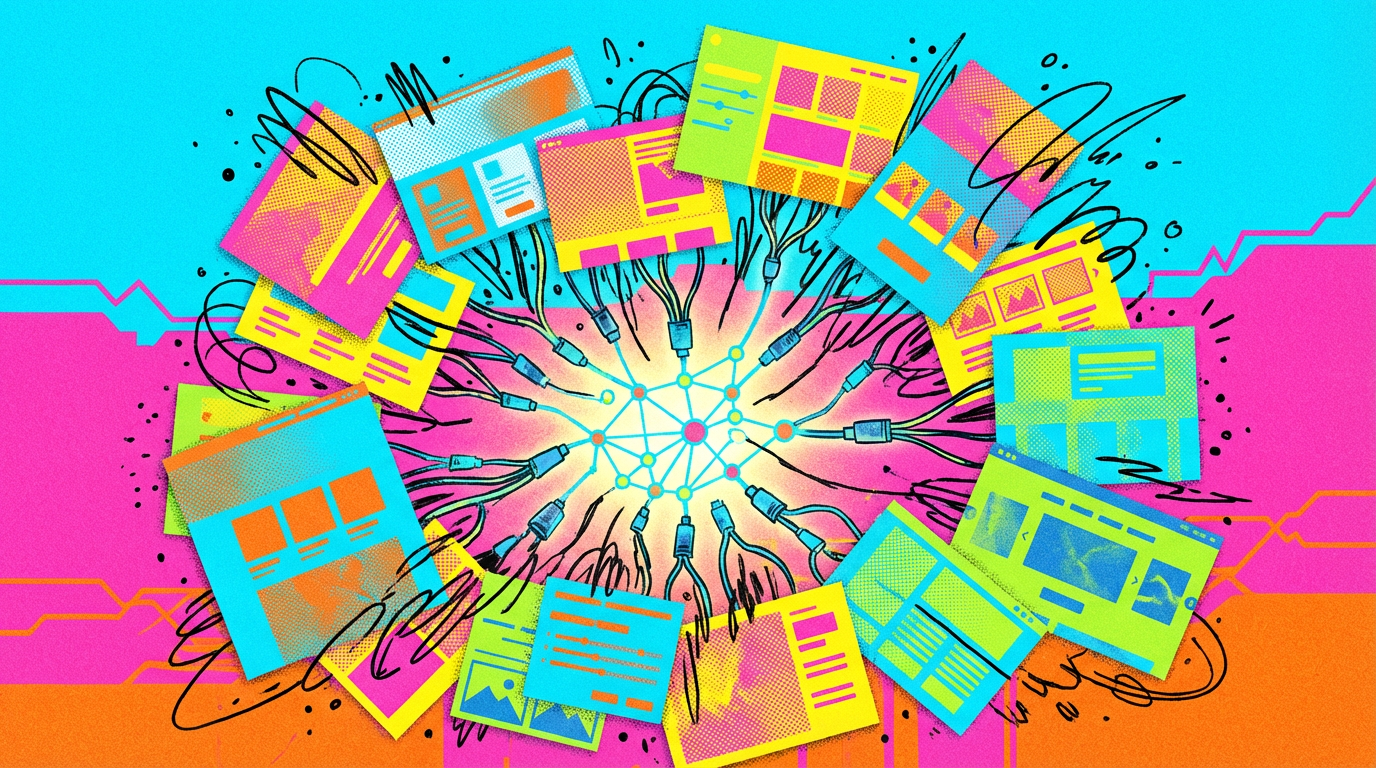
OpenAIがGPT-5.4でより良いフロントエンド結果を得るためのプロンプトガイドを公開
OpenAIは、フロントエンドデザイナーがGPT-5.4を使用してウェブサイトやアプリを構築する際に、より良い結果を得て、モデルが一般的なデザインに頼るのを防ぐ方法を説明する新しいガイドを公開した。
キーポイント
プロンプティングガイドの公開
OpenAIが、GPT-5.4を活用してフロントエンドデザインの品質を向上させるためのプロンプティングガイドを公開した。
対象ユーザーと目的
フロントエンドデザイナーを対象としており、ウェブサイトやアプリ構築時にGPT-5.4からより良い結果を得ることを目的としている。
解決すべき課題
モデルが一般的なデザインに頼ってしまう(falling back on generic designs)という問題を防ぐ方法を提供している。
影響分析・編集コメントを表示
影響分析
このガイドは、AI生成ツールの実用段階において、ユーザーがその潜在能力を最大限に引き出すための重要なリソースとなる。特にデザイン分野でのAI活用を促進し、作業効率と創造性のバランスを取る方法を示すことで、業界の実践に直接影響を与える可能性がある。
編集コメント
AIツールの実用的な活用ガイドは増えているが、OpenAIが公式に特定分野(フロントエンドデザイン)向けのプロンプティングガイドを出すことで、ユーザー教育と製品の効果的な使用を促進する戦略が見て取れる。
OpenAIは新しいガイドにおいて、フロントエンドデザイナーがWebサイトやアプリケーションを構築する際にGPT-5.4からより優れた結果を引き出し、モデルが汎用的なデザインに依存するのを防ぐ方法を解説しています。
記事「OpenAI、デザイナーがGPT-5.4で優れたフロントエンド成果を得るためのプロンプティング・プレイブックを公開」は、The Decoderに最初に掲載されました。
原文を表示
OpenAI has published a set of prompting tips for frontend designers who want to generate UX/UI designs with GPT-5.4.
In a new guide, the company explains how GPT-5.4 can be used to build websites and apps. According to OpenAI, without clear instructions, the model tends to produce generic designs. The company recommends defining a design system upfront—colors, typography, layout—providing visual references or mood boards, and structuring the page as a narrative.
OpenAI's starter prompt:
Frontend tasks
When doing frontend design tasks, avoid generic, overbuilt layouts.
Use these hard rules:
- One composition: The first viewport must read as one composition, not a dashboard (unless it's a dashboard).
- Brand first: On branded pages, the brand or product name must be a hero-level signal, not just nav text or an eyebrow. No headline should overpower the brand.
- Brand test: If the first viewport could belong to another brand after removing the nav, the branding is too weak.
- Typography: Use expressive, purposeful fonts and avoid default stacks (Inter, Roboto, Arial, system).
- Background: Don't rely on flat, single-color backgrounds; use gradients, images, or subtle patterns to build atmosphere.
- Full-bleed hero only: On landing pages and promotional surfaces, the hero image should be a dominant edge-to-edge visual plane or background by default. Do not use inset hero images, side-panel hero images, rounded media cards, tiled collages, or floating image blocks unless the existing design system clearly requires it.
- Hero budget: The first viewport should usually contain only the brand, one headline, one short supporting sentence, one CTA group, and one dominant image. Do not place stats, schedules, event listings, address blocks, promos, "this week" callouts, metadata rows, or secondary marketing content in the first viewport.
- No hero overlays: Do not place detached labels, floating badges, promo stickers, info chips, or callout boxes on top of hero media.
- Cards: Default: no cards. Never use cards in the hero. Cards are allowed only when they are the container for a user interaction. If removing a border, shadow, background, or radius does not hurt interaction or understanding, it should not be a card.
- One job per section: Each section should have one purpose, one headline, and usually one short supporting sentence.
- Real visual anchor: Imagery should show the product, place, atmosphere, or context. Decorative gradients and abstract backgrounds do not count as the main visual idea.
- Reduce clutter: Avoid pill clusters, stat strips, icon rows, boxed promos, schedule snippets, and multiple competing text blocks.
- Use motion to create presence and hierarchy, not noise. Ship at least 2-3 intentional motions for visually led work.
- Color & Look: Choose a clear visual direction; define CSS variables; avoid purple-on-white defaults. No purple bias or dark mode bias.
- Ensure the page loads properly on both desktop and mobile.
- For React code, prefer modern patterns including useEffectEvent, startTransition, and useDeferredValue when appropriate if used by the team. Do not add useMemo/useCallback by default unless already used; follow the repo's React Compiler guidance.
Exception: If working within an existing website or design system, preserve the established patterns, structure, and visual language.
Real content and lower reasoning produce better results
OpenAI also suggests starting with a low reasoning level, since more compute doesn't always lead to better output. Lower reasoning helps the model "stay fast, focused, and less prone to overthinking."
Feeding in real content rather than placeholder text makes a difference too. OpenAI says the model generates more appropriate structures and more believable copy when it has something concrete to work with. On the tech side, the company recommends React and Tailwind as the preferred stack. GPT-5.4 can also use the Playwright tool to visually review its own output and fix errors on its own.
The company also provides a "front-end skill" for its coding agent Codex. Finished projects can be submitted to a public gallery.
Google has also started focusing on UX/UI designers. Its new "vibe design" tool Stitch turns natural language descriptions into user interfaces. A built-in design agent analyzes the full project workflow, tracks multiple ideas in parallel, and supports real-time changes directly on screen via voice control. Google has also introduced A2UI (Agent-to-User Interface), an open standard under an Apache 2.0 license that lets AI agents generate graphical user interfaces.
AI News Without the Hype – Curated by Humans
Subscribe to THE DECODER for ad-free reading, a weekly AI newsletter, our exclusive "AI Radar" frontier report six times a year, full archive access, and access to our comment section.
Subscribe now
関連記事
今日のまとめ
AI日報で今日の重要ニュースをまとめ読み